Standing in line with other high-end brands, “Less is better” has always been the one principle that we can all observe in Apple’s branding and design. From their physical store layouts to their website and products including hardware and software, Apple has always emanated a sense of luxury in their aesthetic. And that’s what makes them stand out.
What standards has Apple set for the world of design? Let’s take a close look at how they do it.
How Apple Does Web Design
Do you remember the first time you went on Apple’s website to check out their new iPhone? You were probably really quickly convinced by the clean typography, smooth animation flows, and high definition product images that immersed you by filling your screen… that you wanted one.
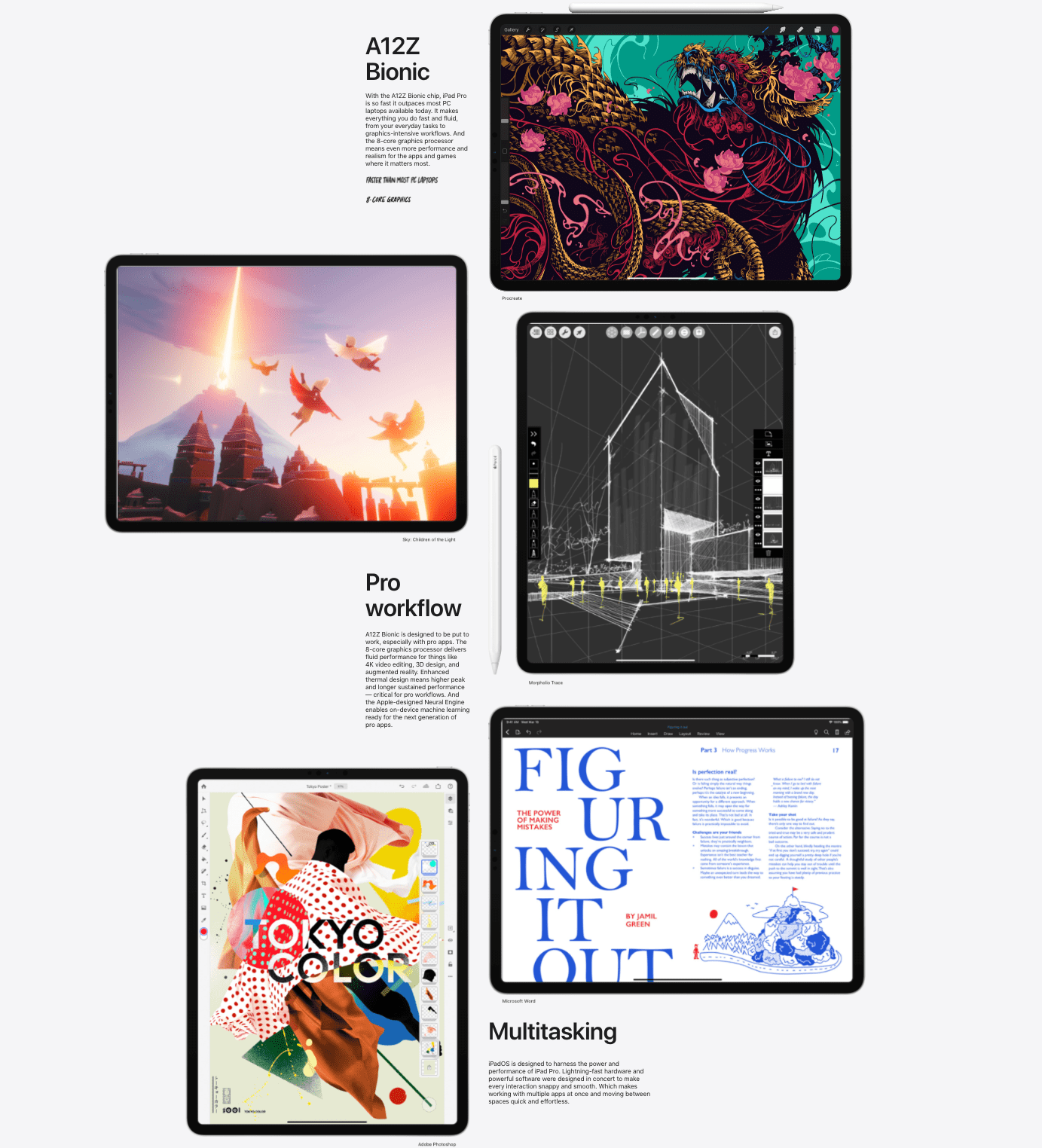
Apple’s web design doesn’t just function, it wows. (Image Source: Apple)
If we look at how Apple’s website has transformed over the years, we can see that minimalistic web design is one of its most consistent catches.
Their website focuses on clutterless single content areas that highlight one piece of content at a time with plenty of white space and wide margins. Not only is this design aesthetically pleasing, it is easy on the eyes and makes content easy to take in.
To make reading even lighter, Apple also uses simple headlines that show you the main idea of the paragraph without requiring you to read the paragraph.
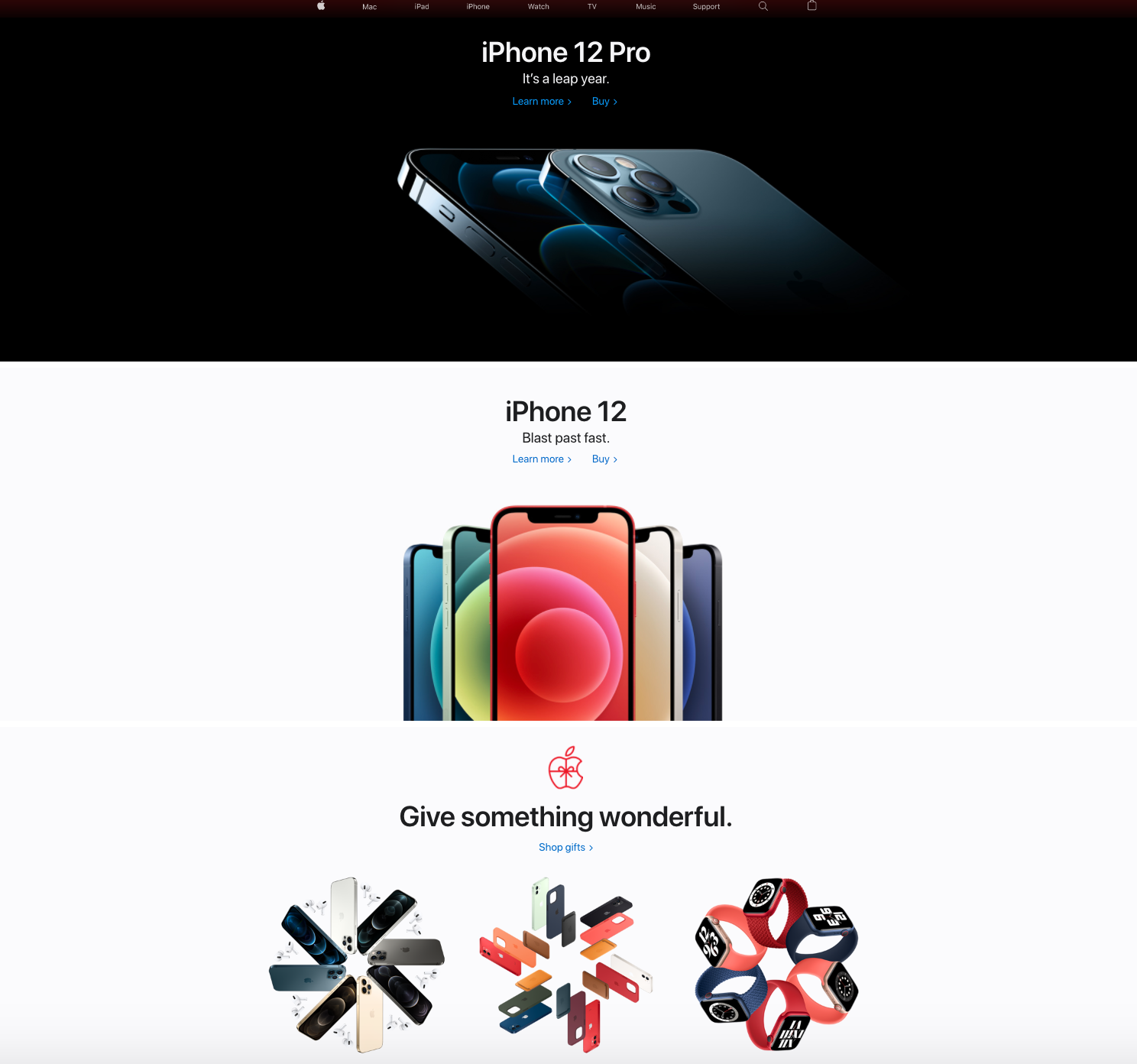
 (Image Source: Apple)
On their homepage, it’s difficult to ignore the huge product image that appears as soon as you enter, filling your entire screen from edge to edge, immersing you in it. The reason behind this design choice is to prevent decision fatigue and give visitors room to breathe. Instead of pushing their products onto you all at once, they let you focus on one single product, one headline, and one catchy subheadline.
Unlike most other websites that use multiple, smaller product photos, Apple uses techniques that obey the principles of visual hierarchy. They use large images, high contrast and bold typefaces for emphasis, and maximize space around it to draw even more attention to the subject. That is why when you glance at the image above, ‘iPhone 12 Pro’ takes center stage before anything else.
How Apple Does Product Design
It’s no unpopular opinion that Apple products look AND feel luxurious, whether it’s the iPhone, Mac, iPad or Apple Watch. One of the most groundbreaking moments for Apple was when they launched the original Macbook Air in 2008. Their iconic Envelope Ad went viral because at the time, the Macbook Air was the thinnest laptop ever in the market.
When we look at their unrivaled history of success, we can’t help but wonder: What’s been keeping Apple products ahead of the rest all these years?

Yes, Apple definitely has a strong focus on user experience, premium quality, practical design, and even tasking users’ feedback into consideration. But ask anyone what they think stands out about Apple products, and they’ll mention one thing — simplicity.
The book Steve Jobs Biography written by Walter Isaacson highlights Apple’s emphasis on simplicity:
Jobs’ belief in the power of simplicity as a design precept reached its pinnacle with the three consumer device triumphs he produced beginning in 2001: the iPod, iPhone and iPad. He immersed himself daily in the design of the original iPod and its interface.
His main demand was “Simplify!”
He would go over each screen and apply a rigid test: If he wanted a song or a function, he should be able to get there in three clicks. And the click should be intuitive. If he couldn’t figure out how to navigate to something, or if it took more than three clicks, he would be brutal.
“There would be times when we’d wrack our brains on a user interface problem, and think we’d considered every option, and he would go, ‘Did you think of this?’” said Tony Fadell, the team leader.
“He’d redefine the problem or approach, and our little problem would go away.”
This is what makes Apple’s design unique. With Jobs’ hard focus on clean, simple, and sleek, iOS had started a big design wave that, to this day, has Android operating systems scrambling to ride it.
When Apple launched the iPad 2 in Silicon Valley in 2011, Jobs said:
“It is in Apple’s DNA that technology alone is not enough – it’s technology married with liberal arts, married with the humanities, that yields us the results that make our heart sing.”
Today, it’s clear that Apple designers are continuing his legacy in keeping Apple at the intersection of technology and liberal arts. This is the reason why Apple’s design is great. Their products don’t just look good, they’re designed in a way that thinks about the people they’re designed for.
Next Step for You
User experience is what makes Apple the winner that it is today. Here at Snappymob, we believe in the same thing.
Snappymob designs products that function with feelings. If you’re in search of a product design and development agency to help set sail your digital strategy, we’re here to help!
Check out our work, work with us, or drop us a message on your next big step into the digital sphere.
