

Designers often work with organizing layouts with many objects, but when it comes to empty pages with nothing on it, designing can become quite the challenge.
But it doesn’t have to.
In this article, I will be sharing with you the best ways to design an empty placeholder. Note: These tips are based on my research and experience working on several web app projects over the years, so they might be skewed towards web apps.
1. Doodle on the Blank Canvas
The space IS empty, but the idea is to make it look non-empty. That’s why placeholders exist — to fill it, and prevent users from getting lost in the white space.
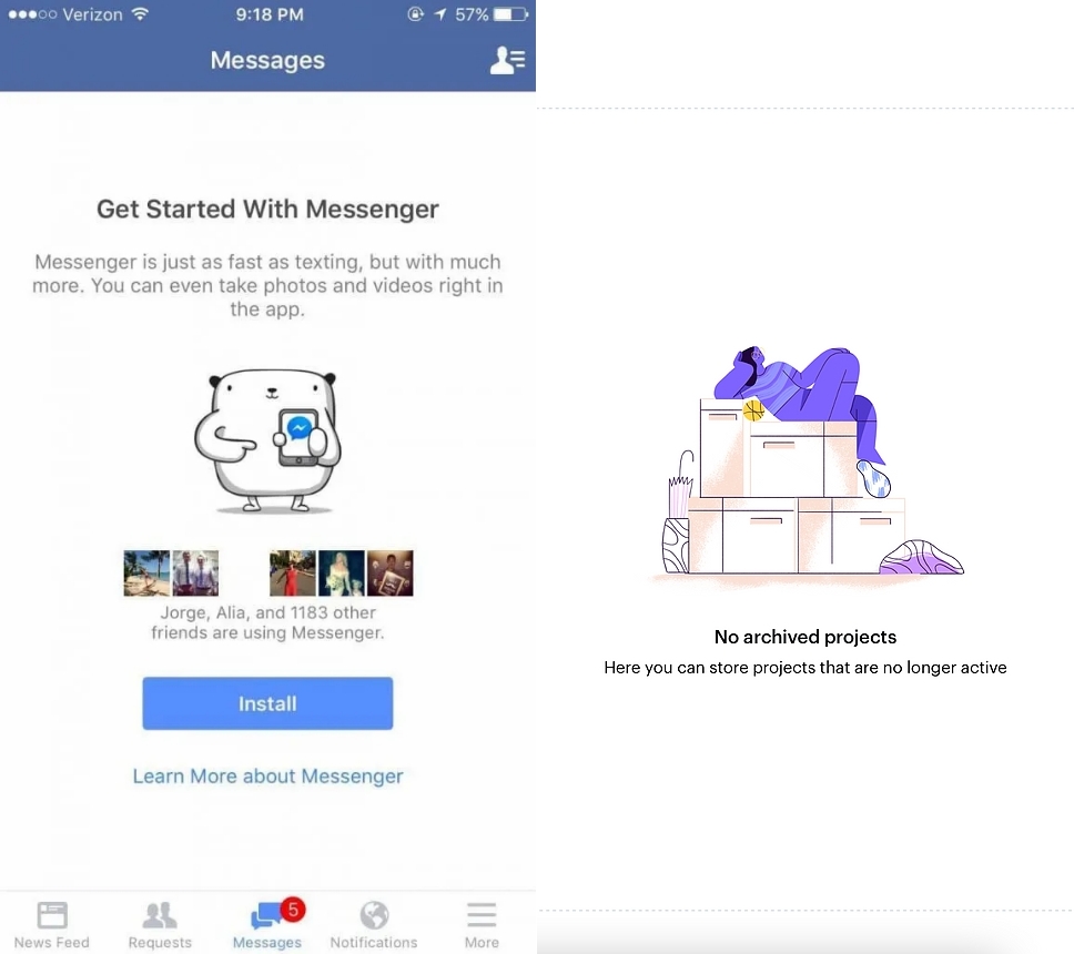
One of the ways to achieve this is to incorporate eye-catching colorful images. Facebook Messenger and Marvel use cute illustrations to fill the empty space and make the void look less daunting.
2. Disable or Hide Unactionable Buttons
As a product designer, it’s part of your job to think of every possible scenario and come up with strategies to overcome them.
One common scenario is when there are action buttons without action items on the page. Simply because it’s an empty state, there is no content for these buttons to interact with.
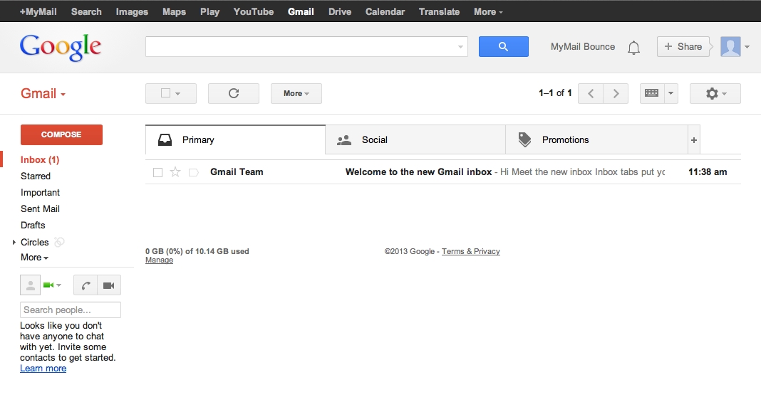
For example, Gmail removes the pagination on the top right corner when there are no pages to navigate.
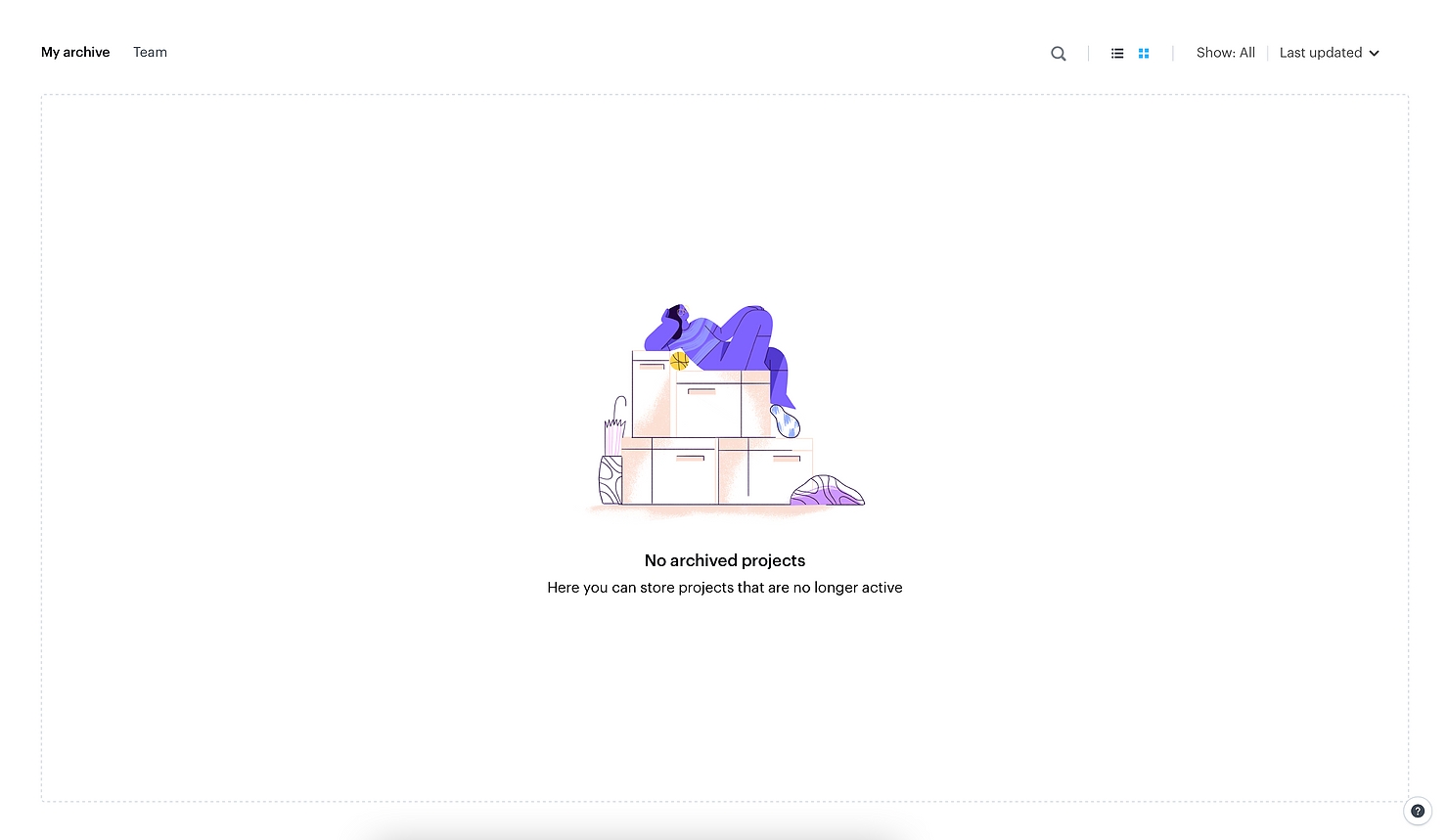
On Marvel, search and sort buttons are disabled when there are no projects to search or sort through. The “Show: All” and “Last Updated” buttons are also not clickable.
Obviously, the only action buttons that should remain clickable without content are the buttons that create new content, like “Create Project” or “Compose”.
Whether you should disable or hide unactionable buttons would depend on your development and how your whole system is designed. If clicking on a button adds content right away, it might be best to keep it but disable its state to prevent your page from jumping. If adding content requires multiple steps, however, you’re probably free to hide or disable the action buttons.
In UI design, there’s no right and wrong, it’s your call to manage objects in a way that looks best to you!
3. Fill the Space with Content
You’ve probably noticed that when you create a new Gmail or Yahoo account, you receive a couple of automated emails that welcome you aboard and introduce you to your new inbox almost right away.
So the first thing you see after signing up is an introductory email, not an empty state you need to fill.
This is a great way to make users feel welcome. It’s like getting free furniture from your realtor when you’ve just moved into an empty house. The house doesn’t look as empty, and you’re motivated to continue furnishing it.
Some of the ways you can do this is by creating example content, or adding onboarding tutorials that help your users familiarize with your platform. These elements also give your site a warmer, more personal touch.
4. Tell Users How to Fill the Space
Sometimes, applications and websites get to the point by immediately letting their users know how they can start filling an empty state with content. Some platforms that do this are Gmail, Spotify, and Blogger.
Spotify gives users brief directions on how to discover and follow podcasts.

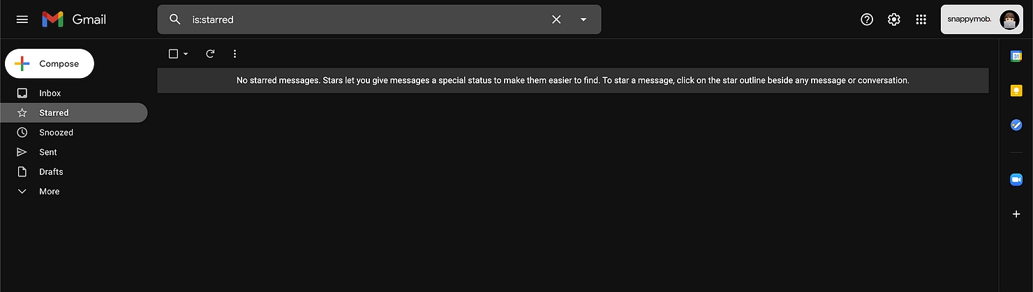
Gmail tells users what starring a message does and how to star messages.
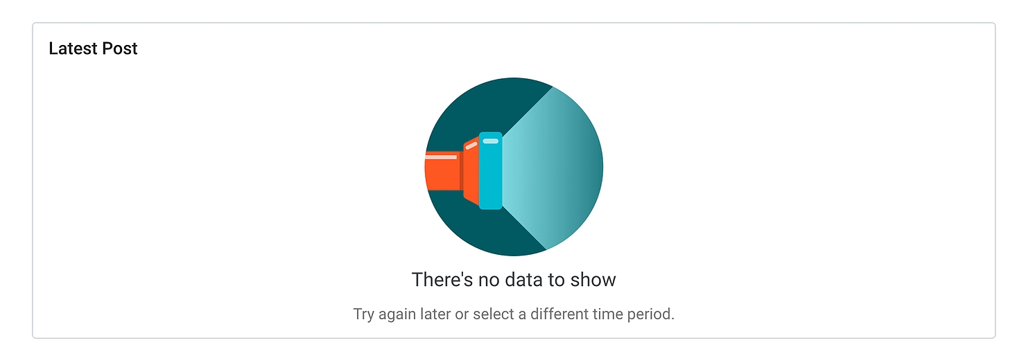
On pages that focus on data and analytics, sometimes the only way to fill the space with content is to check again later or change the variables. Blogger does this by telling users what they can try for different results.
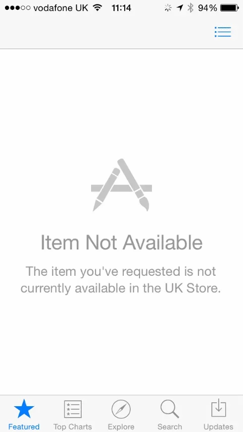
5. Explain Why it’s Empty
Empty pages can be vague and confusing. Users might not understand why they’re empty — Is it something they’ve done or haven’t done? Is it a server error? Does the searched item not exist?
It’s always good to answer the questions before they’re asked.
For example, when an app on the App Store isn’t available in your country, you get an empty page when you try to enter its download page. Apple does a great job informing their users of why exactly they’re unable to access it.
6. Celebrate the Emptiness
An empty state isn’t always a bad thing, especially when clearing up the items on a page is the very purpose of the page.
For example, when a to-do list page has been fully ticked and cleared, it means the user has completed all their tasks. This is when you should say “Hooray! You’ve got no more tasks.” instead of telling the user to fill up the empty space, or filling it up for them.
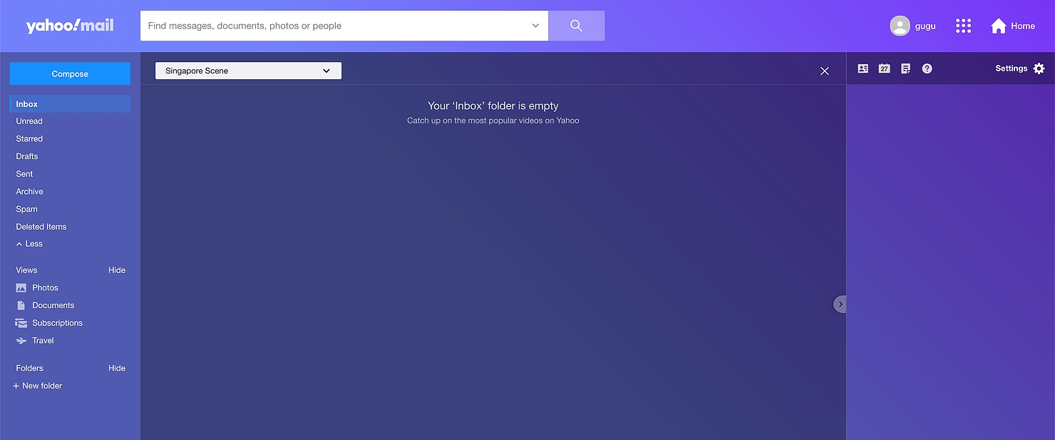
7. Distract by Recommending Other Features
If content doesn’t come easy, and you don’t want your users to be staring at a blank page for too long, try diverting them to a different feature on your platform. This can help them discover more on your site and keep them engaged at the same time.
For example, Yahoo! Mail encourages users with an empty inbox to watch videos on Yahoo instead of staying on their inbox page.
And that’s it! My 7 tips on designing an empty placeholder page.
Which tip works best for you would ultimately depend on the context you’re working on, so make sure you understand your platform well, and always put yourself in your users’ shoes.
Build Your Next Product With Us
At Snappymob, we care about making products that function with feelings. We care about perfecting design down to the smallest detail to deliver the best user experience.
Check out our work, or drop us a message on your plans for your next big project!