Hello! After months of hard work, the Snappymob team is finally ready to announce — we’ve rebranded! Since you’re reading this on our new website, you’re already seeing our new identity in action.
Welcome!
Why Change?
A brand’s look and identity are meant to capture the character of a company, its people. Over the past three years of growing as a team, Snappymob’s old identity and image had progressively become less representative of the work we do and who we are.
This nagging feeling built up over the course of the last year when the size of our team grew significantly. We realized that we needed a brand that communicates the values we’ve always been about from the beginning — simplicity and professionalism, with a touch of warmth. Casual conversations between our leadership and design team gained momentum and eventually turned into a focused initiative.
Our old look needed a rework. Our logo was whimsical, but didn’t really capture a story. Our old website worked really well and delivered on our goals, but it really felt like yet another agency website, and may not have delivered a sense of what we wanted our visitors to feel. It was also out of date as it didn’t capture focus or showcase contemporary work, especially web based work.
Now that we’ve rebranded (hooray!), let us take you on a journey with the people who made this change — our designers and developers — as they show us the vision behind our new voice and the challenges they overcame to make this possible.
Our New Look
Our elegant new look is home grown, led by our very own talented design team. Here’s what they have to say about the story behind our new identity.
We knew that if we wanted people to pick us for the right reasons, our introduction had to reflect our values, standards, and personality.
The logo
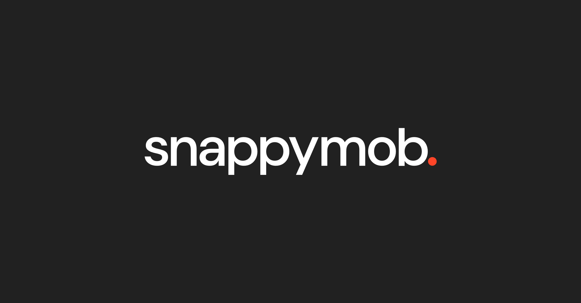
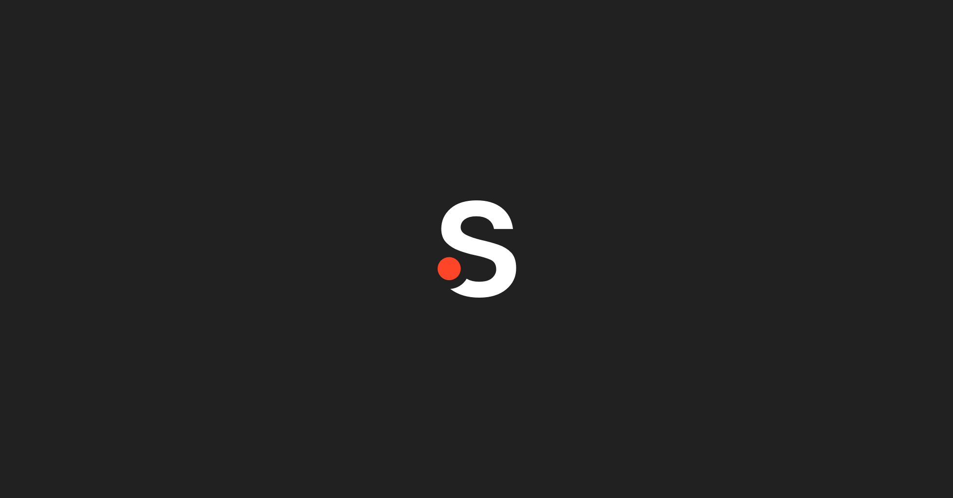
A logo isn’t simply a symbol of a company’s identity. It is also a company’s introduction to the public, its first opportunity to pique a viewer’s interest and reel them in. We knew that if we wanted people to pick us for the right reasons, our introduction had to reflect our values, standards, and personality. That is why our design team put careful thought and deliberation into every little detail when it came to our new logo, culminating in the design below.
What inspired the new wordmark?
“We used a clean sans-serif font to create a minimal design that exudes a sense of refinement. Beyond aesthetics alone, we wanted our new logo to highlight the core of our holistic philosophy — simplicity, precision, and cohesion.”
Is there a reason for the full stop after the company name?
“The full stop signifies completion, but it being a circle bears meaning as well, as a circle is a symbol of wholeness, perfection, and evergreen. These elements convey our aim and ability to help our partners arrive at and eventually materialize their most solid and meaningful ideas.”
Design language and illustration style
Apart from a new logo, we worked on a completely new design language for our brand, which brought along a different set of challenges for the design team.
What were the challenges in reinventing Snappymob’s design language?
“Being the first rebrand after many years, breaking out of conventions (both our own and the world’s) was an unpaved road for us. In creating our new design language, we made it a point to differentiate ourselves — to tell a story about who we are and what we do, as well as inspire and connect with people. This led to us picking a design direction that we’d never tried before — the “Nordic style” which is all about simplicity, minimalism and functionality. It resonated with us, so we took the leap. Achieving cohesion was another challenge on its own. Our new logo, typography, color palette, and illustration style were all revamped to be consistent with each other, and harmonious in different combinations and across different media.”
What choices were made for typography and language?
“We paid lots of attention to typography and language too, since they’re parts of design language. We tried different serif fonts to find the perfect primary typeface that elicits the personable look and feel we wanted. Eventually, we decided to ground our typography in the elegant and timeless serif typeface Tiempos, mixed with the modern sans-serif Inter. We also carefully distinguished the different font pairings to be used to create different effects depending on its specific function.”
How did the team decide on the new color palette?
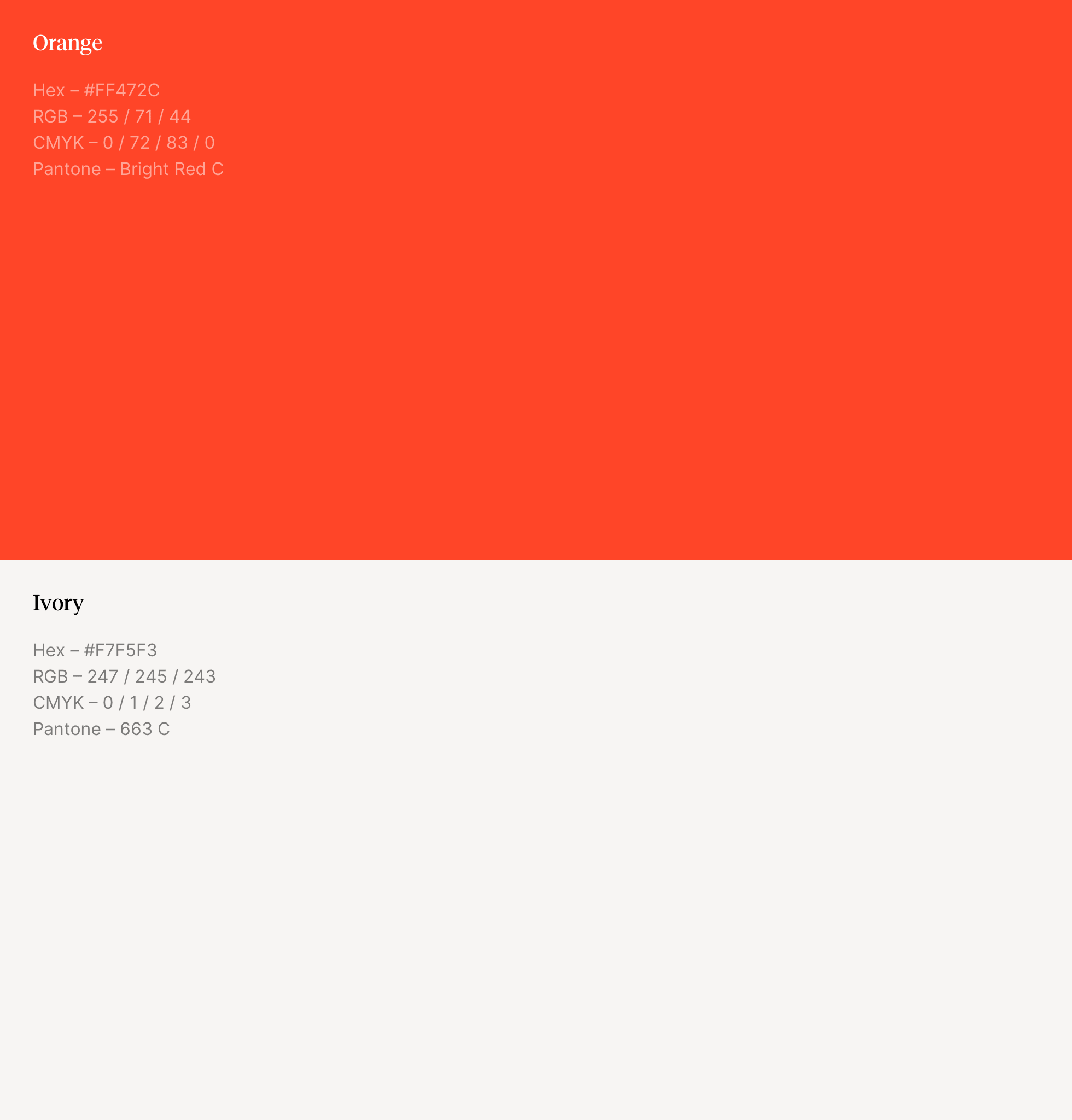
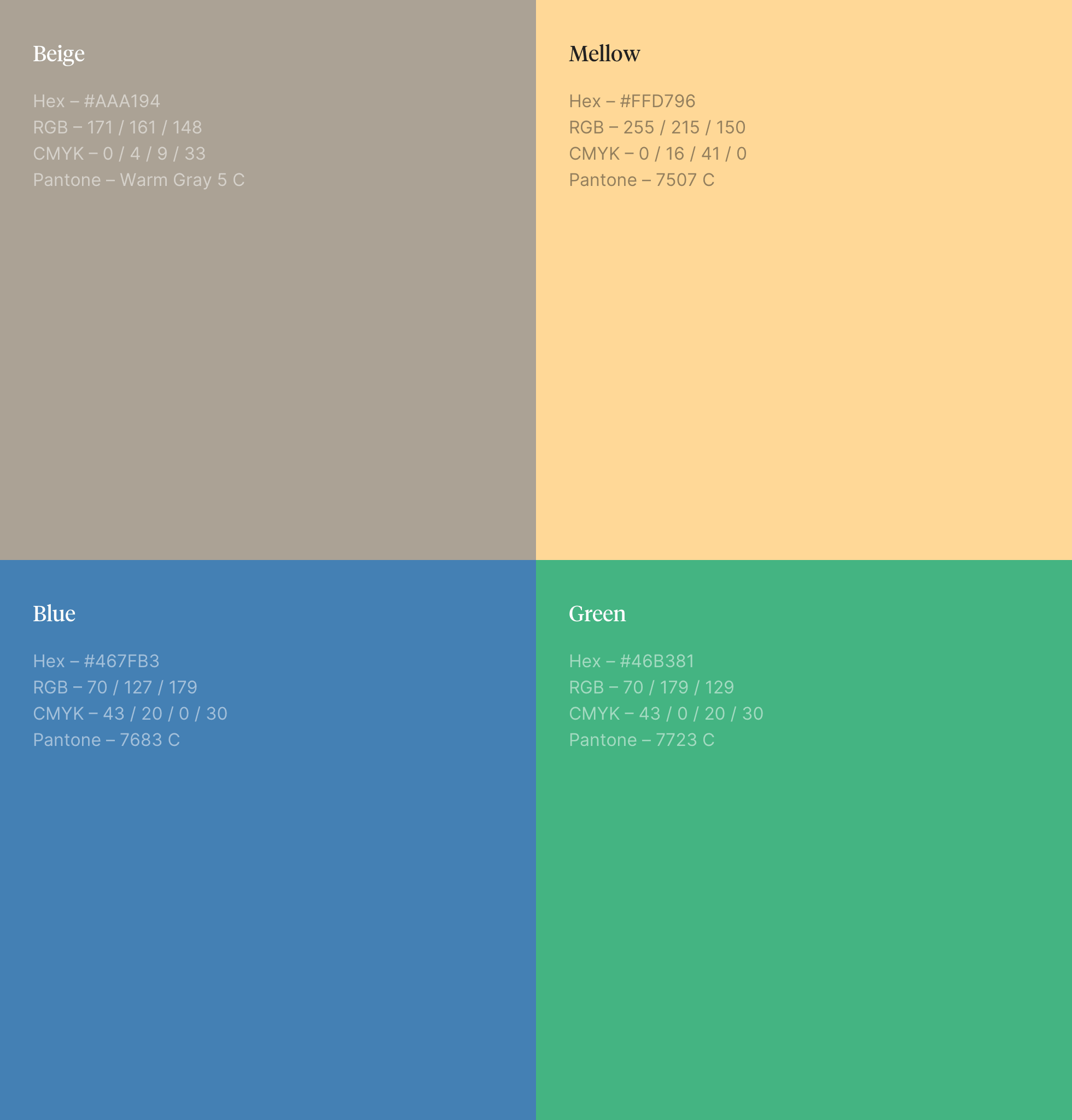
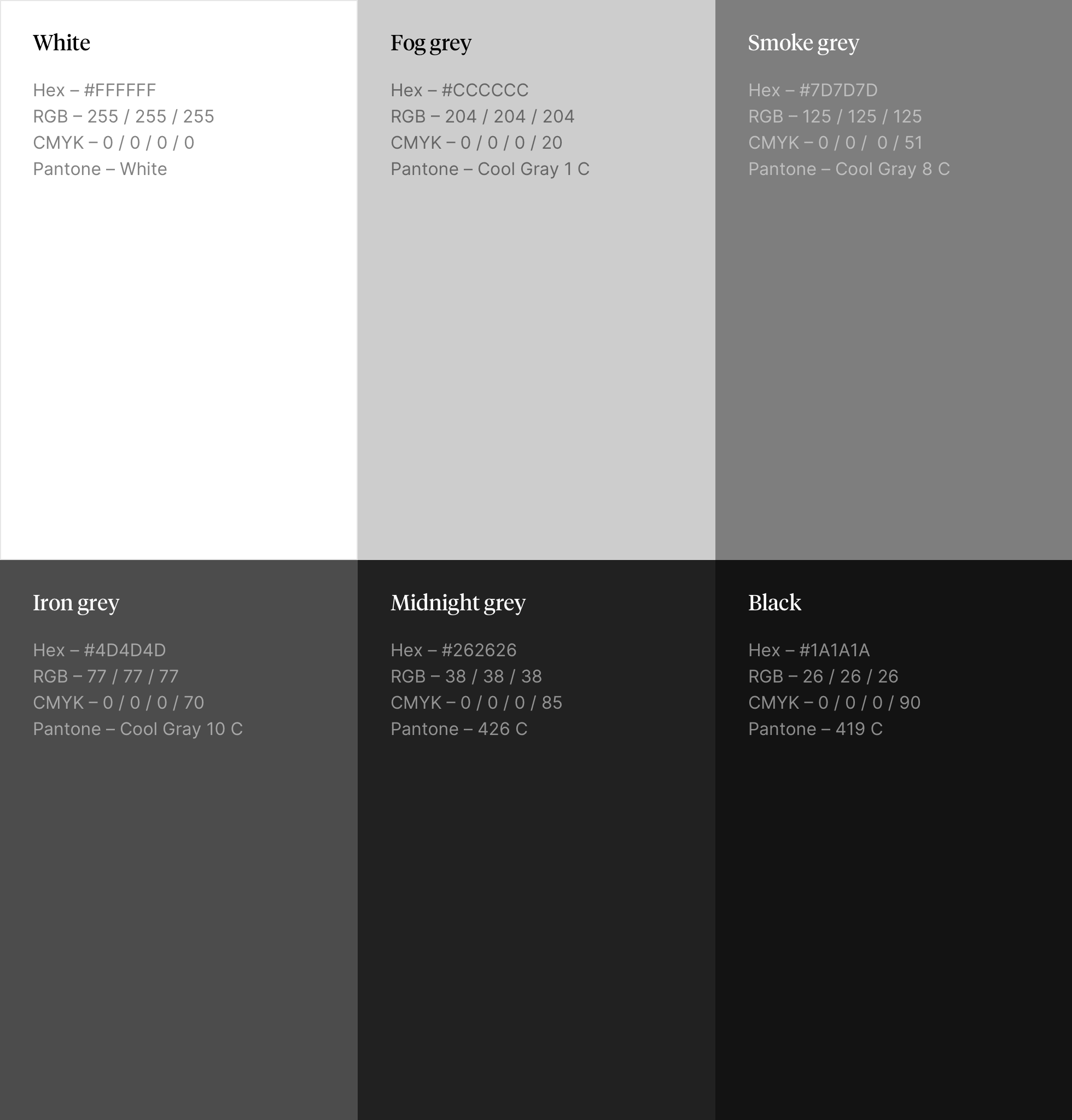
“Since clean and simple was the concept in mind, we wanted a toned down and minimised primary palette, with a little pop of color. After looking through a range of distinctive, attention-grabbing colors, we decided to have orange (#FF472C) as our accent color for creating emphasis, contrast, and rhythm. With it, there’s a splash of uniqueness, creativity, positivity, and passion over our neutral-colored backgrounds of white, grays, and black. With our primary and secondary color palettes, we have the flexibility to come up with different layout styles and switch between light and dark themes.”
What are the principles behind the new illustration style?
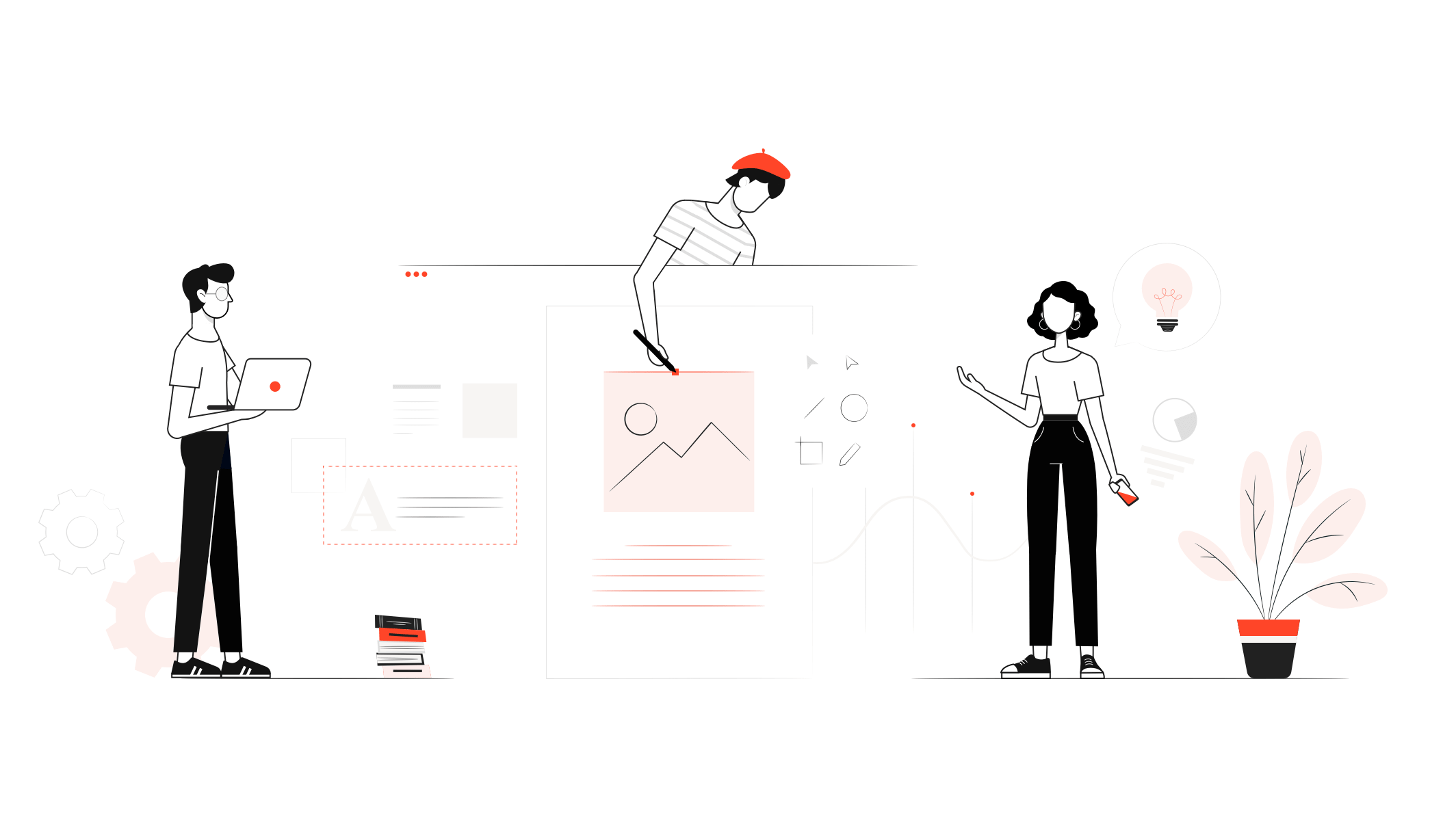
“To keep our look cohesive, we had to make sure our illustrations have a clean and simple look as well. Ultimately, we decided that our illustrations are to be constructed with lines and basic geometric shapes, from detailed hero illustrations to the simplest icons. They also should come in both light and dark versions to accommodate different backgrounds and needs.”
Our New Website
Our new website leverages our new design language, reflects our personality, and showcases our work through a crystal-clear lens.
While reworking all of our content, we kept in mind that our goal was to ensure that visitors emotionally connect with who we are and what we are about, even before making contact. We want to be seen and valued for who we are — a professional, competent, partner who cares.
In this new virtual home, we have a new focus on case studies to showcase what we’ve done and what we can help potential clients with, including testimonials from our valued clients. We also emphasize on writing, as we are fans of communication, the written form, and long-form content.
The process and conception
The idea to redesign our website was conceived at the end of 2019. Since then, we had been working on it in the foreground and background, interspersed with regular project work.
It took about three months to get over the hill to confidence, after working through a large number of design concepts, feedback, and iteration. Finally, after many rounds of being picky about the little things, we arrived at a design that reflected us.
Our development team played a vital part in this transformation. In their shared effort to make the website work better, they shared some of their input on this project as well as the obstacles they faced.
What was the aim in improving the Snappymob website?
“One of the focuses that the development team had was to make the site as accessible as possible. This required a good understanding of the needs of different users, e.g. visitors who use the keyboard for navigation on their desktops, or users of iOS/iPadOS who make use of VoiceOver to navigate the website.”
How did the team tackle accessibility?
“As developers, we had to know our own tools inside and out, so that we are aware of the options available to us in meeting the needs of different users. For instance, we included text labels for meaningful images, so that VoiceOver and other screen readers can pick up on the text and read them aloud. By doing this (using either the alt attribute for images, or aria-label for different sections on each page), we believe that we have created an experience for users with special needs — one that is arguably clearer than that for the normal user.”
What challenges did the team face in this process?
“Among some of them were the limitations of the User Interface (UI) library that we have chosen to begin our project, as well as the lack of control over certain styling properties of native components without awkward hacks. For example, there is a lack of options to extend on the default behavior of a dropdown menu, and making our own dropdown menu would be extremely complex and time consuming. Hence due to time constraints, we’ve opted for a simple dropdown, extending on our UI library while reimplementing default behaviors that a user will expect while using it, all while maintaining the aesthetics.”
Our development team also took this rebrand as a testbed for trying out technology stacks and deployment technology that differed from our usual approach, such as Nuxt.js and Cloudflare Workers. They share a little on their experience stepping into new waters:
What drove the decision to try out new methods for the site?
“We started out with the aim of keeping the site as lightweight and clean as possible in terms of code, so that our coding can be easily understood by other developers. Nuxt.js framework is strong in their application architecture, as they are able to generate routes based on file structure. We also wanted to create a static site for our website, and had a few options for hosting it. We ended up opting for Cloudflare because of their solid infrastructure and simple deployment process.”
How did using Nuxt.js help improve our website?
“It was very easy to build and configure both the server’s and client’s side of the application by simply writing the settings in one config file (nuxt.config.js). Nuxt also comes with a great feature that generates a completely static version of our website. When our website was generated with just a bunch of HTML files, its speed and performance shot up.”
How did the team benefit from Cloudflare Workers?
“Deployment was made simple with Cloudflare. It is able to deploy a website to any edge of the world within seconds. It also enables Node.JS serverless functions, which allowed us to perform A/B testing with relative ease. This helped with getting our website to load blazing fast.”
Thanks to the development team, the website you’re reading on today is now faster, smoother, and more accessible.
What’s Next for Us?
The ultimate goal of this project was to create a sense of cohesion in our brand. Now that we’ve arrived, we are excited to share the rest of our journey with you.
In the coming years, as we create more engaging and valuable content for our visitors, we will continue to contribute to the app design and development community with utmost pleasure.
As we’ve been around since 2012, our rebrand is only the next step to the beginning of this fruitful journey. There is much more to come, and we’d love for you to grow with us. Feel free to look around, get to know us, and (if you think we align) let us know how we can help you.


