Suria FM App’s Design Sparks A Return Of Radio Entertainment
Take a moment to reminisce about the days when tuning into a radio broadcast was the heartbeat of entertainment. Or the thrill of cruising to school with music blaring through the car speakers. Those moments, once etched in our daily lives, now feel like a distant memory of the past.
The relentless surge of personalized audio experiences has ushered in a new era, one that seemingly left conventional platforms, i.e. radios, in the rearview mirror. Effortlessly expediting its extinction in the realm of entertainment.
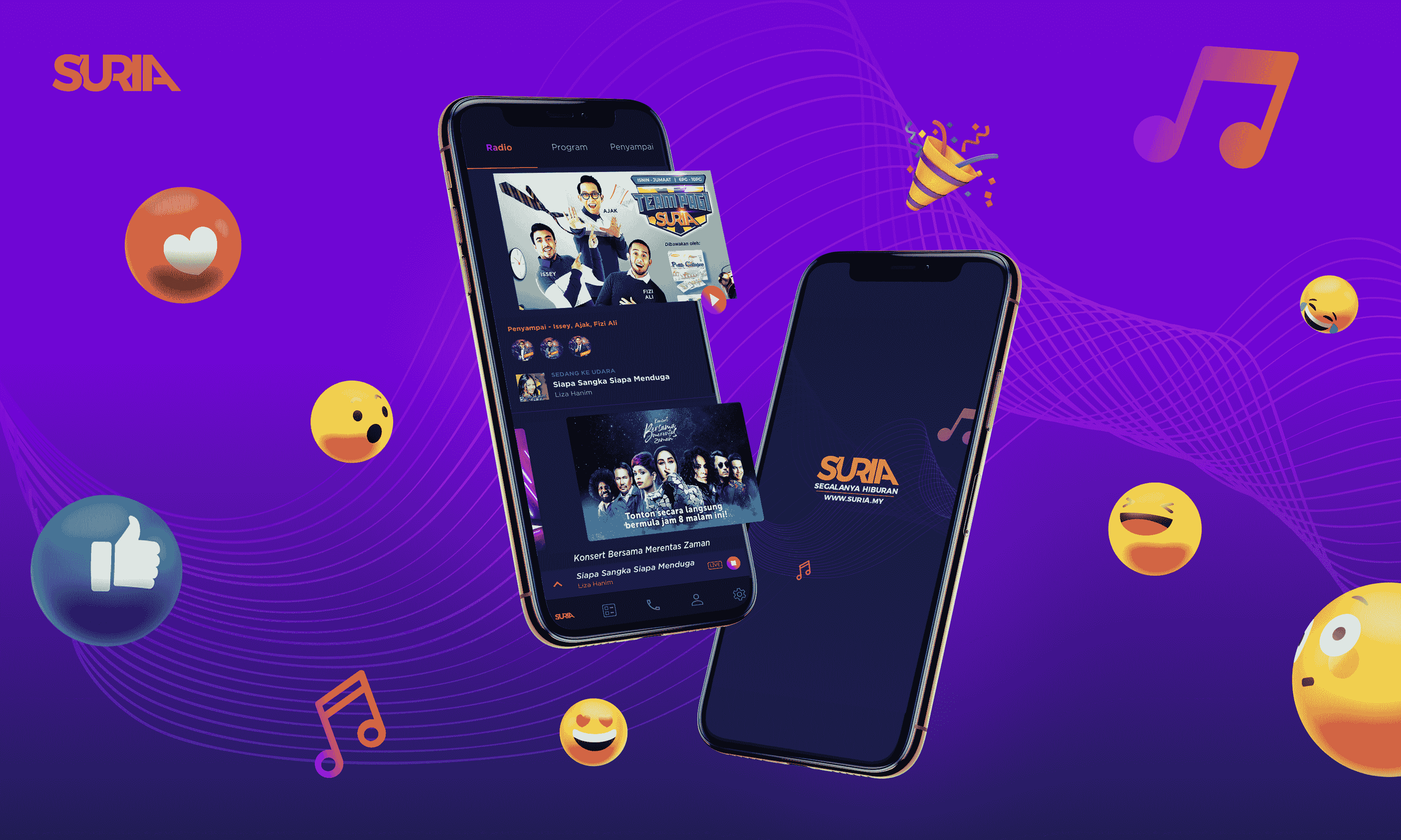
However, some innovative players are working to challenge this assumption. Suria FM, a Malay language radio station, has taken a bold step to revive the radio entertainment industry with a revamped mobile app.
The result? The Suria FM App!
Fast forward to 2023, the project is still achieving notable recognition, earning its place among the prestigious selections of “The Best App Designs of 2023” by DesignRush, renowned for its exceptional UI/UX design reviews.
Suria FM App’s Dark Mode Balances Aesthetics Without Compromising Optic Health
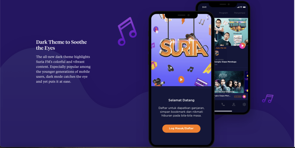
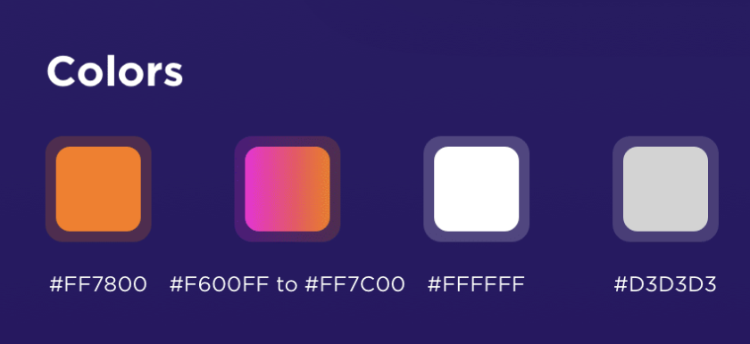
Opting for dark mode in the app’s design isn’t just a desperate attempt to be in with the times; it’s a carefully curated symphony of users’ preferences and colors derived from the Suria FM palette.
The deep blacks, soothing purple, and subtle grays work in unison with the brand’s colorful and vibrant colors to create an aesthetically pleasing and visually comfortable interface.
This balanced color amalgamation helps minimize eye fatigue by emitting less light, allowing users to enjoy the app without putting unnecessary stress on their eyes. This thoughtful approach to design enhances the overall user experience, making it more accessible and enjoyable for everyone.
Not only that, but the reduced luminance also contributes to a lower cognitive load, making it easier for users to navigate through the app effortlessly. This streamlined experience ensures that users can focus on what matters most— the content.
Suria FM App’s User-Oriented Features Promote Active Engagement
Suria FM’s main goals with the redesigned version were to promote better user experience and engagement. Taking that into account, we researched, brainstormed, and designed as requested. The app’s user interface is designed with simplicity and functionality in mind, ensuring navigation through the plethora of features is intuitive and entertaining.
For starters, the catch-up play’s feature is intelligently organized by the days of the week, allowing users to effortlessly browse and play past content. This thoughtful inclusion not only keeps users informed but also provides a personalized and flexible radio experience.
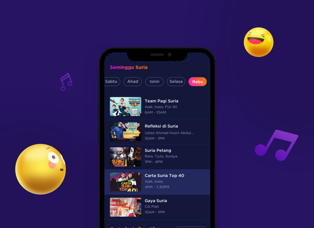
On top of that, the content presented is also chronologically arranged. Users can enjoy an ever-changing stream of content with easy-to-browse features at their own pace. Making it similar to streaming services.
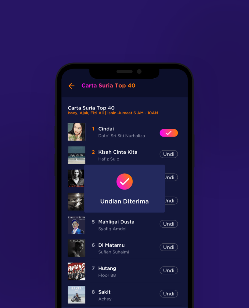
Additionally, the app makes it a breeze for users to participate through a dedicated Top Charts voting section. With a simple and accessible interface, users can cast their votes for their favorite songs, actively shaping the content they want to hear.
This level of engagement not only empowers users but also creates a sense of community within the Suria FM listening experience.
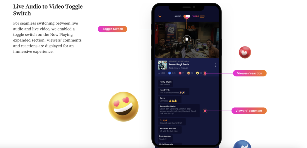
To further promote active user participation, a live audio-to-video toggle switch is featured in the redesign. This seamless functionality allows users to participate in conversations on live radio shows through comments and reactions.
And the best thing about it — it all takes place on a single page. No more tedious and unnecessary screen changes.
Suria FM App’s Design Is A Pinaccle of User-Centric Designs
Undeniably, crafting the Suria FM App was challenging in the age of streaming. Despite this, we understand and believe that at the core of any mobile application is its users.
Suria FM’s implementation of Dark Mode is not merely a stylistic choice; it’s a testament to the app’s commitment to user well-being. Beyond addressing health concerns related to prolonged screen exposure, the app aligns itself with contemporary trends within its user base.
Moreover, the app liberates users from the confines of repetitive and outdated content, offering them the autonomy to curate their listening experience. No longer do users have to endure monotonous songs or outdated shows, empowering them with the freedom to pick and choose content tailored to their preferences.
Users are also no longer passive listeners; they are active participants in their radio journey with the app. By offering a diverse range of content and empowering users to shape their experience, Suria FM fosters a sense of connection and engagement that goes beyond the traditional boundaries of radio broadcasting.
Overall, Suria FM doesn’t just offer a radio app; it crafts a personalized journey for every listener, making the act of tuning in a delightful and engaging experience.
The app’s intuitive UX and user-oriented features actively transform radio listening into a dynamic activity, undoubtedly deserving of the Best App Design of 2023 recognition for its emphasis on user experience.