
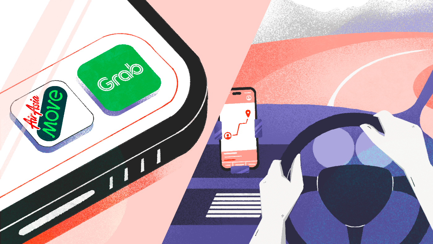
Let’s be real—getting around is easier than ever. Just a couple of taps, and your ride’s on the way.
In Malaysia, two names pop up when it comes to e-hailing: Grab and AirAsia Move.
One is a long-standing giant that has evolved into a super app, while the other is a rising competitor leveraging its airline roots to make travel more connected.
Both promise travel convenience, but how do they actually feel? Or in our terms, their UI/UX designs.
Curious ourselves, we had our UI/UX designers dig in, explore the whole experience, and come back with insights you’ll want to see before your next booking.
Onboarding Experience
Grab— Functional yet unguided.
Grab’s onboarding process gets the job done, but doesn’t exactly make a strong first impression.
While none of the steps are particularly confusing, entering personal details involves navigating through several screens.
To a seasoned user, this might seem like a minor inconvenience.
But for new users, each step can feel like a moment of uncertainty— raising questions like, “Is this necessary?” or “What happens if I skip this?”
Once the sign-up is complete, there’s little to no follow-up. No walkthrough, no onboarding tips, no cues—just a blank slate.
The app seems to take an “explore it yourself” approach, which may be intentional, but risks disorienting users who prefer a more structured introduction.
While the process is functional, it lacks the clarity and user support that could make onboarding more welcoming.
A few thoughtful touches—like contextual prompts or a brief tour—could help reduce friction and make the experience feel less like a cold start.
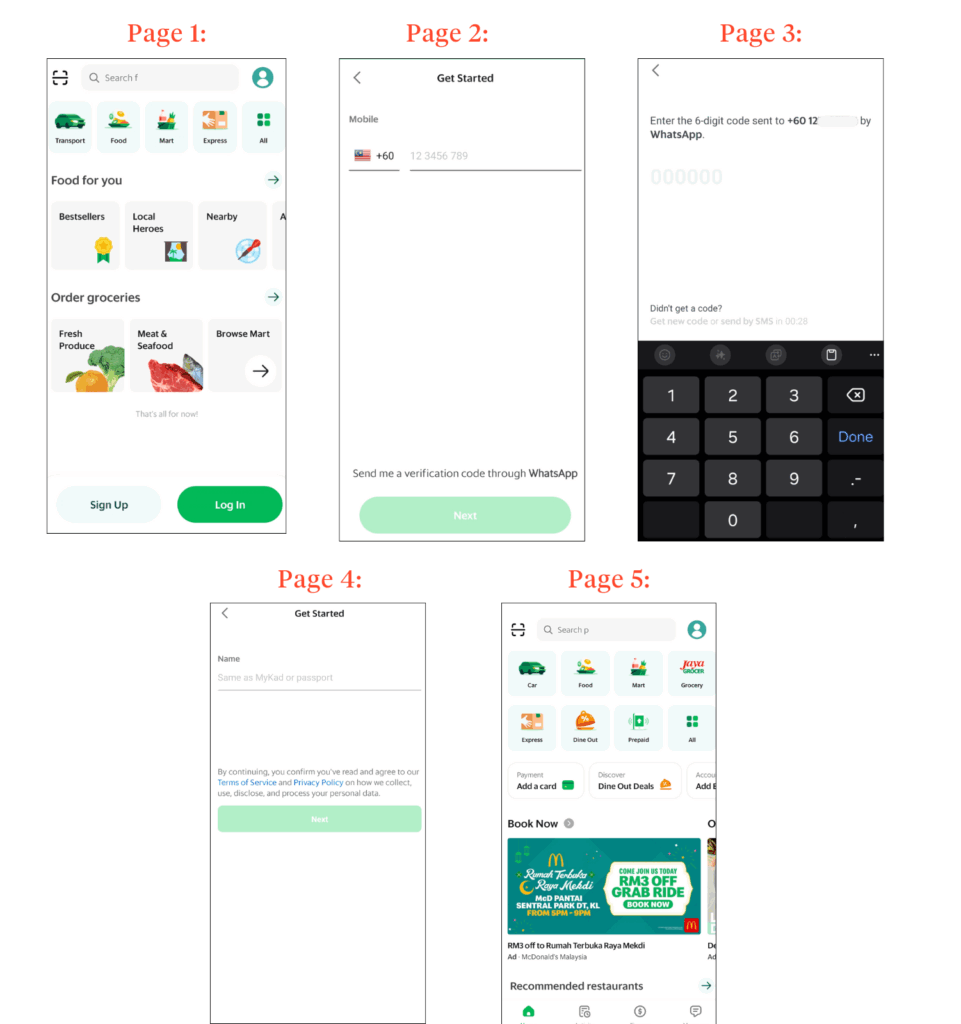
AirAsia Move— Efficient and structured.
AirAsia Move takes a different approach by bundling its sign-up process into a single form.
Users enter their gender, email, password, name, surname, date of birth, and phone number—all at once. Quick and efficient.
That said, the call-to-action (CTA) copy could benefit from a small but impactful tweak.
Currently labeled “Continue,” the button gives the impression that additional steps follow—potentially deterring users hoping for a fast registration process.
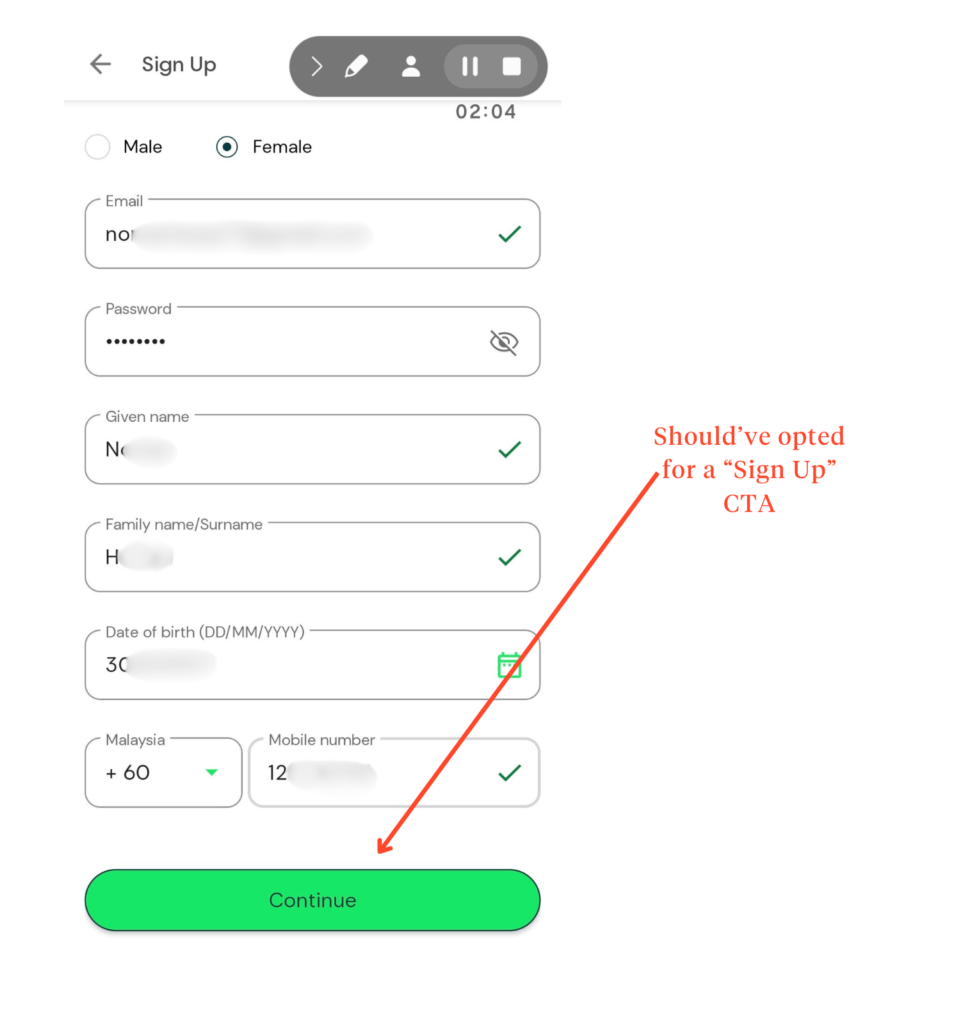
Replacing “Continue” with “Sign Up” would help set clearer expectations, reassuring users that this is the final step before entering the app.
Where Grab is lacking, AirAsia Move leads in what happens following sign-up.
The app immediately sets the direction by prompting user identity verification (quick selfie) when tapping the ride icon.
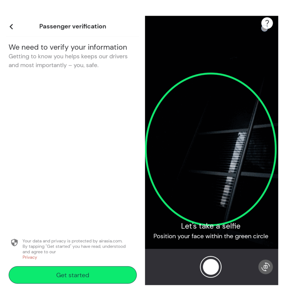
While the extra step may feel like a minor barrier, it signals intent and purpose.
It shows the app is leading the way rather than leaving users to figure things out on their own—something first-time users are likely to appreciate.
Booking Flow
Grab— Intuitive, speedy, and personalized.
Despite the rough start of its onboarding process, Grab does several things right with its booking process.
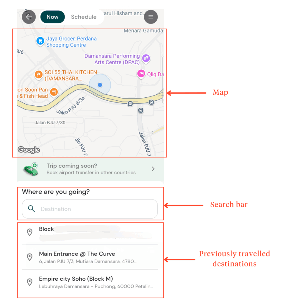
Upon launching the booking screen, the app automatically detects the user’s location, and a search bar is presented to enter their destination.
This mirrors how people naturally think about getting from point A to B—starting with “Where am I now?” and “Where am I going?”
By offering this “smart default,” Grab reduces cognitive effort, helping users move through the process quickly without overthinking each step.
Several other thoughtful features reinforce this goal:
- The ability to clear entries in the search bar effortlessly.
- Support for multiple drop-off points, useful for carpoolers.
- A “snap a photo” option allows users to capture landmarks or signboards for better navigation.
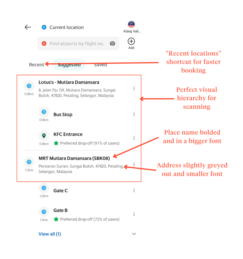
Grab’s visual hierarchy also works in favor of quick identification.
In the location list, place names are prioritized first, followed by street details and distance.
This helps users identify the right destination quickly. And for frequent riders, the “Recent Locations” shortcut brings added convenience.
However, there’s a slight hiccup in the interface. The dropdown arrow labeled “Now” in the search bar suggests the option of booking immediately or scheduling later.
Instead, it opens the same pickup/drop-off screen the main search bar already leads to—a redundant interaction that might mislead users based on its label.
Despite that minor friction, Grab maintains a strong balance between automation and manual control.
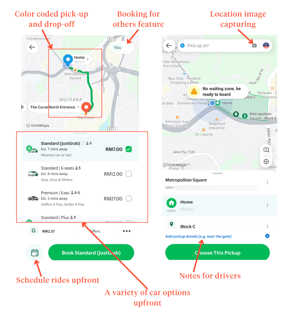
When selecting a pickup point, users can stick with the app’s auto-detected location, type in a new address, or drag and drop a map pin.
The pin interaction dynamically updates nearby pickup points, accommodating both quick-booking users and those who prefer hands-on adjustments.
The app also demonstrates transparency and intuitive design well. In addition to displaying vital information—route, ETA, and total distance—upfront, it utilizes universal associations like color coding (blue pickup/red drop-off) and image capture to help drivers identify a user’s location.
On the personalization front, the app houses features that anticipate user needs without making them dig through menus. Users can:
- Leave a note for their driver.
- Choose from various ride types.
- Book rides for family members.
- Schedule rides in advance.
- Add multiple stops
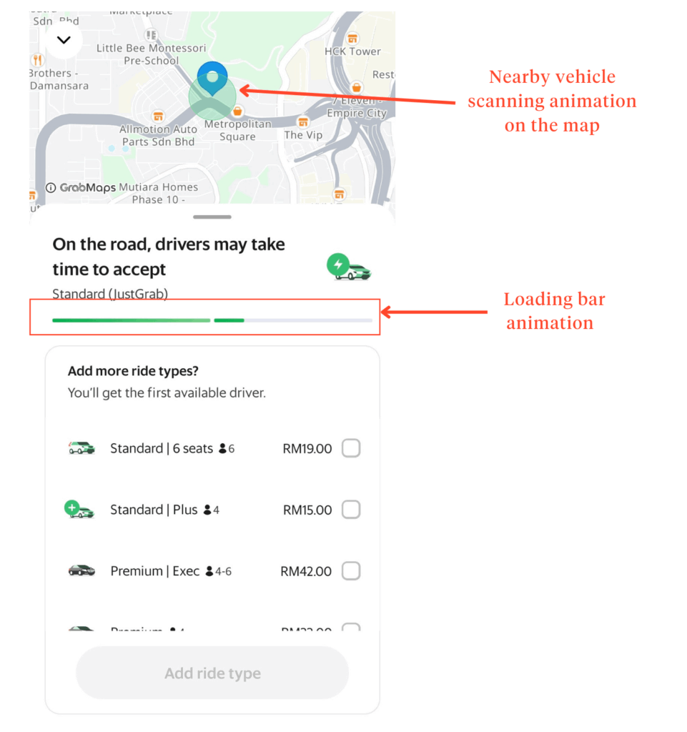
And once you hit “Book,” there’s a reassuring animation showing the app finding a driver.
It even lets you know if drivers are readily available or if there might be a wait—an underrated feature that prevents unnecessary guesswork.
AirAsia Move— Direct but needs improvement.
AirAsia Move’s booking process is slightly more direct but still falls behind Grab.
Right from the start, you get a…
All of which help speed up the decision-making process for returning users.
A toggle for “Order Now” and “Schedule for Later” allows users to make advanced bookings from the start, which is a more significant advantage than Grab’s appearance later in the booking process.
However, the auto-detect location isn’t as sharp as Grab’s.
While it does offer a list of nearby places as a corrective measure, the auto-detect function occasionally falls short.
If users are not paying close attention, they could inadvertently select the wrong pickup point.
This slight inaccuracy could become problematic in high-density areas or unfamiliar surroundings.
It also lacks the feature to capture images of pickup points, meaning users and drivers have to rely on the map alone.
Another point of friction emerges in the vehicle selection step. At first glance, it seems as though there’s only a single car option. When in fact, other choices are hidden behind a “See More” button.
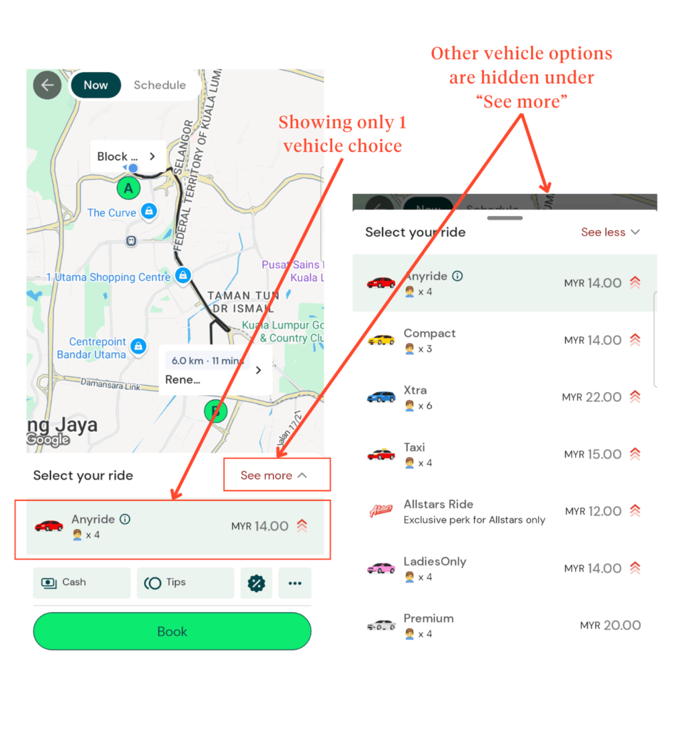
While this design might appear clean, it can unintentionally mislead users into thinking fewer options are available.
This collapsed view could lead to hesitation or even mistrust for users expecting transparency or browsing for the most cost-effective or comfortable option.
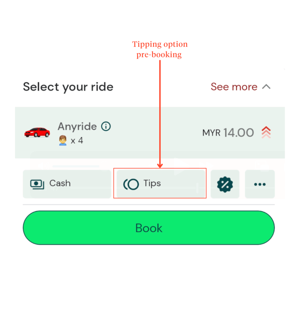
An unexpected UX decision comes in the form of tipping—before the ride even begins.
While pre-ride tipping may have its reasons (like for frequent corporate or concierge-style bookings), it’s not a standard convention in the e-hailing space.
Its placement may confuse users or make them feel prematurely obligated, especially when no context is provided.
As for booking confirmation, AirAsia Move does feature an animation to signal that a driver is being located—mirroring an industry norm.
However, the animation lacks feedback about real-time driver availability.
Without that transparency, users may find themselves uncertain about how long they’ll be waiting, especially during peak hours.
User Communication Features
Grab— Seamless and inclusive.
Grab provides users with solid communication tools to cater to different user preferences, but maintains speed and clarity.
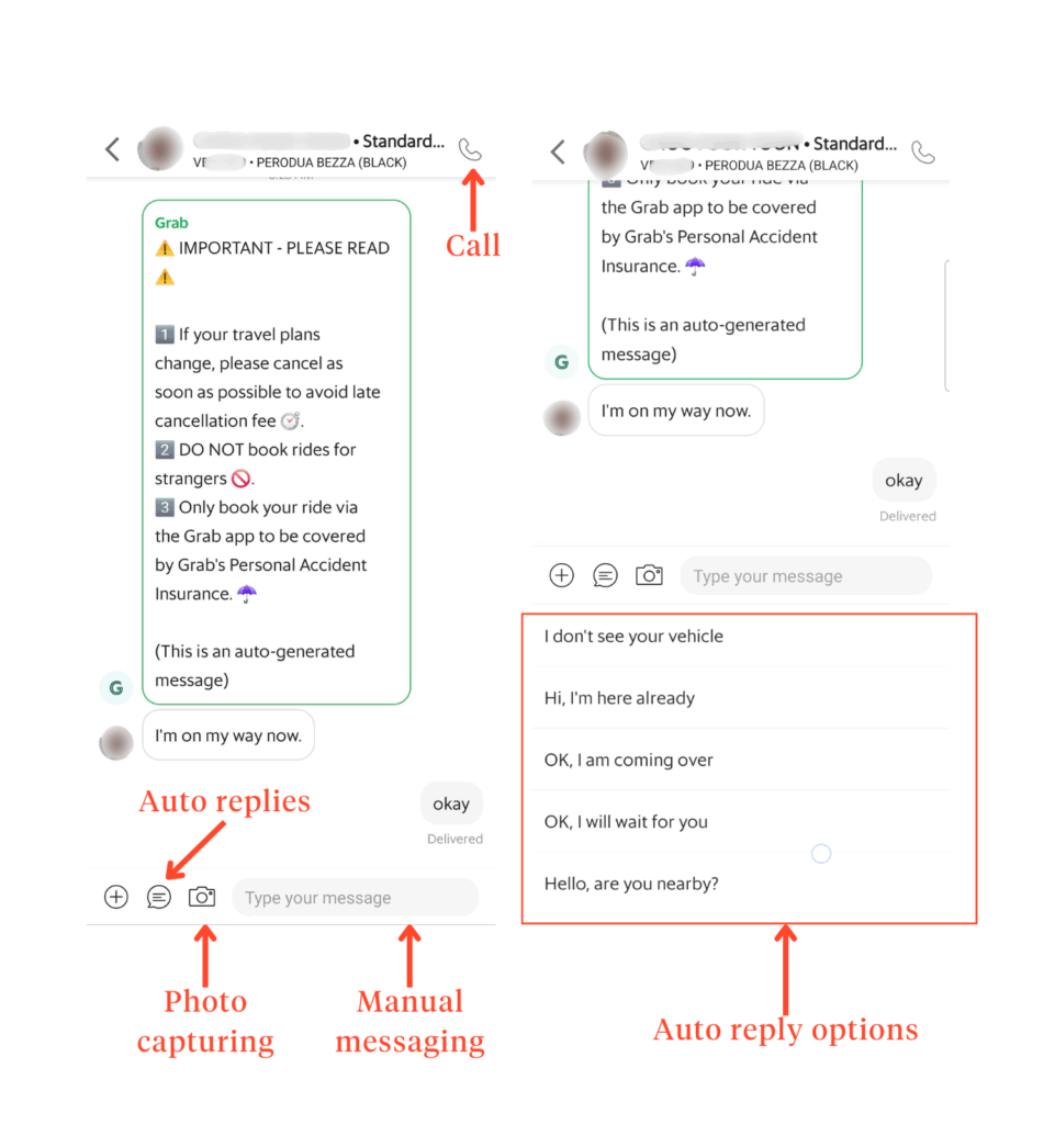
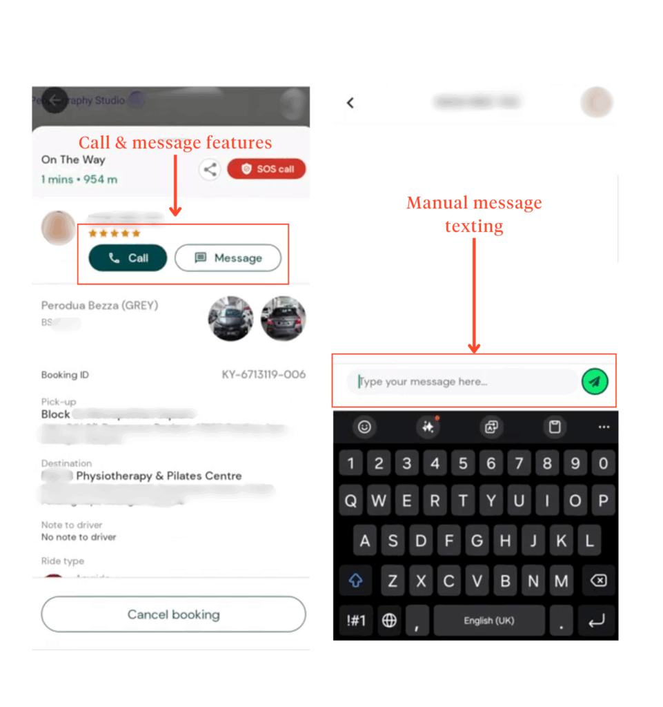
Need to give directions? You’ve got a call icon for verbal coordination.
Not a fan of speaking to strangers? The in-app chat supports both manual typing and convenient quick-reply options— so users are not stuck typing “I’m here” for the hundredth time.
One thoughtful addition is the ability to send images directly through the chat. Whether it’s a photo of a nearby shop sign or a building facade, this visual aid can make a big difference when text alone won’t cut it.
A standout feature worth mentioning is the “View Translation” option. This tool automatically translates chat messages between driver and passenger, easing communication when language barriers arise.
It’s a small detail with a big impact—helping to reduce misunderstandings and improve trust and comfort.
AirAsia Move— Simple but relies on user efforts.
AirAsia Move, on the other hand, keeps things much more straightforward.
Users get a call button and manual texting. No quick replies, no image-sharing, and no built-in translation. A missed opportunity in our opinion.
While the current setup still allows users to coordinate with drivers, it requires more effort from the user.
In moments where timing, clarity, or accessibility matter, this minimal approach may slow things down or create unnecessary friction.
Ride-tracking & updates
Grab— Proactive reminders with instant visual cues.
Grab’s ride-tracking experience feels like having a personal assistant whispering timely updates in your ear.
From the moment a ride is booked, the app keeps users informed through timely push notifications, even when the app is closed.
These updates—covering driver arrival, trip status, and delays—eliminate the guesswork and help users stay one step ahead without constantly checking the app.
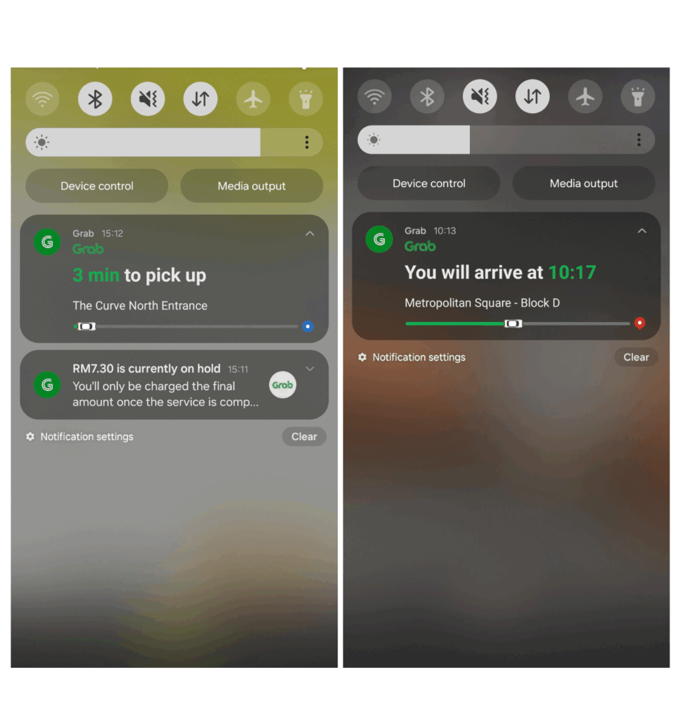
What sets Grab’s ride tracking apart is how much detail it provides at a glance.
In-app, the live map shows the driver’s exact location with a clearly marked green route, giving users immediate visual clarity on where the driver is and how long it might take to arrive.
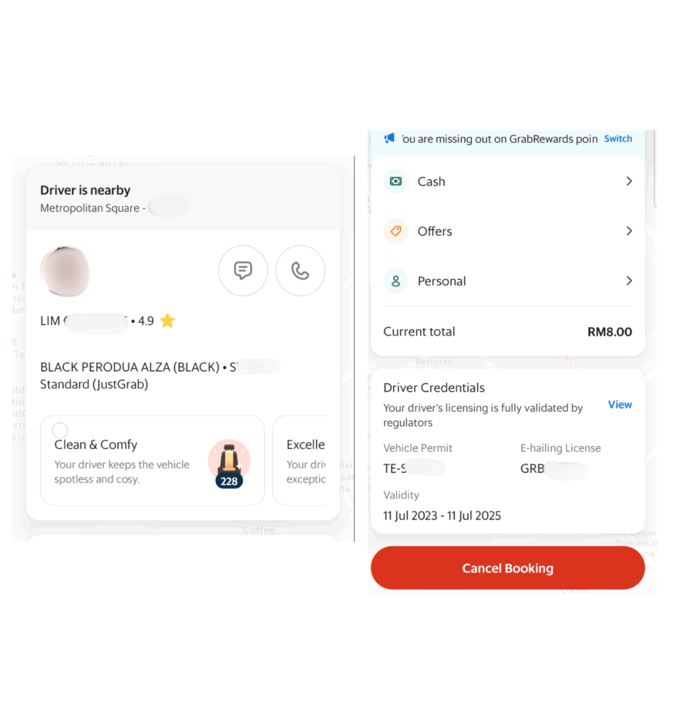
Beyond just the basics like driver name and vehicle type, the app also displays driver star-ratings, vehicle ratings, and driver credentials.
And for safety-conscious users, Grab’s live-tracking link demonstrates safety-driven UX done right.
The feature directly addresses users’ deepest ride-hailing anxieties through proactive reassurance by enabling one-tap sharing of real-time trip data with trusted contacts.
AirAsia Move— Important info drowned within UI/UX.
AirAsia Move takes a similar approach, but with some missed opportunities.
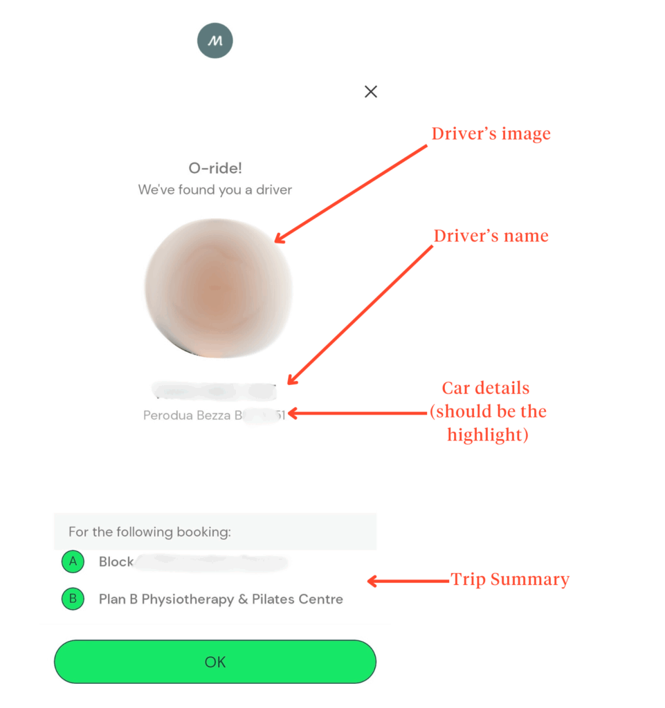
Users are notified when a driver has been assigned; however, unlike Grab, the license plate number doesn’t appear in the notification itself.
This requires users to re-enter the app to access that vital detail, introducing an extra step during a time-sensitive moment.
Once inside, a pop-up provides a summary of the trip, including:
While this summary is informative, the visual treatment lacks urgency. Font sizing and color choices fail to highlight the most critical information, like the license plate, potentially slowing down confirmation in real-world settings.
Plus points are warranted, though, for the ride-tracking UI for clear visual differentiation (using black for the driver’s path, similarly to Grab’s green).
But the seemingly cramped layout does discourage readability, which isn’t the best for at-a-glance moments.
However, the inclusion of thoughtful safety features like an SOS emergency button reflects strong user-centric thinking.
While it may not boast the same visual refinement as its competitors, this functionality prioritizes user well-being over aesthetics—and that’s a trade-off worth applauding.
Post-ride experience
Grab— Experience beyond drop-offs.
Grab’s post-ride experience is a well-rounded, user-first approach that ensures riders and drivers feel supported after the journey.
In addition to a star-rating system that allows users to give feedback on their driver, Grab integrates thoughtful post-ride reminders.
One such feature is a simple auto-generated message in the chat prompting users to check their belongings before leaving the car.
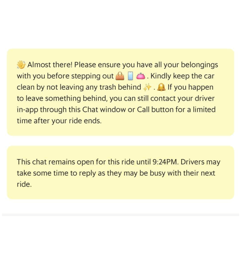
It’s a small but handy touch, especially for those who’ve experienced the mild panic of realizing their phone is still in the back seat.
Other post-ride conveniences include:
- Tipping options for users who want to reward great service
- A ride summary for reference
- Easy issue reporting in case something went wrong
- Reorder a ride CTA for users who need another trip ASAP
- Post-ride chat available for up to an hour—useful for quick clarifications with the driver
AirAsia Move— Practical features but need refinement.
AirAsia Move’s post-ride experience is less structured but still offers essential features.
The ride status updates automatically upon completion. But unlike Grab, there’s no driver rating system—instead, users are asked to rate AirAsia Move itself.
The problem with this is that it’s unclear what users are actually rating: is it the ride? The app experience? Or something else entirely?
This ambiguity could leave users disengaged from the feedback process.
On the positive side, AirAsia Move does include:
- A ride summary for users to refer back to
- A CTA for requesting a digital receipt via email
- A direct chat option with customer service for issue resolution
- Unlimited post-ride messaging/calling with the driver (which could be useful but also raises privacy considerations)
However, the UI feels cluttered, making it harder for users to scan and absorb key information. With some tweaks—like better spacing and clearer prompts—the app could elevate its post-ride experience to feel more polished and intuitive.
And the winner is…
When it comes to e-hailing apps, the best user experience isn’t just about getting from point A to point B—it’s about how efficient and delightful that journey feels from start to finish.
And after breaking down Grab and AirAsia Move’s UI/UX across multiple touchpoints, it becomes clear why Grab remains a preferred choice, even with its premium pricing.
It consistently provides an efficient experience, thanks to its:
- Richer user communication tools, like quick replies and image-sharing in chat.
- Thoughtfully designed ride tracking and updates, with color-coded pathways and intuitive notifications.
- A well-structured post-ride flow, from seamless ratings to helpful ride summary features
En route to UI/UX excellence
If you’re building (or refining) a digital product, UI/UX isn’t just a box to check—it’s the difference between an app people tolerate and an app people love.
At Snappymob, we craft intuitive, high-performing UI/UX experiences that resonate with real users.
If you’re looking to improve your product’s usability, let’s talk.