
When you ask a Southeast Asian, “Shopee vs. Lazada?”
Odds are— they’ll pick one over the other.
But what creates this preference?
On the surface, Shopee and Lazada share many similarities.
They both popularized online shopping, carry identical product offerings, and have price points in the same affordable range.
As a UI/UX design agency, the logical conclusion we can draw is in the app’s UI and UX designs.
Here’s why we say so.
Editor’s Note
This article has been updated in 2025 for enhanced user experience and greater content relevance.
Homepage and First Impressions
Shopee: Clarity Over Clutter
Shopee has visually tidied things up for 2025.
For starters, gone are the two chunky rows of category icons crowding the top.
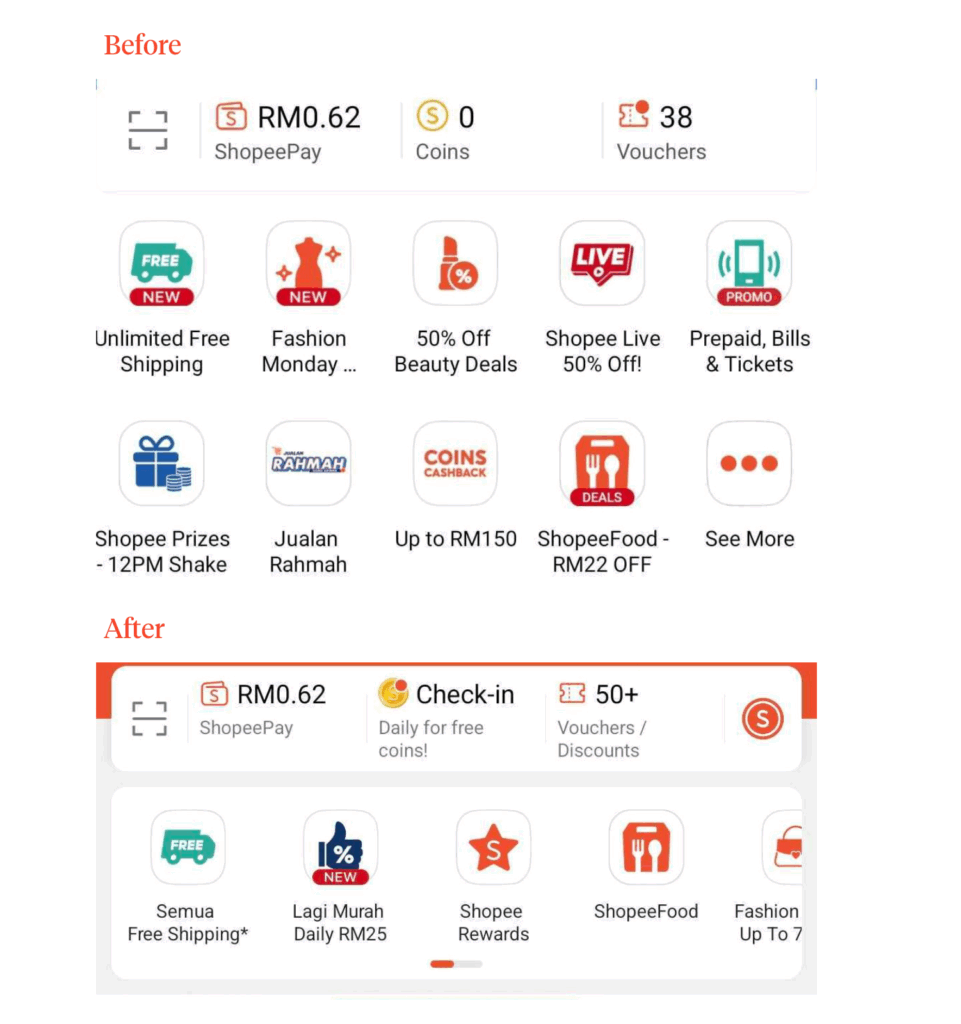
It’s replaced by a scrollable carousel that neatly tucks away less-used categories.
This alone has made the layout less cluttered, making it easier for users to focus.
Shopee has also rethought how it presents ads.
By taking a page from Western e-commerce UI/UX design’s playbook, ads now appear naturally as part of the Shopee product grid instead of standout horizontal banners.
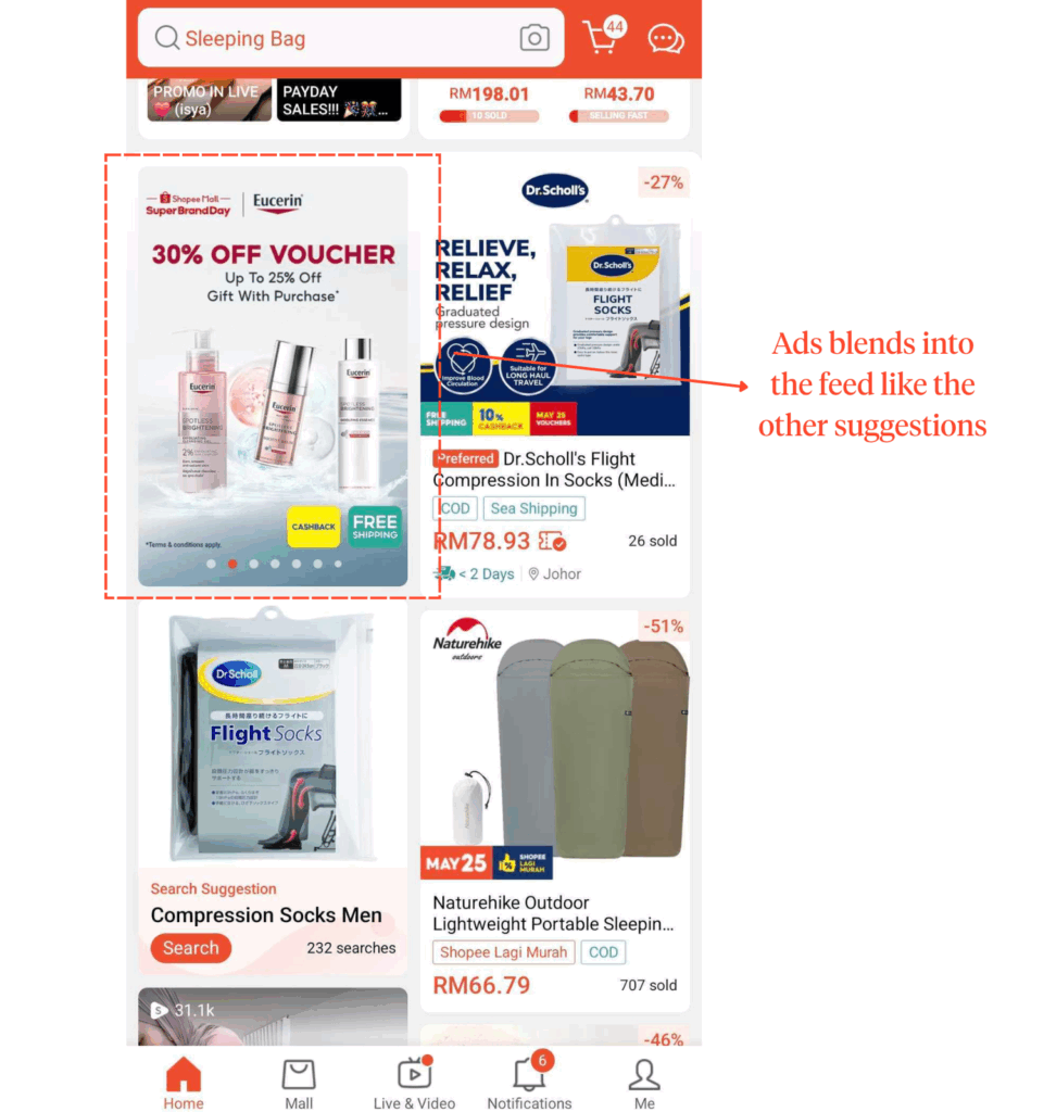
With fewer distractions, the homepage feels more focused.
It’s easier for users to jump straight into search or browse through the recommended products without being cognitively overwhelmed by ads.
Section Highlights
Shopee’s homepage has:
- Replaced chunky icon rows with a scrollable carousel
- Ads are more subtly integrated into the product grid, not distracting banners
- Less visual noise = easier navigation for returning users
Lazada: Ads Over Relevancy
At first glance, Lazada’s homepage seemed to promise UX clarity too.
Like Shopee, Lazada trimmed its category shortcuts into a single, compact row. Allowing a little breathing room from the previously cluttered interface.
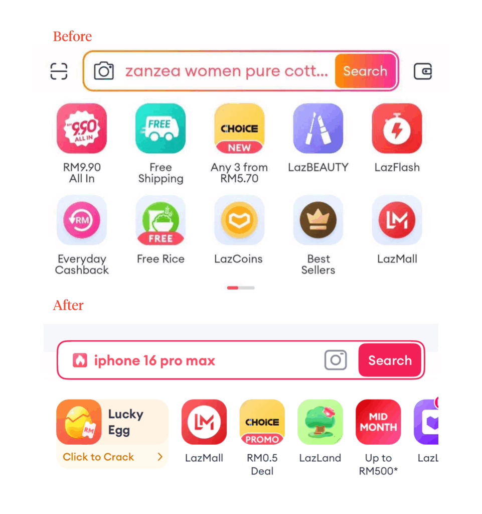
But scroll just a bit and it’s back to square one.
Deals and promotions dressed in oversized horizontal cards still take up a lot of screen real estate.
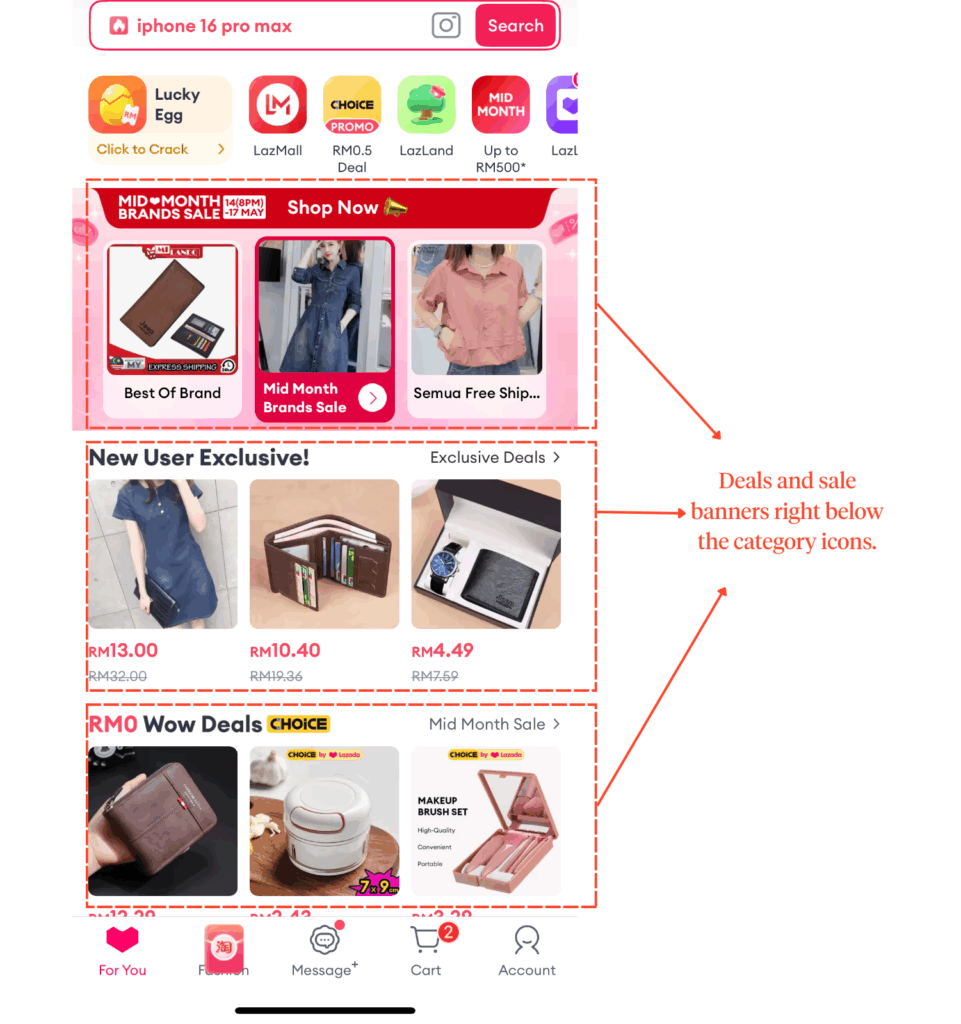
Though understandably its purpose is to standout, these sections have pushed more personalized sections like “Recommended” further down the page.
Not only does it create friction for returning user’s with a goal, it’s counterintuitive to place a personalized section lower in the screen hierarchy.
“Recommended” sections are meant to save users’ time and effort by presenting relevant items they are likely to be interested in.
If they have to spend more time scrolling to get relevant content, it undermines that very value proposition.
Section Highlights
Lazada’s homepage has:
- Cleaner top section with a single-row category bar
- But scroll down and the homepage gets noisy.
- Large “LazFlash” and “RM0.50 Deals” dominates
- While “Recommended” content pushed too far down
So, Shopee vs. Lazada?
Shopee, simply because it’s more user-focused.
Its more subtle approach to ads and minimizing friction for returning users makes its homepage a clear winner.
Search Functionality
Shopee: Personalized & Accessible
Very much sticking to its “tailored to user” approach, Shopee is more concerned of showing product suggestions based on users’ recent searches than trending categories in its search landing page.
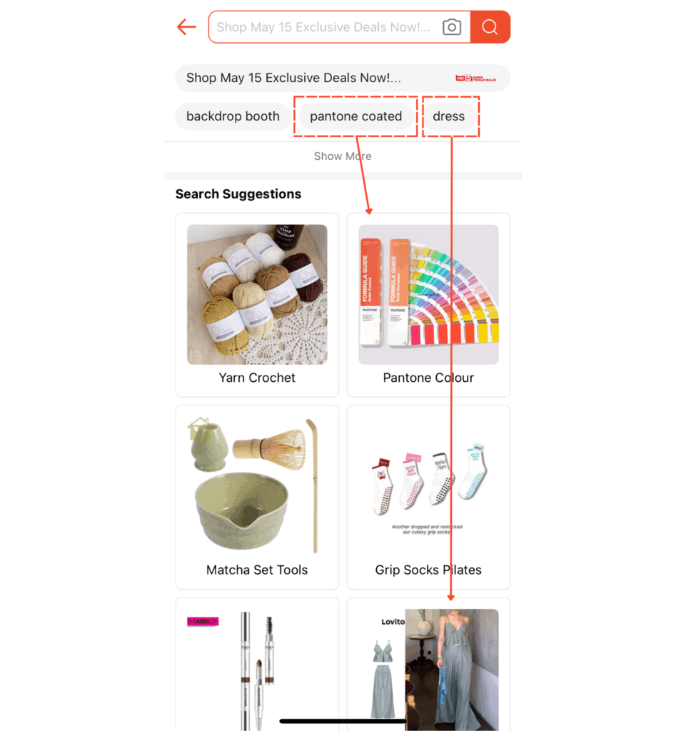
Though a win for personalization, it can limit discoverability for newer items.
Shopee also utilizes large image tiles when showcasing the products, making it more accessible for users who have a difficult time seeing smaller images.
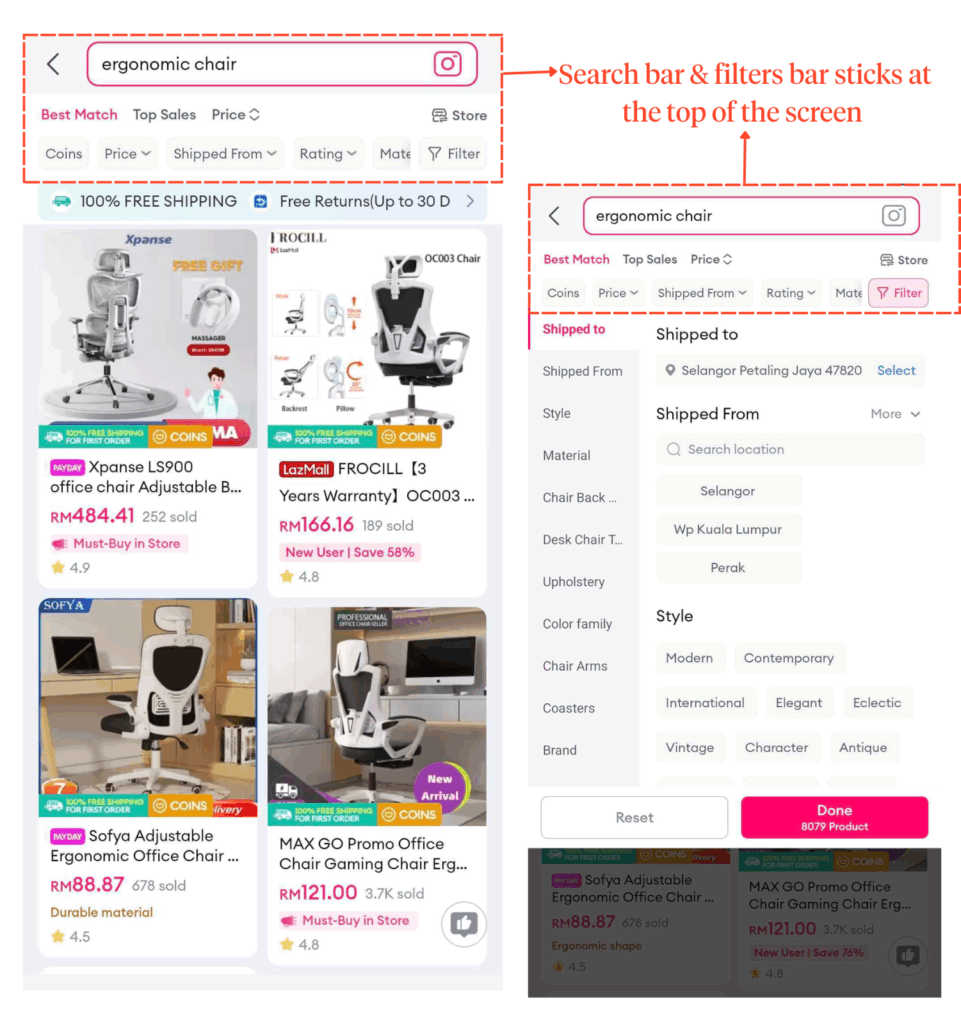
Where Shopee shines is in its filter experience.
Upon showing the search results after input, users can find the filter button right next to the search bar for a more detailed result.
Tapping it will open up a clean overlay with neatly laid-out options.
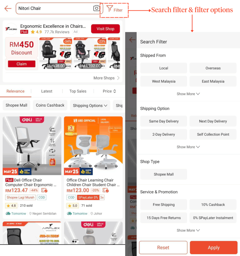
Each option button is consistent in size and evenly spaced, making scanning through and applying multiple filters easier without second-guessing what was applied.
Section Highlights
Shopee’s search functionality:
- Prioritizes based on recent search history over trends
- Large image tiles aid visibility
- Clean filter overlay: well-organized, scannable, and intuitive
Lazada: Unique Approach But Confusing
Lazada’s search landing page spotlights popular categories more than search-history-related items. Perfect for users who prefer jumping on trends.
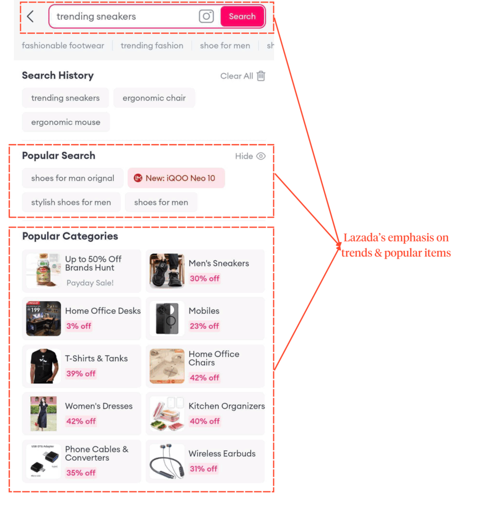
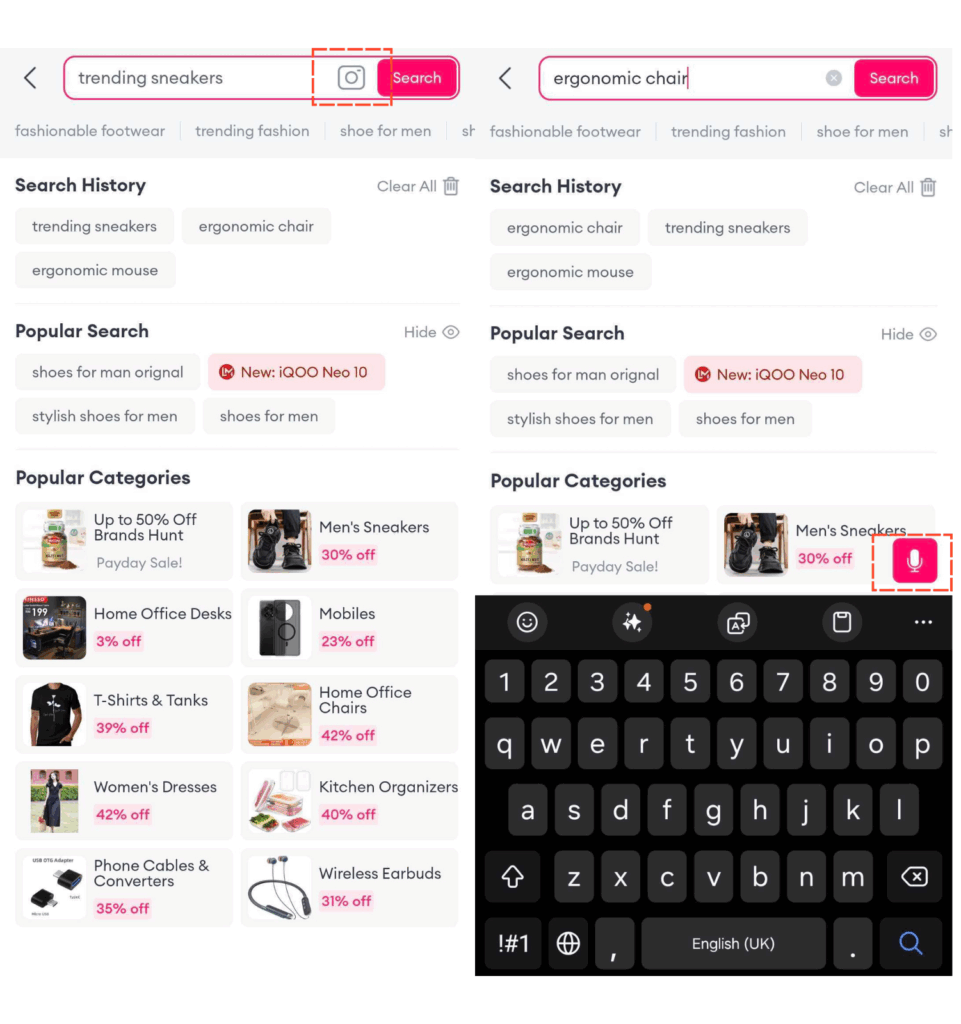
It’s well-structured with small, scannable tiles for quick discovery and features image and voice search for hands-free navigation. However, it could benefit from a bigger font size for better readability.
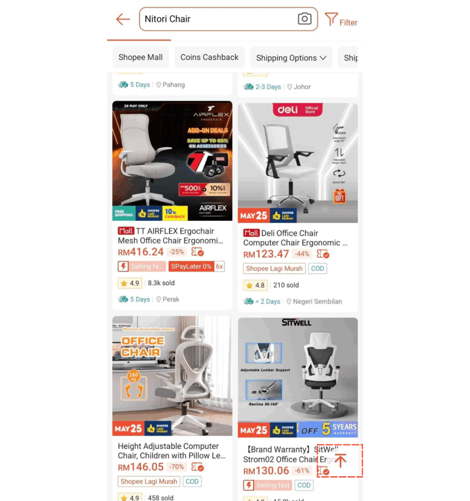
Where Lazada’s search UI/UX lacks is in its filters.
Before users tap on the “Filter” button, the results page previews a horizontal bar with a certain number of filters, most probably the more commonly used ones, for easy access.
Upon tapping the button, a drop-down overlay appears, showing more filter options. Oddly, the preview horizontal bar and search bar stay visible above it.
This overlap creates unnecessary visual clutter, almost like two UI parts are fighting for attention. It makes the flow feel slightly less polished than it could be.
Section Highlights
Lazada’s search functionality has:
- Search homepage shows trending categories
- Voice search is a nice touch
- Filter UI overlaps with preview filters — clunky and confusing
So, Shopee vs. Lazada?
Lazada’s voice search adds a nice touch, but Shopee still takes the win here.
From the moment users tap into search, the experience feels more tailored and visually calm.
The clean filter overlay and consistent layout guide you without getting in the way.
It’s the kind of thoughtful design that helps users stay focused and explore confidently.
Product Listing Page
Shopee keeps its product listing page refreshingly simple and thoughtful.
The grid layout is tidy, product titles usually well-spaced, no intrusive ads cluttering the top of the product feed, and there’s even a handy scroll-to-top button that quietly appears as you browse.
That final, small feature is useful touch in enhancing navigation, especially for longer lists.
What’s missing, though, is store-level filtering (filtering based on official stores or trusted sellers, which Lazada offers.)
It’s not a deal-breaker, but it does add friction when you’re shopping with a seller preference in mind.
Section Highlights
Shopee’s product listing page has:
- Clean grid layout, no intrusive ads
- Scroll-to-top button enhances long-browse navigation
- Missing: store-level filter
Lazada: Sleek Visuals But Friction-filled
Visually, Lazada keeps things grid-aligned and polished. But dig more, and a few usability issues emerge.
For starters, store filtering, once conveniently available through a visible “All” and “Store” tabs, is now tucked behind a barely noticeable swap icon in the top-right corner.
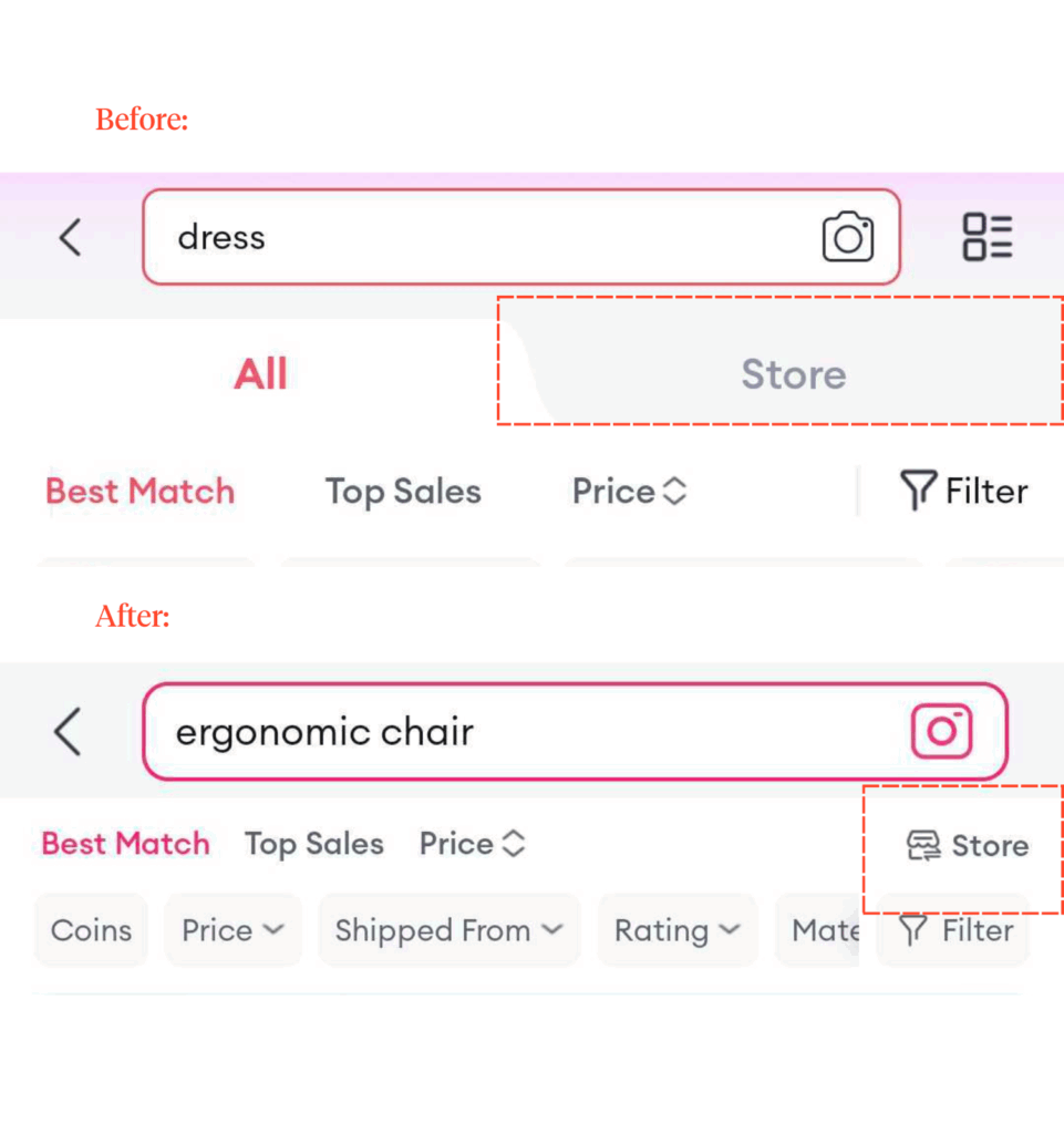
For casual shoppers, this reduces visual clutter, making it easier to discover products. However, for users who primarily shop at official stores, this extra step adds considerable frustration.
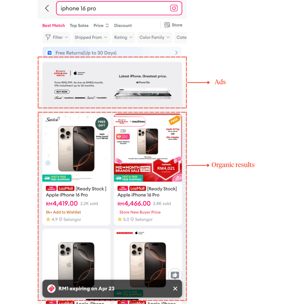
Furthermore, ads appear first in the grid and look almost identical to regular results. This kind of visual blending can quietly disrupt the browsing rhythm and lead to misplaced trust. It’s just user behavior to not trust platforms that heavily emphasize ads nowadays.
And then there’s the lack of a scroll-to-top button. Something that might seem minor until you’re 100 products deep and suddenly browsing feels tiresome.
Section Highlights
Lazada’s product listing page has:
- Store filters hidden behind tiny icons
- In-grid ads blend too well among the organic results listing
- No scroll-to-top
So, Shopee vs. Lazada?
Lazada’s page appears polished at first glance, but ad placements and hidden buttons introduce friction that affects overall clarity and ease of use.
So, to that we say, Shopee is better.
Thoughtful touches, such as the scroll-to-top button and uncluttered layout, make browsing on Shopee feel smooth, even with limited store-level filtering.
Product Detail Page
Shopee: Design That Guides
Several elements on Shopee’s product detail page suggest Shopee respects clarity and visual hierarchy. This is evident through:
- Product images that dominate almost half of the screen immediately capture the user’s attention without overshadowing product details.
- Price tags clearly displayed beneath it make it easy to evaluate at a glance
- CTA buttons that are bold and intuitively placed to guide users seamlessly.
- Secondary CTAs like “Visit Store” are subtly in the background so as not to compete for attention.
- Product details (product info, reviews, seller ratings) are grouped into clear, scrollable sections.
Ultimately, these carefully designed elements create a seamless experience that feels focused and built to convert.
Section Highlights
Shopee’s Product Listing Page has:
- Large product images
- Bold and intuitive main CTAs
- Product details are grouped into scrollable sections
Lazada: Feature-rich at The Cost of User Flow
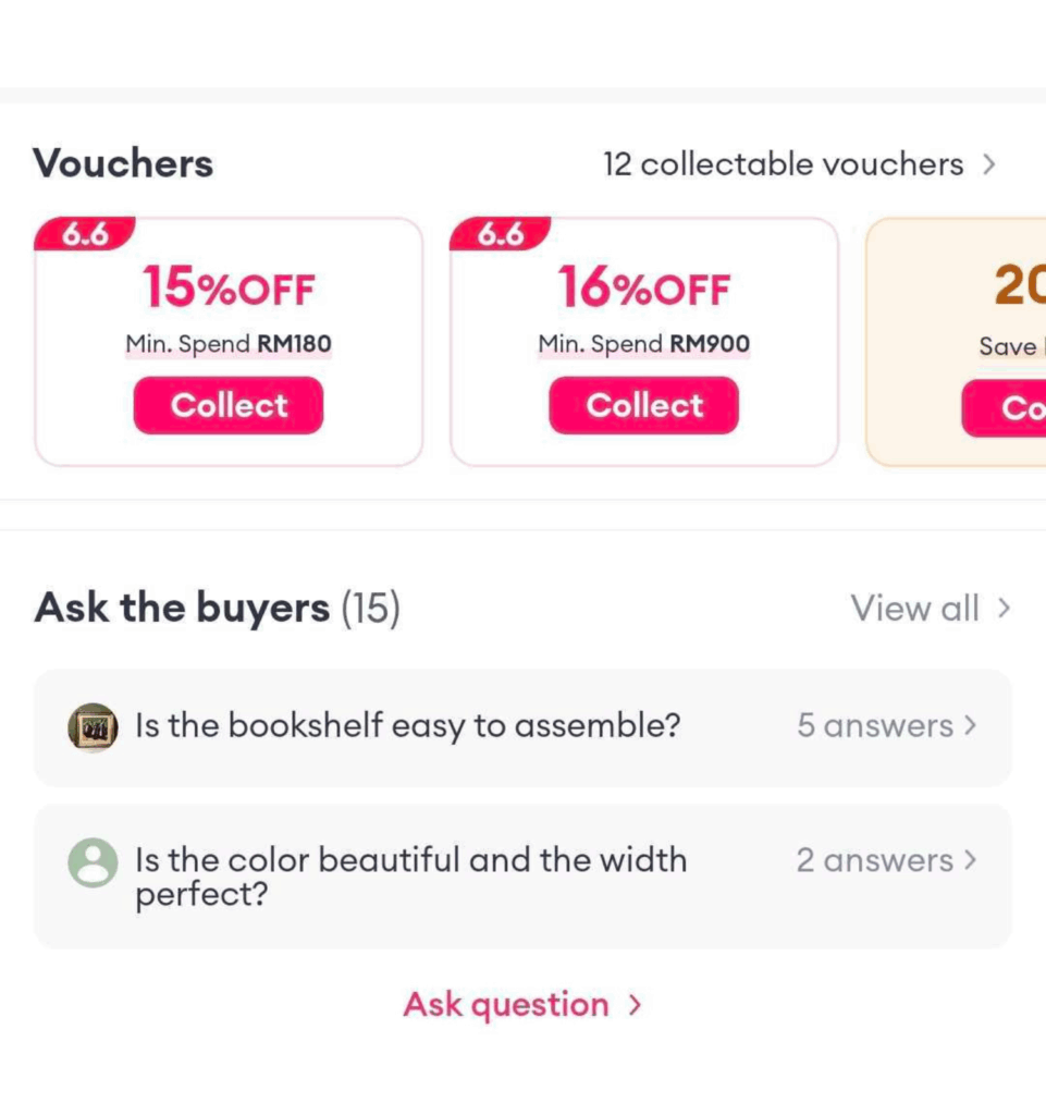
Whereas Lazada’s wins lie in its somewhat unique-to-Lazada features such as:
- The prominently placed “Voucher” section effectively encourages users to apply savings early in their purchasing journey.
- The “Questions from Buyers” section creates a community-driven space for questions about unclear and expensive items.
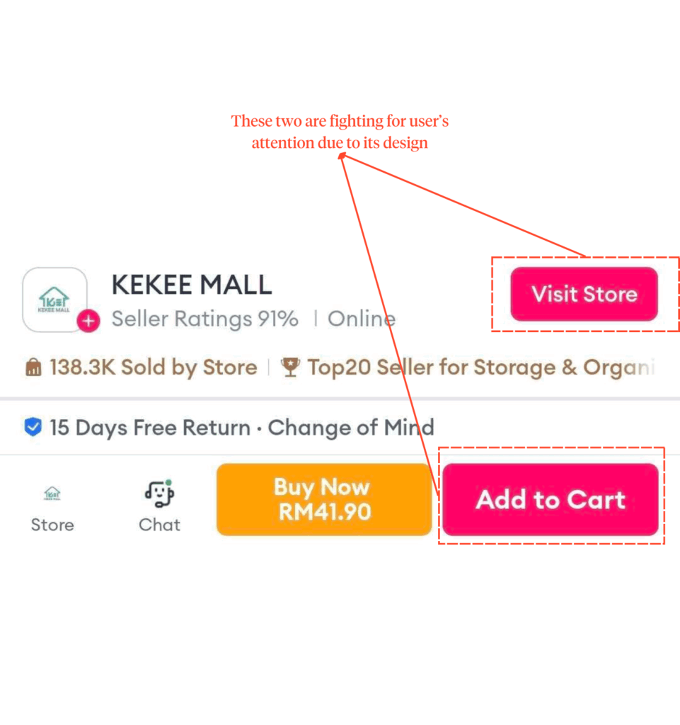
However, the visual hierarchy here could use a little love.
For starters, the bold styling of secondary actions, like the “Visit Store” button, competes with primary CTAs like “Add to Cart.”
That kind of clash can subtly derail the decision-making flow, especially when a user’s trying to act quickly.
Then there’s the search bar, which oddly sticks around even on the product detail page.
Instead of helping, it adds visual weight to the top section. It pushes the product image further down and splitting user focus right when clarity matters most.
And to top it off, quite literally, the horizontal navigation bar that includes reviews and product details ends up further cramping the already crowded section.
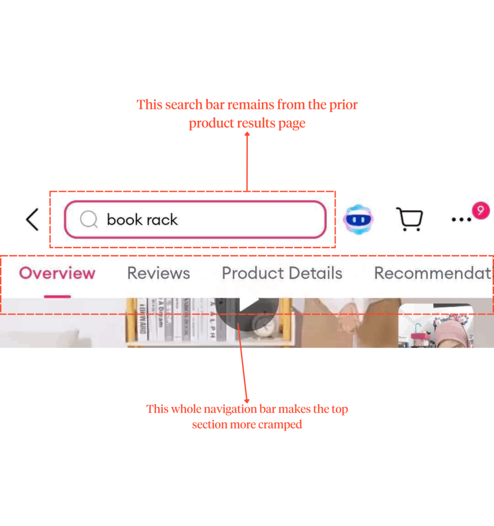
While it’s a plus for researching users, it can feel overwhelming on smaller devices and for impulse buyers who just want the quick facts, fast.
Section Highlights
Lazada’s Product Listing Page has:
- Extra features: Voucher section & Community Q&A
- Cluttered layout
- Equal emphasis on primary/secondary buttons
- Repetitive top search bar
So, Shopee vs. Lazada?
While Lazada brings more functionality with supporting features, Shopee ultimately delivers a more focused experience that’s easier to act on, giving it the edge in product page design.
Shopping Experience
Shopee: Smooth-sailing experience
Shopee nails smooth checkout to the tee.
In the cart, there’s no clutter and unnecessary items; just a clean layout, consistent colors, and ample breathing space that help guide users effortlessly through their shopping journey.
Furthermore, key actions like “Add to Cart” and “Checkout” are easy to spot and access, and the platform even applies vouchers automatically.
One missing thing, though?
A search function within the cart. If users added a ton of items, finding one specific thing can turn into a scroll marathon.
Section Highlights
Shopee’s shopping experience has:
- Clear layout with minimal distractions
- Consistent spacing and intuitive CTA placement
- Missing: item search function in the cart
Lazada: Distracting and Inefficient
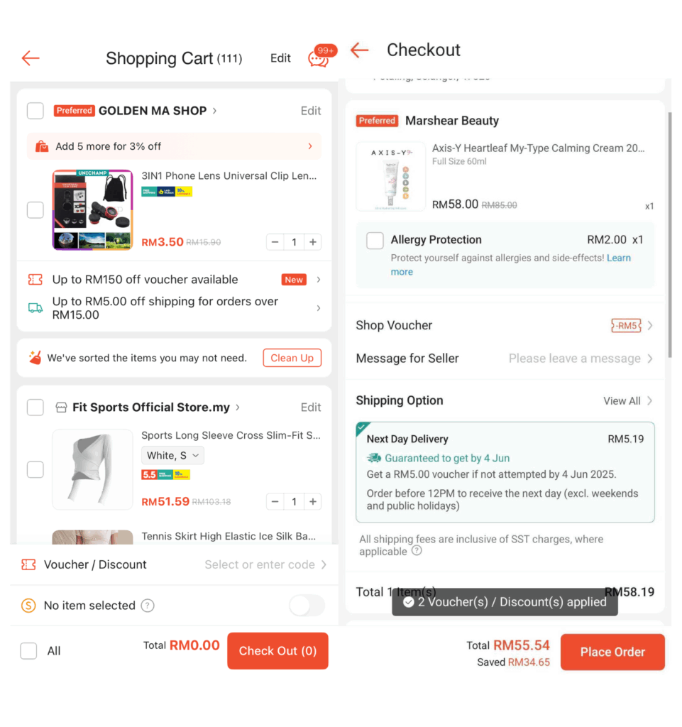
Lazada’s cart in 2025 comes with some welcome tweaks.
Most notably:
- The colors of CTA buttons are more transparent and action-friendly, making it easier to spot
- The built-in search function makes searching in the cart more convenient
However, the user flow isn’t as smooth as it could be.
Product recommendations now appear above cart items.
Not only does this have the potential to pull users away from checking out, but it also clutters the page.
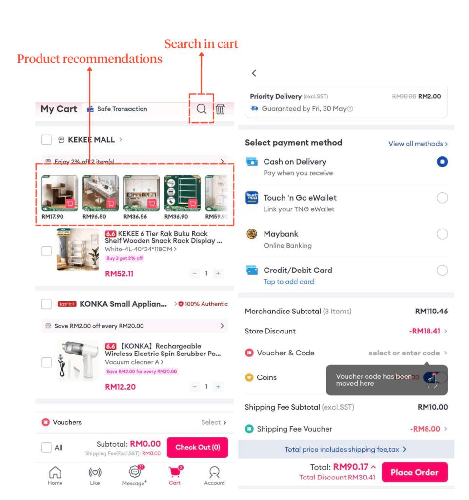
Vouchers are another pain point.
Unlike Shopee’s one-tap voucher claim system, Lazada still makes users enter codes manually.
It creates friction in the experience as it’s an extra step.
And for loyal shoppers, the missing “Buy Again” section is a noticeable step backward in convenience.
Section Highlights
Lazada’s shopping experience has:
- Includes cart search
- But upsell sections (e.g., product recommendations above cart items) clutter the checkout experience
- Manual voucher input slows down flow
So, Shopee vs. Lazada?
Eventhough Lazada offers more features with its cart experience, Shopee’s doesn’t distract users from the primary goal— to complete a purchase.
It’s smooth and efficient in helping users complete their purchases.
Lazada’s extra features only pull users’ attention away from this goal. So, Shopee triumphs once again.
Wallet
Shopee: Intentional & On-Brand
Shopee decided on high visibility when positioning ShopeePay at the top of the homepage. It’s hard to miss.
Tap in, and you’re met with a wallet design that’s true to Shopee’s identity.
With consistent icon styles and Shopee’s signature orange tying everything together, the wallet is visually cohesive and easy to scan with the important information shown first (ex: wallet balance on homepage).
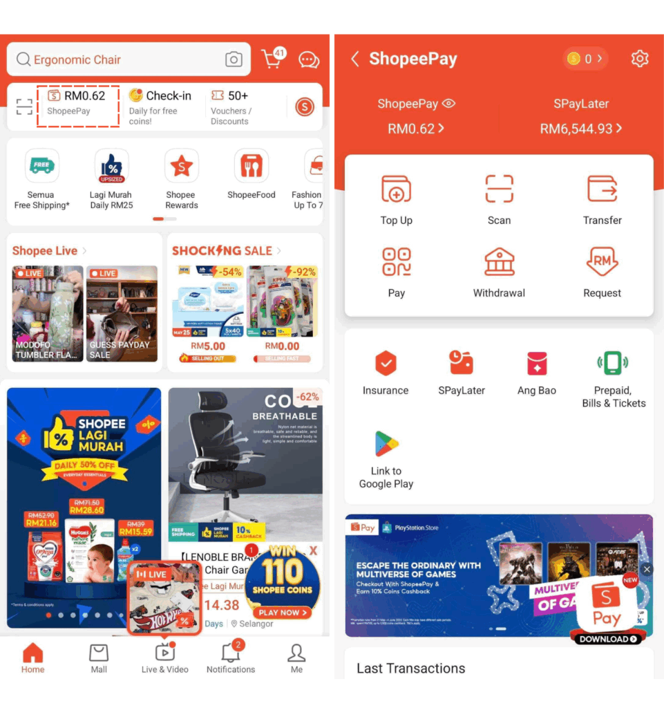
A slight hiccup comes in the need to scroll past a promotional banner (as seen above, on the bottom of the right panel) to view their latest transactions.
This slightly interrupts the experience, but overall, the wallet has an efficient flow.
Section Highlights
Shopee’s wallet has:
- Clearly visible placing from the start
- UI feels cohesive and consistent to branding
- Minor hiccup: promos above transaction history
Lazada: Structure Lost to Clutter
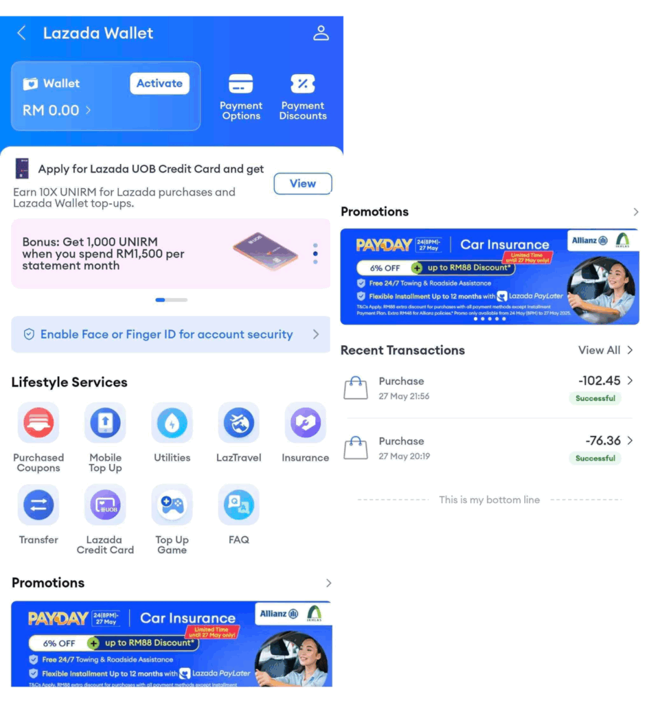
Lazada Wallet is, as similar to certain parts of the app, visually cluttered.
Intrusive promotional banners, especially the pushy ones convincing users to link their Touch ’n Go eWallet, take up valuable screen space.
Additionally, the mix of inconsistent icon colors adds to the visual noise, making quick scanning nearly impossible.
It also doesn’t help that, like Shopee, users need to scroll past promos to view transaction history.
With all the extra distractions, it’s way harder for Lazada Wallet users to focus compared to its competitors.
Section Highlights
Lazada’s wallet has:
- Improved visibility of balances
- But inconsistent icon colors and intrusive banners derail focus
- Like Shopee, transaction history is hidden under promos
So, Shopee vs. Lazada?
Between the two, Shopee offers a smoother and more focused experience.
It feels visually cleaner and is more user-friendly with a layout that gets straight to the point.
While Lazada has improved, it still overprioritizes promos, which makes things feel a bit messy.
Livestream
Shopee: High Energy, Information Overload
Livestream on Shopee knows how to grab attention with vibrant and information-rich on-screen elements.
Vouchers, product links, and limited-time deals— all front and center, likely to encourage engagement and on-the-spot purchases without missing a beat.
But with all that stimulation comes a bit of hecticness.
The activity log such as comments, likes, gift animations can pile up quickly.
For first-time viewers or those tuning in to follow a product demo closely, this visual busyness can make it harder to follow what’s happening in the stream.
Section Highlights
Shopee’s Livestream has:
- Flashy overlays, real-time comments, clickable deals
- Great for urgency-based purchases
- But may overwhelm first-timers or passive viewers
Lazada: Chill Vibes All-Around
If Shopee Live is the chaotic one, Lazada’s is the calmer one between the two.
More minimalistic and distraction-free, Lazada’s livestream UI is less overwhelming with far less on-screen noise.
For viewers who prefer a more focused and slow-paced experience, this is a welcome change.
But that calm comes with a tradeoff.
Interactive elements like vouchers and product links aren’t always obvious.
Without clear prompts or visual nudges, users might not actively engage during the livestream.
Section Highlights
Lazada’s Livestream has:
- Minimalistic approach for aiding focus
- Interactive elements aren’t always noticeable
- Slower pacing may lose viewer attention due to under-stimulation
So, Shopee vs. Lazada?
This time, it seems both platforms have equal pros and cons.
Shopee packs a punch with high energy and strong purchase incentives, but it could definitely benefit from better visual prioritization to reduce clutter.
Lazada, on the other hand, offers a more easier on the eyes experience, which some users may appreciate, but hiding key interactive elements risks losing engagement and conversion.
Who’s on Top?
With a momentous 6 out of 7 wins, Shopee runs supreme in the “Shopee vs. Lazada” debate.
Across almost every major UX touchpoint, Shopee consistently favors user clarity, personalization, and streamlined journeys.
Lazada makes strides in specific areas, such as voice search and livestreaming, but it often lets promotions interfere with usability.
Ultimately, deciding a clear-cut winner among users depends on individual preferences and priorities. But from a UI/UX standpoint, Shopee wins.
Want Your Own App?
Consider partnering with us!
With a proven track record of creating intuitive and visually stunning designs, we can elevate your applications (or websites).
We’ll ensure your users enjoy a smooth and engaging journey with your app. That’s a guarantee.