

Sometimes, the smallest actions make the biggest impact. This is especially true when it comes to UX design. The micro movements and feedback we trigger on an interface are called microinteractions, and they make the whole experience.
Microinteractions can range from scrolling animations to subtle hover states and transitions. These prompted movements are necessary on every great digital interface, and are especially important on interfaces that aim for high engagement like e-commerce sites, or high security like finance apps.
This is why we mention motion design as one of the 5 UX trends to keep an eye on in 2021, and UI feedback as one of the 7 features in a great shopping cart experience. Microinteractions make a colossal impact on the quality of an interface design.
What are Microinteractions?
A microinteraction is, in the most simplified sense, exactly what its name suggests — a tiny interaction between the user and the interface.
There are two parts in a microinteraction: (1) a trigger, which includes any user action or system alteration, and (2) feedback, which is the response to the trigger communicated through small and usually visual changes on the user interface.
Why are Microinteractions Important?
Microinteractions are an essential part of UX because they make the experience on an interface (not just bearable, but) enjoyable. They fill the void and bridge the gap between functionality and design.
Whether we’re browsing the web on our mobile devices or working on a digital painting on Photoshop, without the subtle animations on the interface that we take for granted on the daily, the experience would be left disjointed, incomplete, and rough.
But, the goal with microinteractions isn’t just to fancy things up. Feedback also reduces cognitive load by leading the user’s eyes to the right places and helping them understand the micro-outcomes of their actions. They are the subtle sign boards scattered throughout an interface, guiding users through a user flow map.
In the best case scenario, with effective microinteractions, a user will spend less time learning how to navigate an interface, and more time enjoying the content and experience itself.
5 Types of Microinteractions
Microinteractions, being an umbrella term, covers all kinds of feedback that take various forms and serve different purposes. So we’ve broken them down to 5 primary types, and compiled mini lists of where you can find each of these types on everyday interfaces.
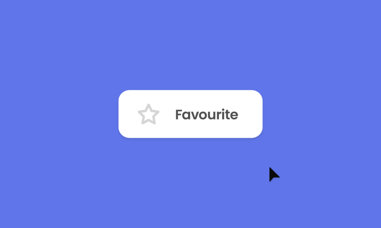
1. CTA

CTA microinteractions are all about nudging and encouraging click throughs and conversion. With feedback that guides the eyes, draws attention, and communicates clear clickability, CTA links and buttons are more effective.
These types of microinteractions are usually seen in the form of button hover states and triggered animations. They are worth mentioning only because of how effective they are. Even the subtlest movements around a CTA can do a lot for metrics, whether we’re talking website, app, or business.
Where you can observe CTA microinteractions:
- Animated Share buttons at the end of blog posts
- Contact Us buttons that change in color when hovered over
- Download buttons that display file types and size info when hovered over
- Next Page buttons that fade in or appear when a user scrolls to the end of a page
2. Progress

Let’s be real, no one likes waiting idly, especially without knowing if any progress is being made. When it comes to UX, microinteractions are the painkillers that dampen the pain of waiting.
Progress microinteractions show users the progress that they are making on a prompted action or process. This typically includes progress indicators displaying how much is complete and how much is left in a process, often accompanied by percentage values or counts representing the remaining time or action items.
These microinteractions are effective because they play on our psychological need for closure. Whenever we see parts that are “missing” in a familiar shape, we feel the urge to fill in the blanks. By showing us how much is left to complete in a process, progress indicators increase our willingness to wait through or complete it by creating the illusion of reduced waiting time.
Animations distort our perception of time by making processes seem shorter than they actually are. Interesting progress visuals can not only keep users distracted while waiting, but also incite anticipation for an end result.
Where you can observe progress microinteractions:
- Buffering animations with a loaded percentage value on videos
- Uploading or downloading progress animations
- Pull-to-refresh gesture animations
- Page scroll progress bars on the top of webpages
- Publishing Post progress bars on social media platforms
3. Completion
Seamless user experience also involves not leaving users in the dark. You know how microwaves beep when they’re done heating up your food? That’s what we’re talking about here.
Feedback in completion microinteractions notify users that a certain action has been completed. In other words, they add extra flavour to the simple idea of completion. Instead of just a monotonous string of text that says “Complete: 100%” next to a progress bar, a subtle animation or sound effect can make the completion of a task feel much more engaging and certain.
Aside from a sense of security, these microinteractions can also evoke a sense of achievement. Especially when a user is notified with a congratulatory message and animation, they are more likely to feel reassured that they’re on the right path, and thus also feel encouraged to proceed to the next step after completing a task.
Where you can observe completion microinteractions:
- Upload Successful messages with an animated green tick
- Payment Complete messages with animated confetti
- The sound effect after a post has successfully been published on Facebook
4. Change
Imagine clicking on a button and all of a sudden, you’re looking at something completely different. You’d probably feel a little disoriented or even lose track of where you are on the interface. Microinteractions fix this.
Change microinteractions are transitions that help users navigate and understand where they are and where they’re going on an interface. This type of feedback often needs to mimic real-life objects and be smooth like butter in order to clearly visualize transitions.
One of the most basic examples of microinteractions under this category is scrolling. Triggered when a user moves the scroll wheel on their mouse or makes scroll gestures on their trackpad, scrolling animations visualize the user changing their location on an interface in a way that mimics the action of moving up and down a physical scroll.
Applying real-life laws to digital contexts makes navigating interfaces much more intuitive. This is how microinteractions boost user experience.
Where you can observe change microinteractions:
- Toggle buttons that mimic on/off switches
- Tab closing and opening animations
- The zoom-out animation when you gesture to view all open apps on a touchscreen tablet
- Twitter’s Compose Tweet icon morphing and maximizing into the Tweet button, and morphing back into the icon when minimized
- Hamburger menu buttons that expand or trigger a slide-out animation to reveal a sidebar menu
5. Visualization

To every action there is a reaction. This law also applies to digital actions. In order for an interface to be interactive and engaging, it must have the most basic microinteractions in check, and these often fall under visualization.
In the simplest terms, visualization microinteractions help users see that their actions are effective. By showing immediate results to their smallest actions with a little movement or change, they are reassured that what they’re interacting with is active and responding.
Feedback is a way for an interface to communicate with users. This includes micro-acts of reassurance that help users keep track of their on-screen actions. For example, after tapping and holding an app icon on your mobile homescreen, the icons start dancing to signal that they are ready and awaiting your further action.
Another example is the brief shaking animation on a wrong password entry. This simple feedback signals the message “Uh-oh, try again”.
Where you can observe visualization microinteractions:
- App icons vibrating when you’re editing your home screen
- Live discount changes when you add something to your cart on a shopping app
- Password strength meters when you’re creating a new password
- The animated explosion of confetti when you click the Twitter like button
Let Us Help You
Need help upping your microinteraction game?
Snappymob is a top web and app development agency in Malaysia, made up of product teams that understand the importance of user interface and user experience design. We’ve helped organizations of all sizes and verticals reach their business goals with ease.
Check out our work, learn about what it’s like to work with us, or drop us a message on your next big project — you could be the next!