


So…you’ve decided to give dating apps a go. Well, first off — good luck.
With the dating scene shifting online, apps like Tinder, Bumble, and Coffee Meets Bagel (CMB) have become the new matchmakers.
But how do these apps actually measure up in terms of usability and design for onboarding, matching, and chatting? That’s what we’re curious about.
Onboarding Experience
First time on a dating app? Step right up, and let’s get you acquainted.
A great onboarding experience should make new users feel welcome by guiding them through the app’s how-tos and solving any hesitations that might stop them from continuing.
Yet, sometimes… it’s the opposite. Do these apps do the prior or latter?
Bumble
Lengthy Onboarding
With a lackluster progress indicator and a seemingly neverending stream of questions, Bumble’s onboarding experience WILL test your patience.
Even with skippable and grouped questions, users must still go through approx. 17 pages before they can swipe.
Although this shows Bumble’s efforts to ensure profile authenticity, there is such a thing as doing too much. And this is just that.
A way to make the experience less tedious is to make the progress bar more noticeable (e.g., step 3 out of 10) instead of a barely visible linear determinate bar at the top.
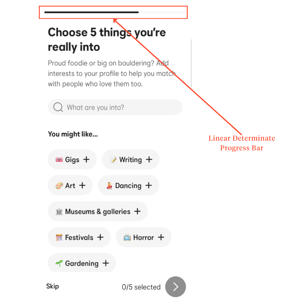
Interestingly, Bumble does offer a profile completion percentage that appears at the end.
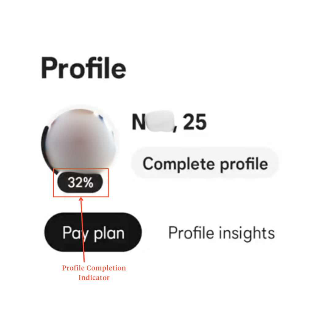
A commendable effort— but wouldn’t it make more sense to introduce it earlier to keep users motivated?
Consistent Branding
Apart from these drawbacks, Bumble does a lot right with its onboarding. For one, its UI stays true to its brand identity.
From the Bumble yellow (#F7C948) to the softer shades of gray to the slightly rounded typography, Bumble’s visual identity is consistent throughout to establish a clear visual hierarchy, as well as feedback and response indicators.
Thoughtful Navigation
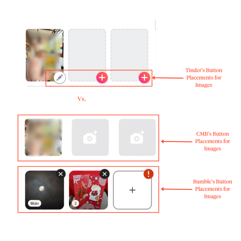
Its drag-and-drop feature for profile photos is another small win. Unlike Tinder and Coffee Meets Bagel, Bumble lets users rearrange pictures without needing to remove and reupload them according to the user’s preferred arrangement.
Personalized Approach
Bumble also has a more personalized feel than the other dating apps, which oftentimes feel disconnected and impersonal.
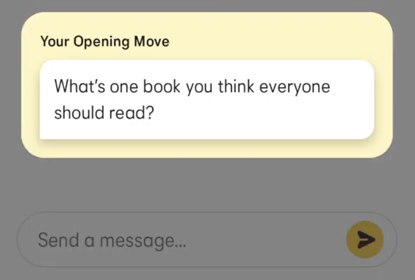
For instance, the “opening move” feature is a unique-to-Bumble feature that encourages users to initiate natural and more engaging conversations than the usual, uninterested-sounding “Hey.”
Even the language used adds to its amiable vibe, making the experience feel less transactional and more personal.
Coffee Meets Bagel
Despite missing a few features— like drag-and-drop functionality for reordering profile pictures, which could have improved usability—onboarding on CMB felt more efficient than on Bumble and Tinder.
A key reason?
Streamlined Onboarding
Users are asked for less information upfront. Unlike Bumble and Tinder’s multiple profile prompts and inputs, CMB streamlines the process by minimizing required fields. Making the onboarding noticeably shorter and smoother.
The minimal design and straightforward navigation (like “skip” or “select and next”) significantly enhance the app’s efficiency.
Thoughtful Visuals
Beyond navigation, microinteractions and cute graphics help create a visually engaging experience. These elements not only improve user feedback but also reduce cognitive load.
While most dating apps gravitate toward vibrant reds and warm tones to evoke passion and romance of new love, CMB takes a more intentional approach.
The modern blue and lavender color palette evokes a feeling of safety and stability for users who might feel vulnerable when meeting new people.
So… props to you, CMB!
Missing Features
An area where CMB falls short is its lack of a visible progress indicator— both during and after onboarding.
Unlike a step-by-step progress bar or percentage tracker, CMB uses language-based cues to signal progress.
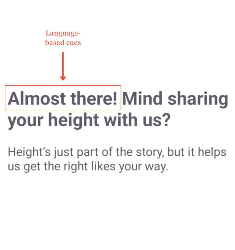
Though not entirely effective as a visible progress bar, it’s still a respectable effort.
Tinder
First Impressions
Right off the bat, Tinder’s bright red color palette and the abrupt “House Rules” give off proceed with caution.
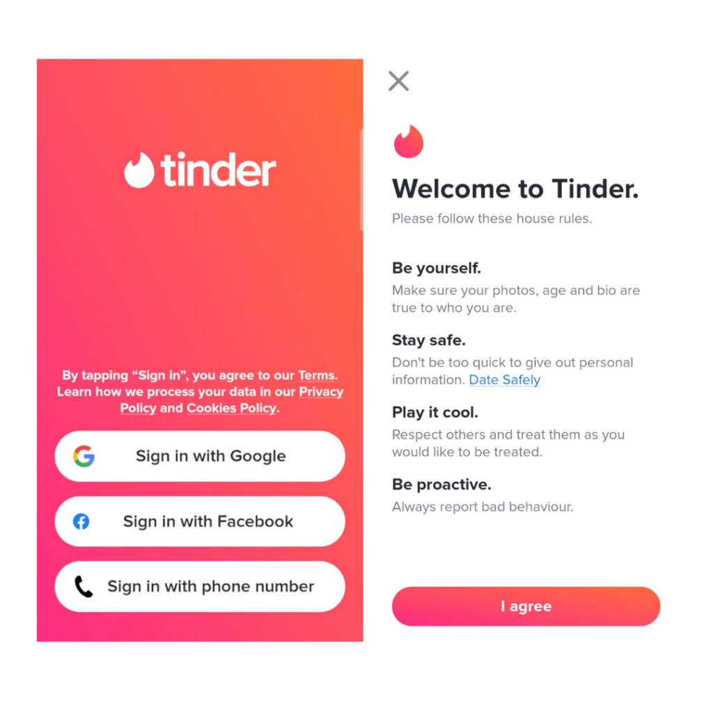
Sure, red and fire-like elements convey passion and romance, but they can intensify the experience too much. Moreover, immediate prompts for location and notification permissions make the onboarding feel more intrusive than welcoming.
By softening the color palette and tweaking the “House Rules” copy, Tinder’s onboarding could ease users into the experience rather than making them feel like they’re signing up for an extreme sport.
Lengthy Onboarding
And like Bumble, Tinder’s onboarding is missing a progress indicator. Users are left wondering how many steps are left — ultimately leaving them overwhelmed.
Even after the initial setup, users are still left wondering how complete their profile is. A simple “x/10 steps” could provide the much-needed clarity.
But unfortunately, it gets worse.
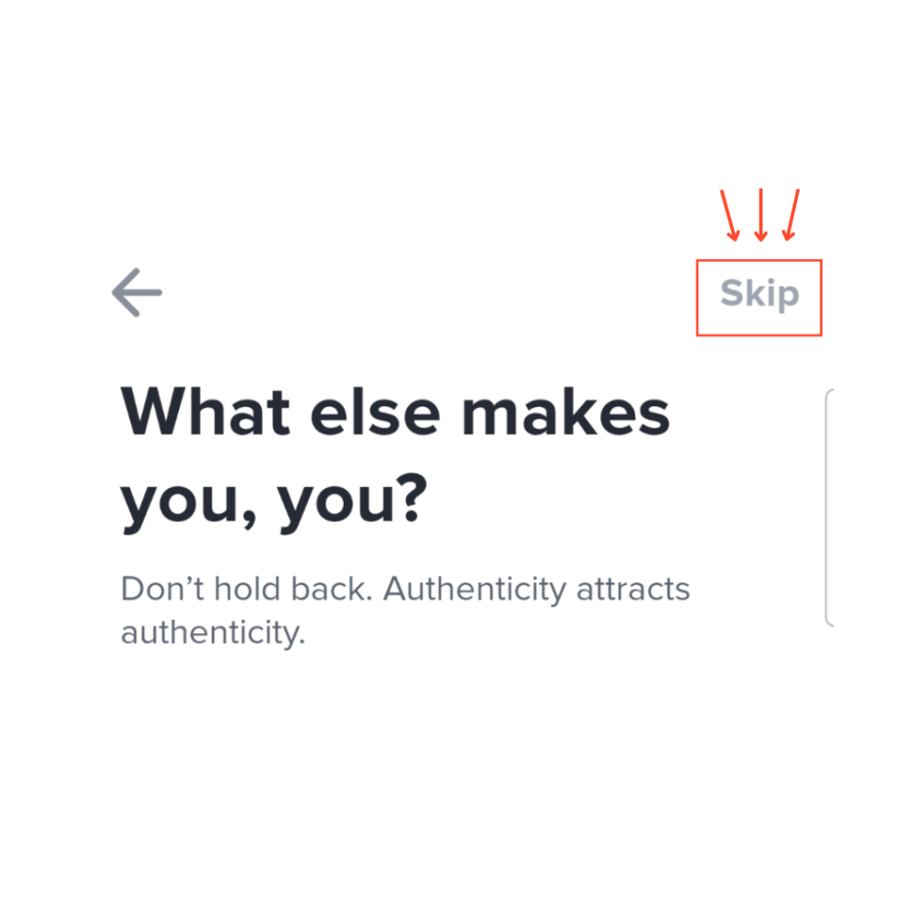
The proceeding “Profile Details” screens, where users are prompted with questions to showcase their personality, are cluttered and seemingly neverending.
With too much text and too many options (below), users may become more exhausted than excited.
Confusing Buttons & Misplaced Positions
Furthermore, certain design choices for its buttons are questionable.
Like why are they greyed out?
Typically, greying-out buttons indicate that a button is disabled until a condition is met — but Tinder doesn’t seem to follow that logic.
Take the “Next” button, for example. It appears greyed out, implying it’s unclickable. However, once users carry out the intended action, the button becomes colored, allowing users to move to the next page. Just as it should be.
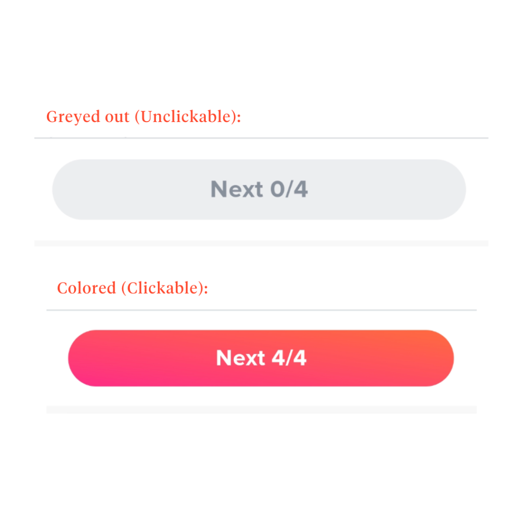
Following that logic, the greyed-out “Skip” button should not work.
Yet, it is still clickable despite looking like a disabled button? It makes users second-guess the functionalities of every other button in the app.
Still on the topic of buttons, what is the purpose of the “Next 0/4” button?
The greyed-out design and its inability to activate without choosing an input suggest a mandatory input.
But the “Skip” button at the top-right corner of the screen is available and clickable. So, why make the “Next 0/4” button mandatory when the “Skip” contradicts it?
Besides that, the ‘X’ and ‘+’ buttons in the profile images page don’t follow standard UI placement. Instead of being where users expect (in the middle or top-right corner), they sit awkwardly in the bottom-right corner.
Matching Mechanisms
Profile all set– now, the real fun begins.
Will you find your perfect match, or will it send you running to the hills? Let’s take a closer look at how these apps’ designs match people.
Bumble
Thoughtful Swiping Experience
At a glance, Bumble’s swiping pool page oozes thoughtful design.
With ample breathing space and a balanced text hierarchy, the page feels inviting and modern, especially with the vertical scrolling focus (a current design trend).
Swiping is straightforward—left for no, right for yes— with the presentation of matches being profile-focused, and feedback is immediately visible.
Features Encouraging Connections
But Bumble doesn’t just stop there. To encourage connection and showcase authenticity, the app incorporates thoughtful details and well-integrated features such as:
- “Things You Can Bond Over” feature highlights shared interests upfront.

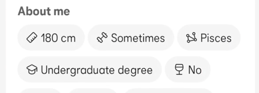
- Visual touches in the “about me” section via emojis and icons.
- “Opening Moves” offers three different methods to personalize initial interactions.
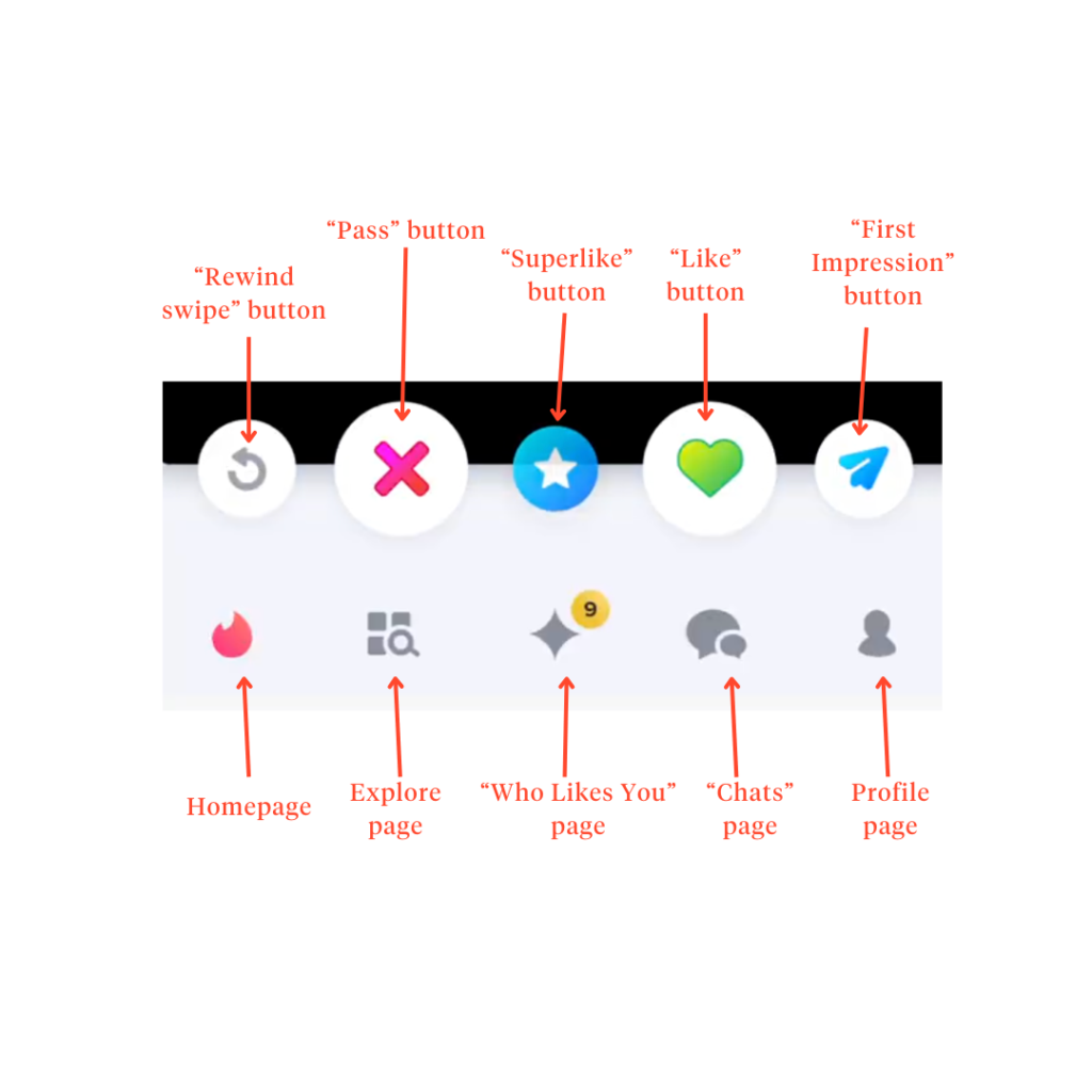
- “Superswipes” (the star in the middle) to stand out to matches you’re genuinely interested in.
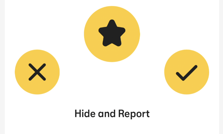
- No floating ‘X’ or ‘✔’ buttons—users browse profiles distraction-free, with decisions made at the end of the swipe journey.
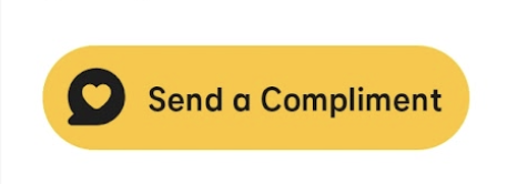
- “Send a compliment” doubles as the first message to improve matching chances
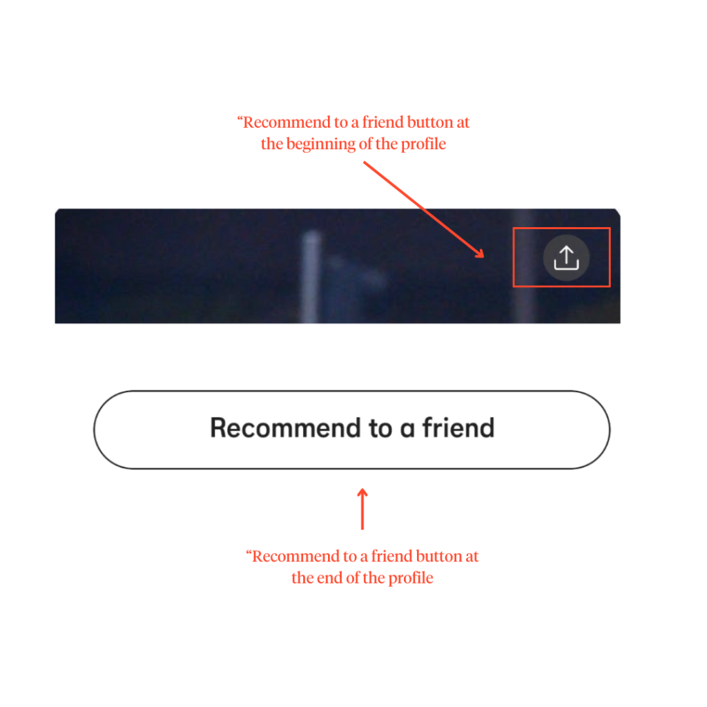
- “Recommend to a Friend” turns the app into a social and community-driven environment when the swiping eventually becomes an isolating and emotionally draining experience
Overall, Bumble’s matching page is a prime example of intentional design choices that accomplish the original goal of dating apps — facilitating meaningful connections between individuals.
Coffee Meets Bagel
Outdated UI Design
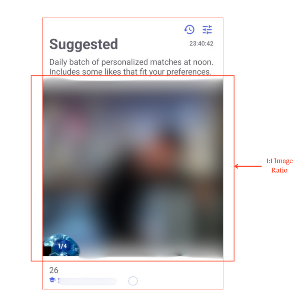
If you’re looking for a blast from the past experience, CMB’s swiping pool would fit you right– but not necessarily in the best way.
Design-wise, CMB’s 1:1 image ratio and compressed image quality gives off early 2010s Instagram. Though nostalgic, this layout doesn’t hold up against its competitors’ modern, polished designs.
Beyond visuals, the text hierarchy could also be improved as it looks monotonous.
Headings, subheadings, and profile details blend together, making it harder for users to distinguish between a CMB prompt and the match’s input. This weakens readability and forces users to do unnecessary cognitive work.
Buttons Over Swipes
Unlike Bumble and Tinder, CMB strays from the “swiping” mechanic within fellow dating apps.
Instead, it relies solely on buttons (Likes, Dislikes, and Send Flowers), eliminating the interactivity in swiping.
Adding salt to injury, there isn’t a detailed guide on how the buttons work (especially the “Send Flowers” button), which could confuse first-time users.
Limited Matching Pool
CMB also limits the number of potential matches users can interact with daily, refreshing only at noon the next day.
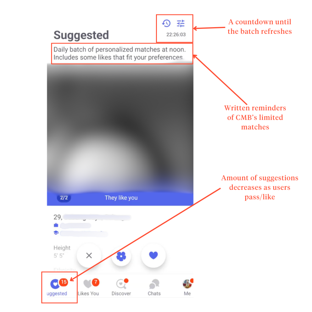
Though this strategy forces users to be mindful in matching (living up to CMB’s tagline: For Serious Daters), it also makes CMB easily forgettable, which may hurt the app’s user retention rate.
Paywalled Features & Confusing Currency System
While features like “Discovery” and “Likes You” offer alternative ways to browse matches after the daily suggestion finishes, they’re locked behind a paywall— rendering them nearly useless for free users.
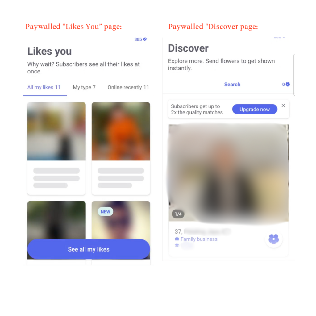
CMB also has unique buttons called “flowers” and “beans.” However, they are very poorly designed.
Though vaguely described as a way to stand out— similar to Bumble’s Superswipe or Tinder’s Super Like— the actual mechanics are unclear.
“Does pressing the flower send the flower? If so, then what do the beans do?”
“Oh wait, the flower wasn’t sent? Do I have to press the bean AND the flower to send the flower?”
Transparent Matching System
However, the matching experience itself is more transparent. The “They Like You” indicator reduces users’ time and energy spent trying to find a match.
It also reduces the mental burnout that one might get from endlessly swiping without knowing who’s interested in you or, worse— passing on them.
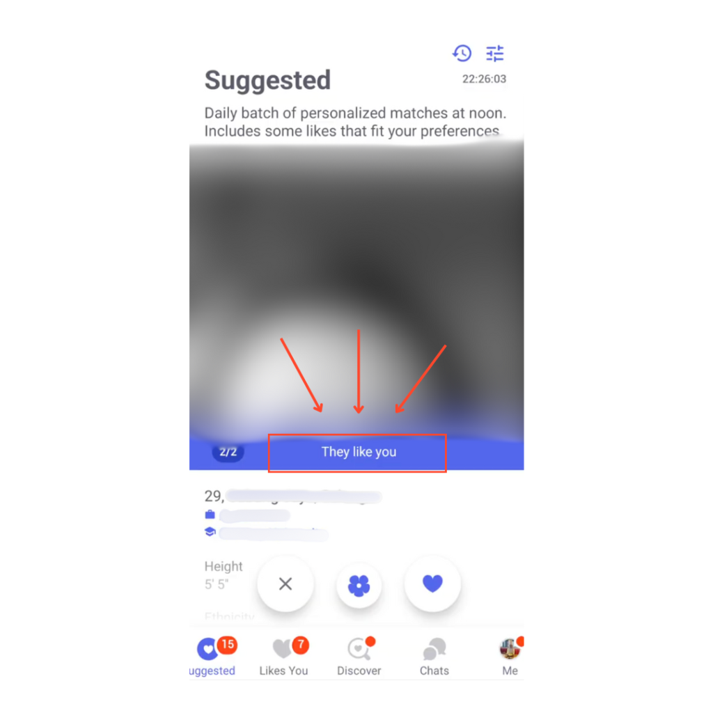
Although this and the “Connected” indicators are helpful, they need a design update. Their current presentation is outdated and lacks visual emphasis.
Details That Improve Personalization
Despite its shortcomings, CMB does introduce a few thoughtful touches that improve the user experience:
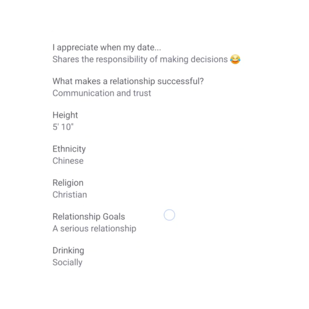
- Emoji use in profile — Adds personality and relatability.
- “Likes You” indicator — Highlights mutual interest.
- “This is a dealbreaker” toggle in match search settings — Helps users filter matches more effectively.
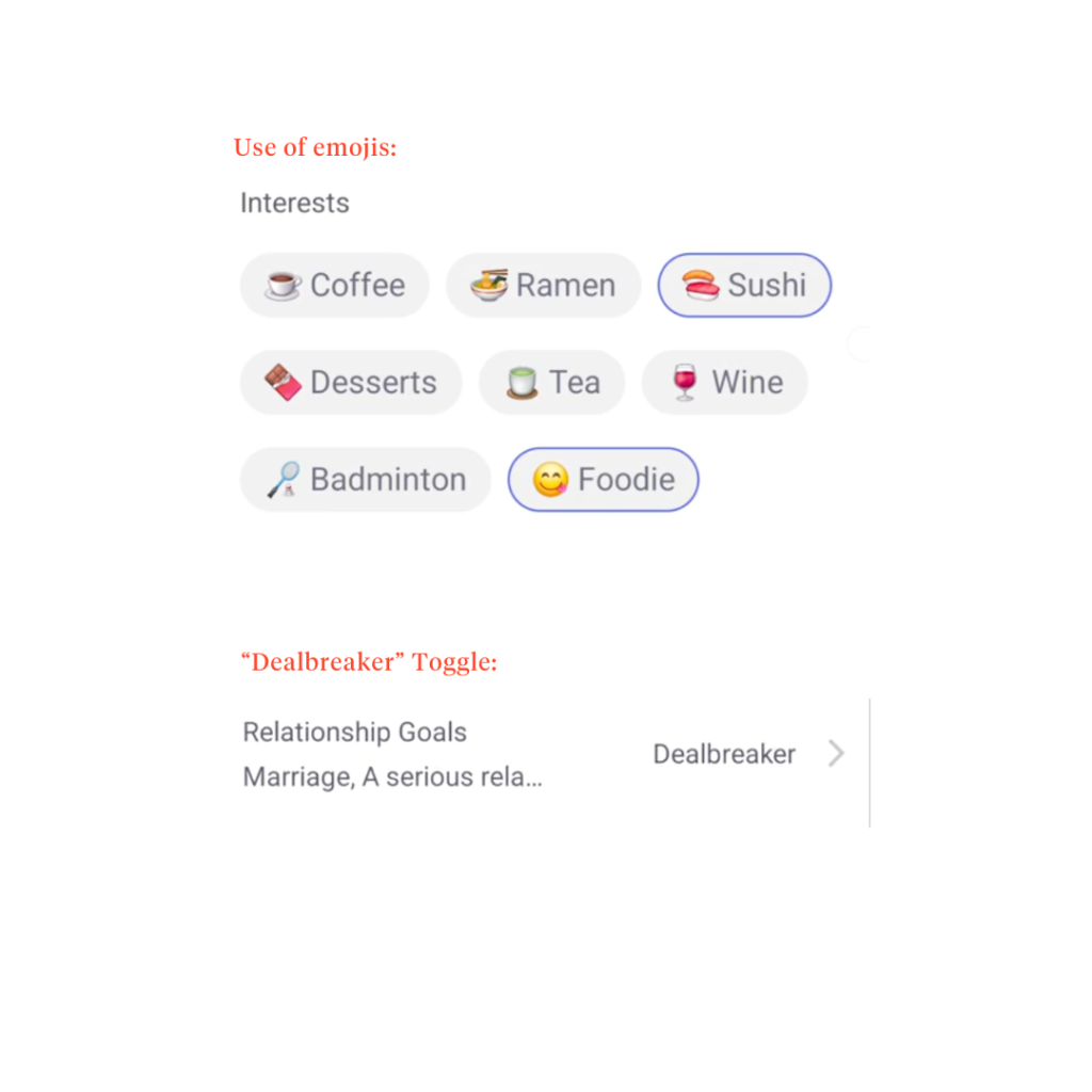
These three features make the matching process more personalized and transparent in an otherwise visually uninspiring interface.
Tinder
Cluttered First Impressions
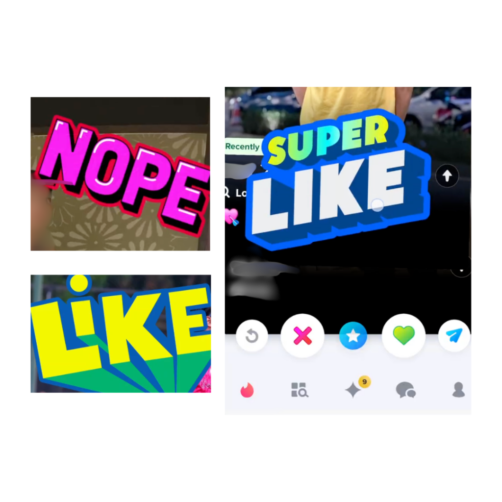
Visually, Tinder’s swiping pool page is overloaded with colors and button options (10 buttons?!), making it cognitively overwhelming.
Not to mention, it also distracts users from core functionalities — just swiping and matching.
Though the “Nope” and “Like” text graphics are helpful feedback tools, the cartoonish design makes the experience feel immature— more like a game than a dating app.
A Lacking Tutorial
To its credit, Tinder does offer a tutorial for first-time users. However, it doesn’t go far enough in explaining the app’s complex interactions and gestures. Meaning…
- Users are told that swiping left and right passes or likes a profile.
- But key details—such as swiping sensitivity and secondary gestures like tapping to view more photos, which differs from Bumble and CMB’s swiping to view pictures—are left unexplained.
Leaving out this equally useful information increases user confusion, creating a steeper learning curve for users.
Swiping Issues
Tinder follows the same swiping model as Bumble when matching, focusing on image-first browsing with a simplified profile preview at a glance.
However, it differs slightly because tapping the arrow down button expands the profile, while Bumble’s swipes up.
Though swiping is easy and intuitive, the action itself is too sensitive.
Users can mistakenly swipe superlike when they might have wanted to swipe left. This leads to frustration, especially if they miss a potential match or accidentally match with someone they’re not interested in.
It could’ve been better if Tinder had a way to adjust sensitivity settings, allowing users to customize swipe sensitivity based on their preferences.
A Button-First Approach
Apart from this, many actions in the profile are a button-first approach.
For starters, extending the page to view profiles requires users to tap on the small arrow button, which is not the usual “swipe-up” of its competitors. And when users are on the extended profile page, swiping left and right doesn’t work.
Only by tapping either the ‘x’ to pass on a profile, the heart to like a profile, the star button to superlike, or the arrow down button can users move to the following profile.
Chatting Features
By some miraculous fate (or a well-crafted profile), you’ve got matches!
Now comes the real challenge— starting a conversation.
Which of these apps helps you break the ice effortlessly, and which ones make it feel like a slow burn?
Bumble
Breaking the Ice Made Easy
Once a successful match occurs, Bumble provides conversation starters right from the get-go to help users who struggle with breaking the ice. Some examples include:
- Sending an “Opening Move” the match could answer
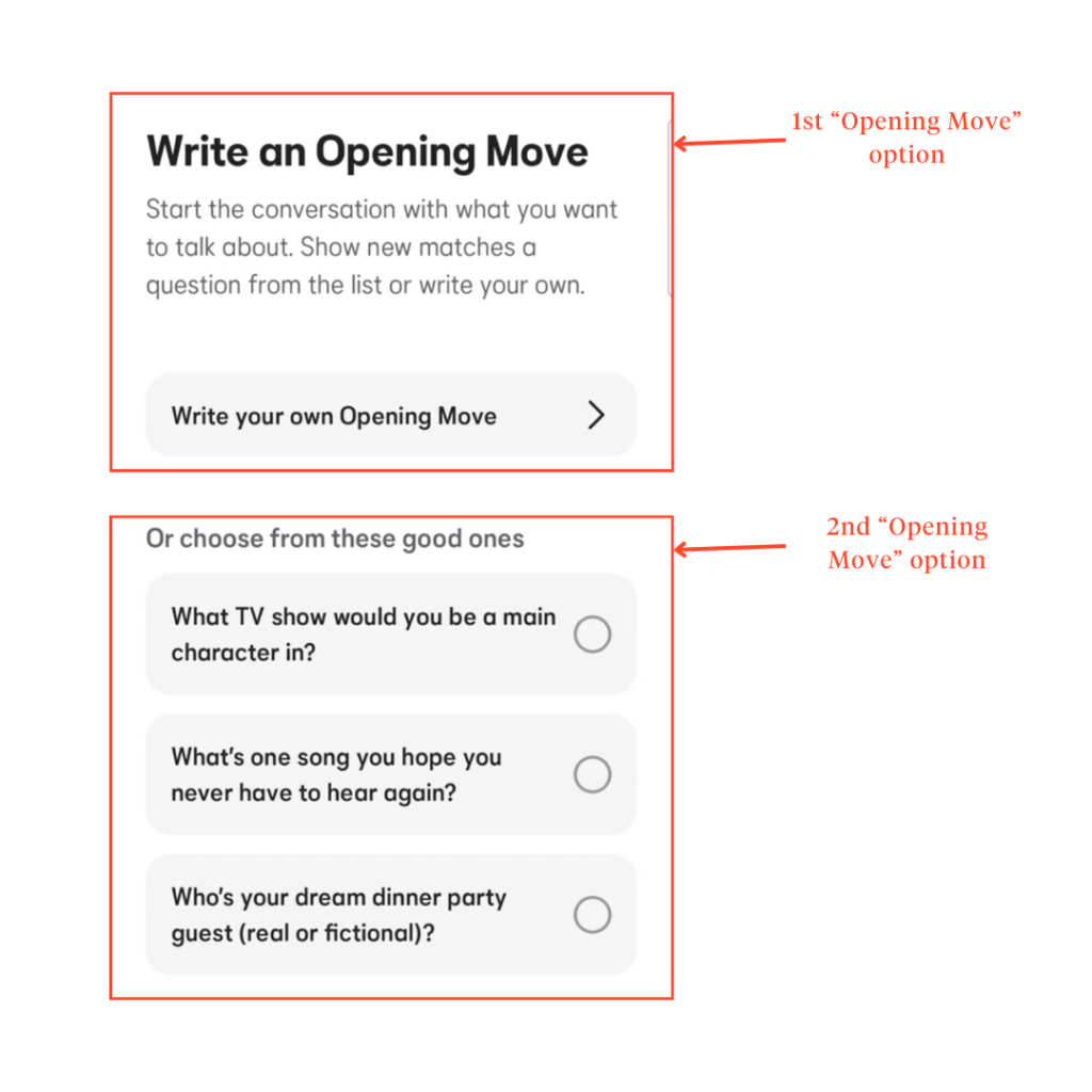
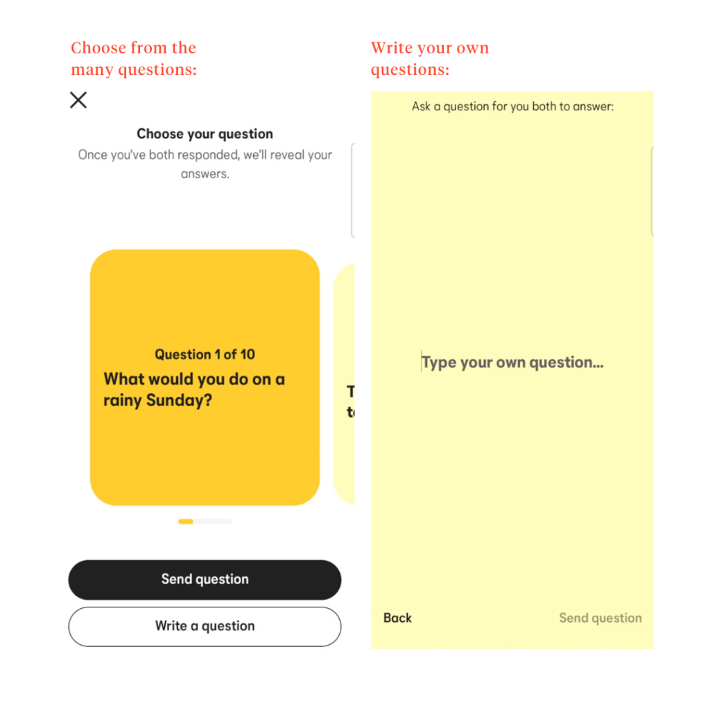
- Opt for the “Choose Your Question” feature, consisting of 10 preset questions to send to their matches.
- Sending “Compliments” allows users to send a quick note to their match before starting a conversation. However, this feature might feel more like a surface-level introduction than genuine curiosity.
Having all of these features removes the pressure from users who might already be feeling uncertain about their matches from having to think about ways to initiate conversations.
For ongoing conversations, functions like the “Search Bar” enhance accessibility for users with many matches, as they can quickly locate them without scrolling endlessly. Thus reducing frustration and saving time.
Streamlining Ongoing Chats
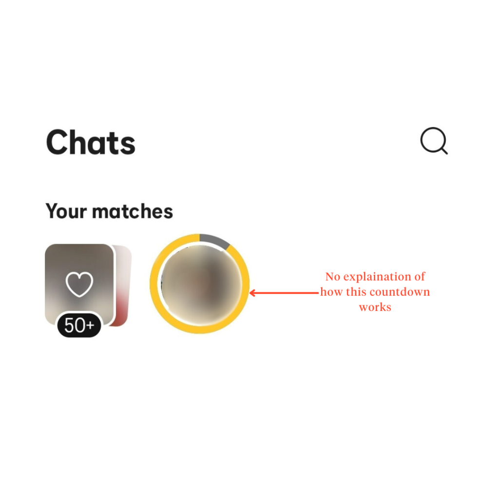
Meanwhile, the “Your Matches” section at the top, though effective in driving prompt responses with matches, has a somewhat confusing design with its timer approach.
Does it indicate how much time you have to respond or how long your match has before the connection expires?
A more explicit visual cue or explanation could improve the user experience.
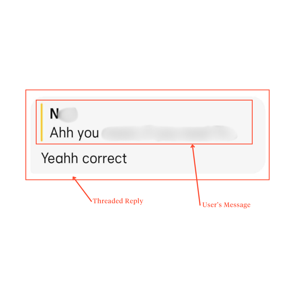
Furthermore, Bumble seems to be the only dating app between the three that has a message threading feature.
Threading allows users to respond to a particular message directly. This “reply to” or quoting action improves clarity, as users can reference specific parts of a conversation, making it easier to follow up on topics and reducing misunderstandings.
As for communication transparency, the “Delivered” indicator when messages have been successfully delivered to the recipient adds a layer of reliability to the app’s functionality.
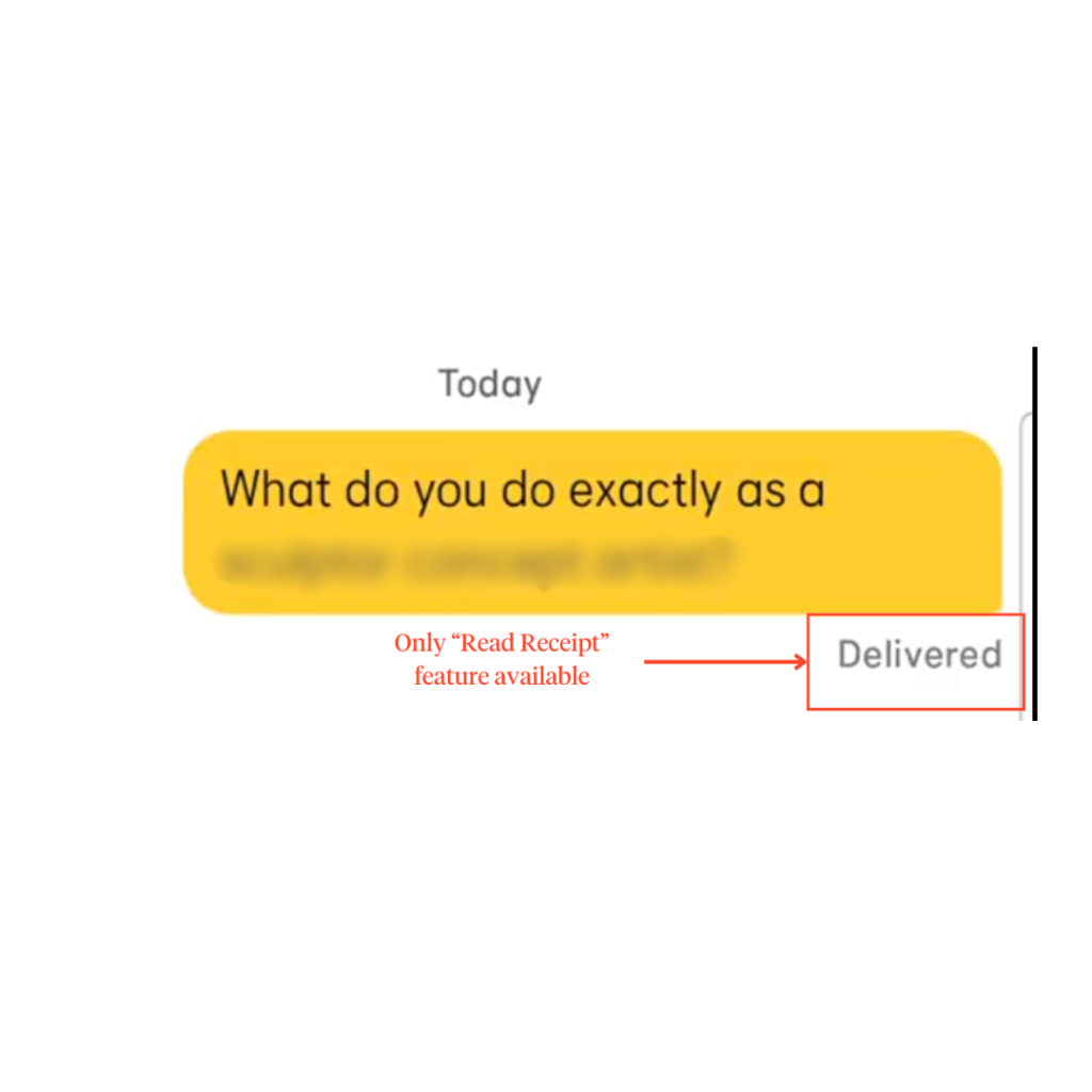
Though there are better message update features (e.g., Read or Edited), the current feature does help in creating a more transparent messaging environment.
Coffee Meets Bagel
Minimalist Yet Outdated Design
Simply put, CMB’s chatting page is characterless or, as the kids would call it — BASIC.
The chat interface lacks personality, and modern engagement tools (like GIFs in Bumble and Tinder) are missing, making possible conversations feel static and uninspired.
Beyond aesthetics, the app falls short in communication transparency with the read receipt feature set behind a paywall.
Without read receipts, users might be less motivated to engage actively, as they lack feedback on whether their efforts are being acknowledged. Thus, leading to frustration, especially in a dating context where emotional investment is high.
Disorganized Conversations
CMB also lacks a message threading feature, further solidifying the app’s outdated design strategy. Most modern messaging apps offer this as a standard, so why doesn’t CMB?
Keeping conversations organized is crucial when getting to know someone, and without threading, users may struggle to keep track of past exchanges, leading to confusion and disengagement.
Countdown Timers
The app does, however, implement a countdown timer for each uninitiated match (e.g., 5 days left to chat…)
This feature aligns well with CMB’s branding as an app “For Serious Daters’.” The countdown encourages timely engagement and promotes intentionality as users have a limited window to get to know someone.
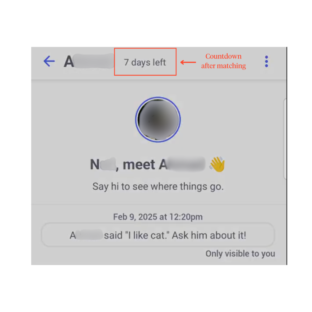
And in an era where “ghosting” is predominant, this feature doesn’t sound so bad.
Tinder
Chatting That Works Fine, But Could Be Better
Among the three apps, Tinder’s chatting features are neither outstanding nor disappointing— it’s just…there.
Users get the usual simple, clean interface with interactions limited to texts, emojis, GIFs, and video calling.
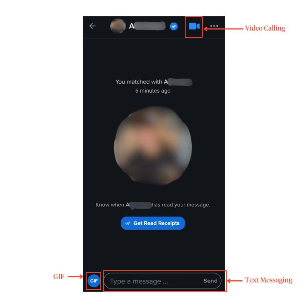
While the interface is generally clean, some button placements could be improved. A glaring issue is the three-dot menu in the top right corner, which houses the Safety Toolkit, being placed too close to the video call button.
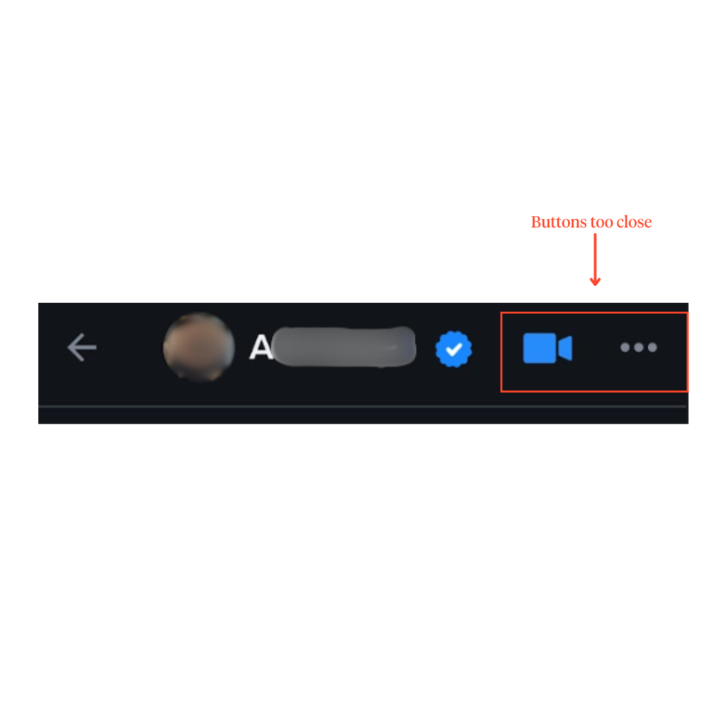
Now, imagine this: A conversation turns uncomfortable, and a user needs to access the Safety Toolkit—but they accidentally tap the video call button instead. This could lead to an unwanted face-to-face confrontation in an already uncomfortable situation.
A better design choice would be to create more spacing between these buttons.
Missing Essential Chat Features
Tinder’s chat could feel more up-to-date if it added commonly found chatting features such as:
- Message reaction beyond just a heart
- Media sharing, like photos and videos
- Voicenotes for a more personal touch
- Message threading to keep conversations organized
Currently, users can heart messages to show interest in their match’s message, but this feature feels lukewarm and doesn’t foster deeper engagement. It’s as if it’s there just to add more aesthetics than functionality.
Limited Communication Transparency
Tinder does offer indicators for when users match (exhibit A) and a basic “Sent” status (exhibit B) of messages sent by users.
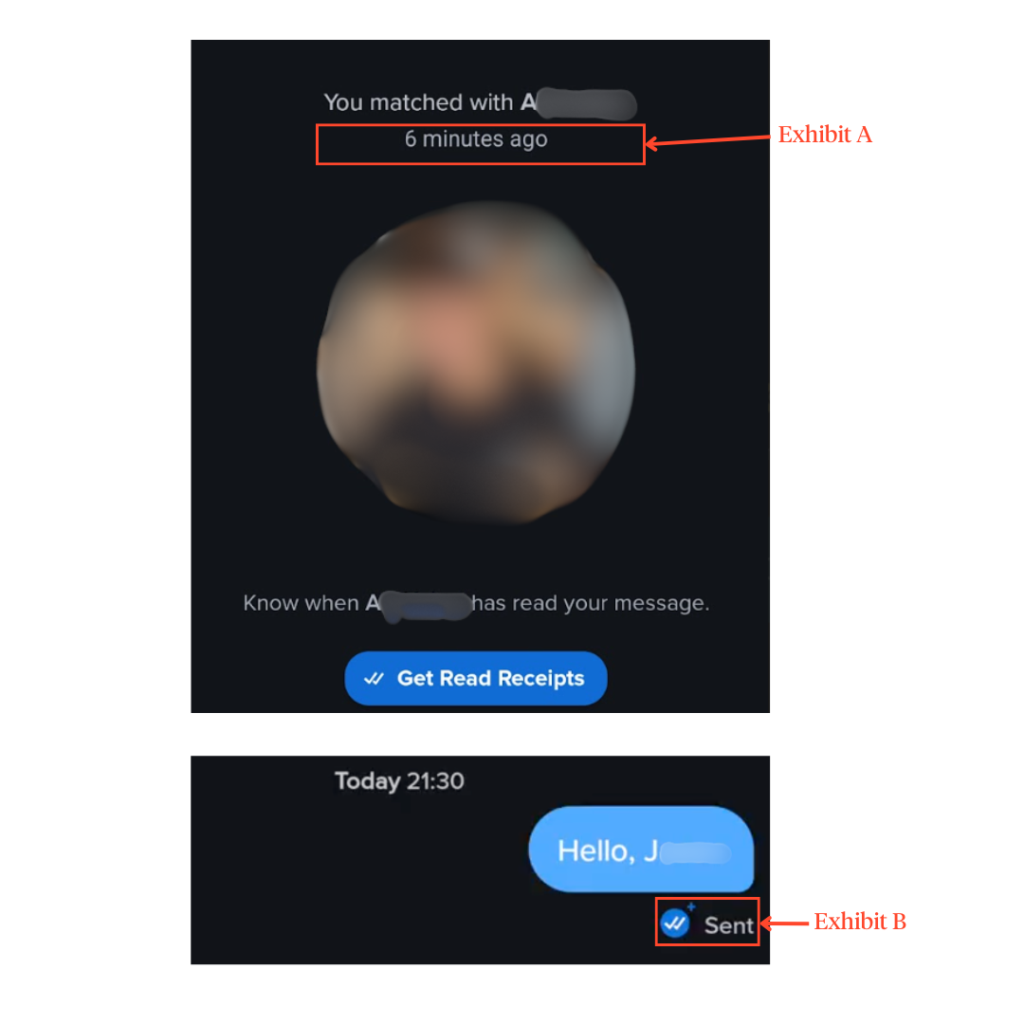
Similarly to Bumble, Tinder could’ve chosen better read receipt features to further improve their chats. But still, it’s better than not having any.
Love at First Swipe?
Finding the perfect match— whether in dating or UIUX design— is all about the right fit.
Each app has strengths, but thoughtful design can make love (or great user experiences) effortless.
Ultimately, great UIUX design isn’t just about looking good—it’s about making connections seamless, intuitive, and exciting.
If you’re crafting an app that needs the perfect balance of form and function, Snappymob’s UIUX designers know how to make swipes, taps, and interactions feel right.