

To add to recent conversations surrounding the JKJAVMY vaccine registration system, we thought it’d be helpful to take a look. Many have reviewed the AstraZeneca vaccine registration page, but few have looked beyond. Is the official site for the Malaysian Special Committee on COVID-19 Vaccine Supply (JKJAV) competent as a whole?
The site’s main goal is to effectively disseminate information on COVID-19 vaccines in Malaysia. As it is right now, how helpful are its design, usability, and structure to Malaysians of all age groups, socio-economic backgrounds, and health conditions?
To answer this question, we shall carry out this review in two parts. The first will focus on user experience (UX) design. The second will touch on the more technical aspects, from the perspective of a user with technical background.
In the UX part, we’ll break the review into two sections — one for the good, and one for the bad. Each section may further break down into smaller subsections that are relevant to the discussed topic. In each subsection of the bad, we’ll also discuss some ways we can improve the situation. As for the Technical Review part, we’ll focus only on technical design.
User Experience Review
Before we start the review, I’d like to first set our expectations straight and even reset our mindsets to accept this: Something can be bad, despite it being one’s only option where they have no other choices.
The public is more familiar with bad design than good design. It is, in effect, conditioned to prefer bad design, because that is what it lives with. The new becomes threatening, the old (or existing) reassuring.
— Paul Rand
With that said, it is important to acknowledge two things. (1) Change is a good thing despite it being uncomfortable at first, and (2) progress is what any product designer should aim for. On that positive note, let’s dive right into the review.
1. The Good
The User Interface
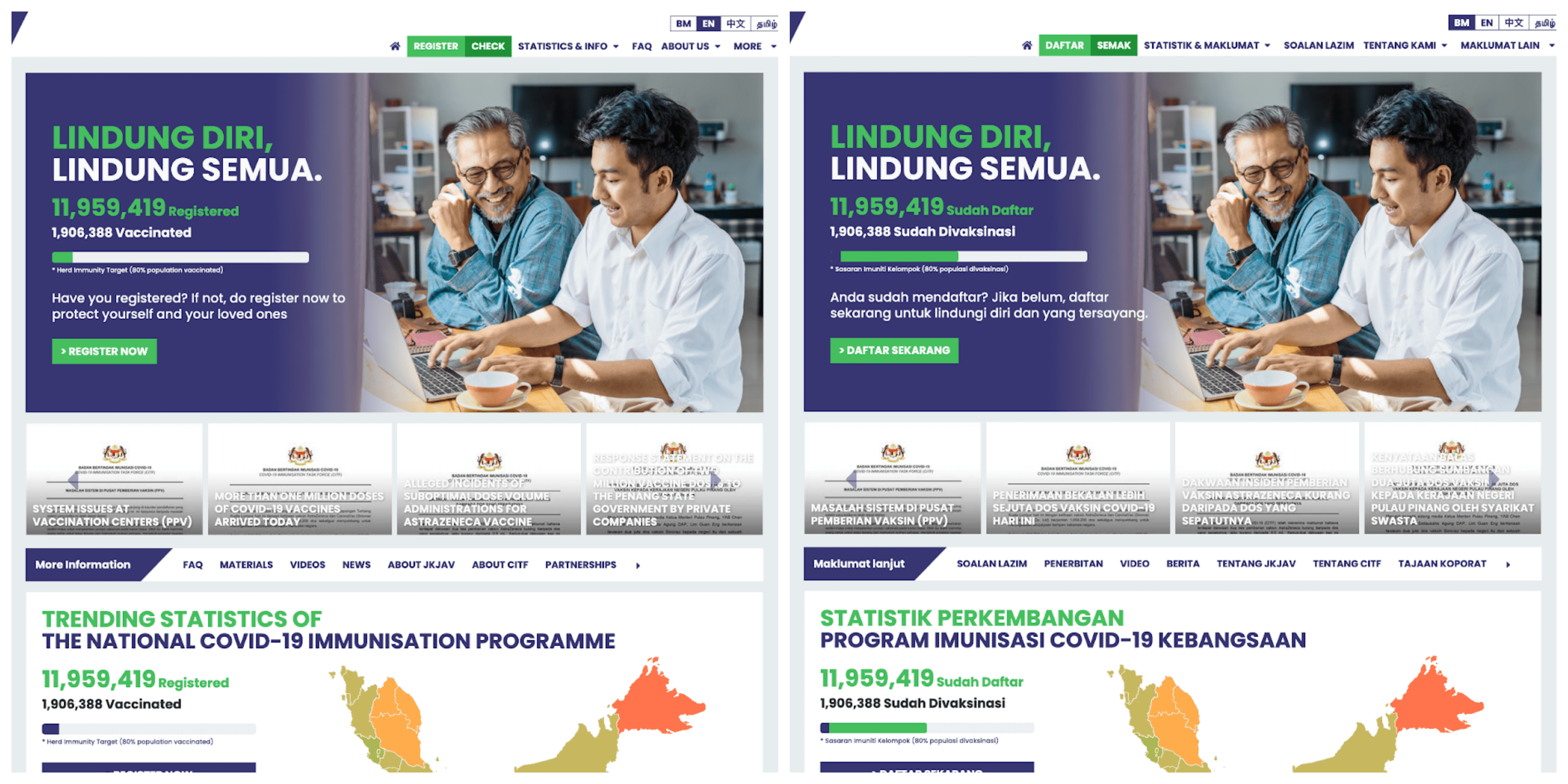
For most users, I believe that the website has a clean layout that’s relatively easy to navigate and locate resources. Links to the registration form are in the navigation menu, and in the largest hero banner. That is pretty standard for one of the main functionalities on the website.
There’s also a help button at the bottom right of the viewport, which follows the user as they scroll.
Ease of Use
For the purpose of registering for the vaccine, the website should be easy to understand and use. It’s good that links that are likely important to the user (e.g. registration, registration status, etc) are either in the navigation menu or in one of the immediate hero banners.
The option for switching languages is easily noticeable on the top right of the page, in the navigation menu. This is very important for Malaysians, and especially for elders who may not know languages outside of their mother tongue. It could be better if the website would automatically send the user to the page with their preferred language.
2. The Bad
Can I click on this?
Let’s take a look at the following screenshot, and notice the shape of the cursor.

That’s the regular cursor on macOS, so this card in the carousel is probably just an image, right? Let’s try right-clicking to get the context menu.

There’s no option to “Open this link in a new tab”. Interestingly, I also don’t have an option to open the image on a new tab. Hovering over the text changes my cursor into an I-beam, so the image is likely just in the background, and so I can’t open the image separately. That’s expected.
What if I try left clicking?
It… opened up a new tab with a PDF?
It turns out that each card in the carousel is a link to either PDF attachments or articles elsewhere online. However, when one hovers over the cards, none of them changes the cursor to a pointer, which is what is expected of a link. Outside of changing the cursor into a pointer, the linked item should at least have some other visual indication that it is an actionable item.
It’s also worth pointing out that the question cards on the FAQ page are the same. The cursor doesn’t change when you hover over the cards, but they are interactable. This makes navigating difficult especially for people who lack computer literacy. And that is a problem because those are the people FAQs are for. FAQ sections should be accessible to be fully effective.
Now let’s look at another example of a similar problem, their statistics section.

All looks fine. Looks like there are two buttons here that I can interact with. That’s what I thought, until I saw my cursor change as I hovered over the certain areas in the section.

That’s interactable? Every one of the names of the states are? When you click into any of them, it turns out that they bring you into statistics dedicated to that state. So they’re links. I can hear you say, “Wait, when you hover over a link, there’s usually a little indicator from the browser telling you where this link will bring you. Is that showing up?” Nope.

If you’re wondering what this indicator looks like, at least on this browser I’m using, here’s an example from the same page.

Incidentally, this is the context menu when I right-click on the name of the state.

You might ask, “Well, what’s the problem with that? You can visit the link that they want to show you, and the cursor changes to a pointer. That’s all the things that they need to let you do, isn’t it?” Alright, but what if I’d like to open up a new tab for each state? One of the most prominent features of a browser becomes unusable!
Also, there are users who cannot use a mouse, and they generally rely heavily on the keyboard to navigate websites. In particular, you can continually hit the Tab key to cycle through each link and button, and hit Enter to trigger the click action on the item. (Note: This differs across browsers on different operating systems. In particular, it’s not the default on macOS. See this article from the A11y Project on how to enable this feature on your browser of choice.) Out of the many links and buttons on the website, only a handful of them are selectable by this action. None of the links in the navigation menu were selectable through Tab-cycling.
All these, unfortunately, are not solvable through design alone, as it requires changing the underlying code for the website. We’ll explore this later in the subsection They are not standard links.
Insufficient Contrast of Text on Images
Text on images is stylish. It saves space. It makes associating an image with text easy, but doesn’t reduce the text to simply captions, which a lot of people will ignore. However, finding the right color for the text is tricky. With a lack of care and attention, we run into a common problem in UI design — too little contrast between a block of text and its background. Let’s take a look at several instances where this surfaced on the website.
The following is a screenshot of the carousel that contains link cards to attachments and articles.

It’s quite clear that the white title in each of the cards start to be hardly readable. Especially for titles long enough to extend beyond the dark contrasting shade that’s there to help with legibility in the first place. Though the text does have some text shadow, it’s unfortunately not enough to improve the contrast.
Furthermore, notice that the white background is just an extreme. Here’s another screenshot of the same carousel with a different set of contents.

You’ve probably noticed that the white title is just bad for a lot of images that are sufficiently bright. But, they do shine quite well on darker images, or images with a dark shade, as seen below.

On a related note, you may have noticed that the left-right buttons are really hard to notice — a similar problem! In fact, these buttons even cover up some parts of certain titles.
To improve this, we can first move the carousel controls outside of the area where the cards show up. Next, we can add a semi-transparent, dark overlay that covers the entire image to accentuate the white text. Here’s a screencast after making these adjustments:
While putting the carousel controls to the side breaks the fully rectangular structure, and some of the images have become a little too dark (as there was already an overlay in the first place), I believe they are fair trade-offs for the sake of wider accessibility and better experience.
Problems with the Registration Form
The registration page is rather unfriendly, especially for the elderly. The page is arguably unnecessarily long, and it may be easy for the elderly to forget where they are and simply give up on filling the form. I’m saying that as someone who’s had to take over filling in the form for my grandparents.
I also noticed that certain fields are unnumbered, while others are.

The logical grouping of the fields is also weak. You fill in personal information near the top of the form, and enter into some questions that you need to answer. Suddenly, the form goes back to asking for your address.

There is also no visible validation while filling in the form. While somewhat time-consuming to implement, it’s almost always better to show messages that help the users validate their input.

Technical Review
We shall now look at the more technical side of the website. Of course, we do not have access to the original source code of the website, and so we shall review based on the rendered DOM, as well as certain networking level information. Furthermore, note that we’ll only look at certain components instead of the entire website. Let’s talk about one good thing, and one bad thing.
Language Switching
Something that I appreciate about JKJAV’s website is that the option to switch languages is presented clearly. It’s something that’s expected of an official government website for a multilingual country, but I find that language-switching is rather rare in many websites that mean to support various languages.
Though I can’t peer into their source code to know how it’s achieved, I came to notice how the multilingual feature works by studying different parts of the website. While somewhat by accident, as one of the rare people on the Internet that disables most JavaScript (JS)t on newly visited websites, I happen to notice that the navigation menu and the footer won’t show up if JS is disabled.
Here’s a side-by-side comparison for when JS is disabled for the Malay version, and the English version of the website, followed by another comparison for when JS is enabled. Note that the subdomain URL with the base path will give you the Malay version, while when appended with /en, we get the English version.

One important thing to notice is that when JS is disabled, some texts are still properly translated in the English version. This likely means that we’re served the HTML file with the English version. However, the navigation menu, a great portion of the statistics section, and the footer, fully rely on JS to even appear, which is arguably awkward.
If we’re already serving the site through different languages, what’s holding them back with doing the same for these parts that rely on JS? I’m sure they have some reason, some of which I can think of; e.g. needing to write multiple similar JS files for the different languages makes it difficult to maintain and keep in sync, and the framework (even if it’s a custom one) behind makes it difficult to just let JS handle everything.
They are not standard links
Let’s first take a look at one of the items in the carousel.

First off, it looks like a single carousel item was actually not what we thought it would be. A carousel-item contains four cards. This was perhaps so that there will always be four different items in view. However, there shouldn’t be a need to do this, especially since the carousel functions using JavaScript. In particular, we can tell the navigation buttons that we want the carousel to always “scroll” by four carousel-items. That does technically depend on how the carousel is designed, however.
Notice that a card is actually a div with an onclick event, and each of them runs a single line of JavaScript window.open that opens up the given link, in the argument, in a new tab. Now it’s no wonder why we couldn’t discern whether the card is a link or not.
It looks like this is similar for the states that we discovered were interactable.

Granted, a card link, or block link, has proven to be a difficult component, with seemingly conflicting requirements. In particular,
- we want the whole card link to be clickable; but
- we also want the text to be selectable;
- the card may contain other links, e.g. text links, and they should be interactable;
- we want the usual browser features, like right-clicking or the middle-mouse-click, to work like they do on a normal text link;
- on screen readers, the alt text of the image may or may not be relevant, and the order of the image and the title requires care;
- etc.
Despite being a rather common appearance in contemporary web designs, we have yet to discover a complete solution to this component, and some of the closest have required weird techniques involving JavaScript. It is so tricky that some have recommended that we try to look elsewhere, or drop the requirement where we want the whole card to be clickable.
But what’s a good alternative? It’s difficult to give a definitive answer as it differs by UI design requirements, but the rule-of-thumb should be that we make the title of the card, or what constitutes the title, or the largest item into the link. After all, one of the main reasons for wanting a large clickable area is because it is difficult to click on text links on a lot of handheld devices.
On a final note for this subsection, let’s have a look at this “link”.

The following is the same in the DOM.

The email link could have easily be written as:
<a href="mailto:[email protected]">[email protected]</a>
and all of the default styles and browser features for a link would apply.
Summary
Overall, the site is fairly usable for most people, but does not seem very friendly for the elderly, or people with special needs. For a website that is meant to serve people from every facet of life in a country, the lack of a good contrast between content and background, unsatisfactory keyboard support, form with rather lacklustre structure and aid (especially important for the elderly and those with special needs e.g. AD/HD, visual impairment, etc.), and unclear links, are all detrimental to the cause.
As a developer, I have found reading the code rather frustrating, although I will recognize the fact that the website works according to what is expected by most. But I also empathize with whoever worked on this website. They likely had little time to actually do things right — the COVID-19 situation is getting more severe by the day, and this is likely just one of the many things they have to do.