Welcome back to UIUX Audit with Snappymob! Brew yourself a cuppa coffee, we’ve got a long ride ahead. A while back, we did an audit on web UX where we compared the Nike and Adidas websites. Today we’ve picked out three mobile experiences to review, and specifically, on streaming apps.
Ah, streaming apps — our trusty R&R companion. Since Disney+ Hotstar has now launched in Malaysia, competition is stirring between the strongest contenders. The apps are fighting for a spot among our streaming subscriptions. How do top streaming apps like Netflix, Disney+ Hotstar, and HBO Go compare? Who has the most edge in this ring?
Before we get into it, let’s refine the angle. For a more focused report, we will be restricting the perspective of this review to UI/UX design and mobile UX. So putting everything else aside, let the battle begin!
Phase 1: Homepage and First Impressions
The Netflix Homepage
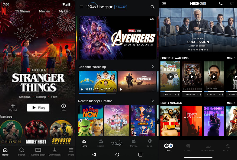
At first glance, Netflix’s home layout seems to be more focused compared to the other two apps. Upon entrance, the singular content layout takes up two thirds of the screen and centers attention onto one main item. In the example above, that main item would be The Emoji Movie.
There’s also a lot of emphasis on engagement in Netflix’s design. Action buttons like Play and Add to My List directly below the recommended content eases and encourages interaction. The large Play icons on the thumbnails under Continue Watching also have a clear and direct function, which is to get people to tap.
It’s definitely worth noting too that Netflix mentions your name in the section title for a personalized feel. And speaking of personalization, Netflix’s support of multi-user setups gives them a big advantage, especially with cohabiting users who share the same account but have different preferences. Personalized content for each user takes away the need to sift through content that is irrelevant to their interests.
The Disney+ Hotstar Homepage
The first thing that stands out about the Disney+ Hotstar homepage is the autoplayed trailer carousel topping the page. This is a great way to get users hooked upon entrance. However, what seems to be lacking is CTAs that distinguish the trailers as actionable.
The second thing that’s definitely hard to ignore is the disproportionate amount of white space on the layout. The Disney+ app heavily uses landscape thumbnails, unlike other streaming apps that almost exclusively use portrait thumbnails. This allows more rows to fit in a single screen, but that also means more gaps between the rows.
Users may not be able to put their finger on what exactly is wrong with this layout. But what makes it feel a little unintuitive is this. Unless they’re on a horizontally propped up tablet, mobile users naturally have their devices on portrait most of the time. Having content laid out in portrait orientation just seems like the more natural choice in designing for mobile experiences.
Disney+ seems to be deriving a chunk of their app design from web UX, which may not translate well on touch-based mobile experiences. They even stray from conventions with muted thumbnail overlays and the tiny Play icons. These deviations may not be as effective at conversion, but may also be their way of saying “We’re not worried. They’ll figure it out themselves.”.
The HBO Go Homepage
Right off the bat, HBO Go looks like sort of a blend of the two. On the one hand, they go for the traditional web look on their featured section with a landscape carousel. On the other hand, they use standard portrait thumbnails for the rest of their content.
The next thing that stands out would be the progress indicators under each thumbnail. Unlike the other two apps, HBO Go’s indicators aren’t progress bars. They’re much more specific. The circular design itself may not make much of a difference in terms of effectiveness, but displaying the exact remaining duration left definitely does.
If you compare this design to the other two apps’ progress bars, chances are you’d feel more of an itch from HBO’s numbered circles to complete the time left.
Phase 2: Categories
Netflix Categories
On Netflix’s categories page, their homepage layout is retained. With a singular recommendation from the selected category, a Continue Watching section and other recommendations follow under. This is a great thing because less adapting for the eyes also means more points for intuitive UI.
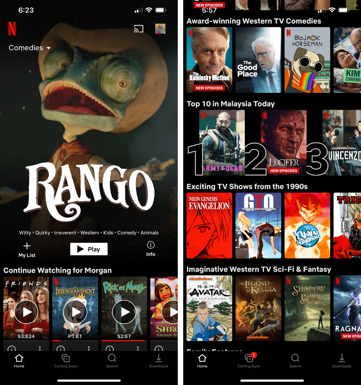
Out of all the categories, Top 10 in (Your Country) Today catches the eye because of the way it breaks the layout structure with large ranking numbers next to each thumbnail. Similar to what was done with their featured content, by highlighting one selected category, Netflix does a great job at getting people to pay extra attention to selected items.
Disney+ Hotstar Categories
On the topic of intuitive design, Disney+ Hotstar’s category page is the furthest removed from its homepage layout, removing the trailer carousel and switching to portrait thumbnails in their categories home page.
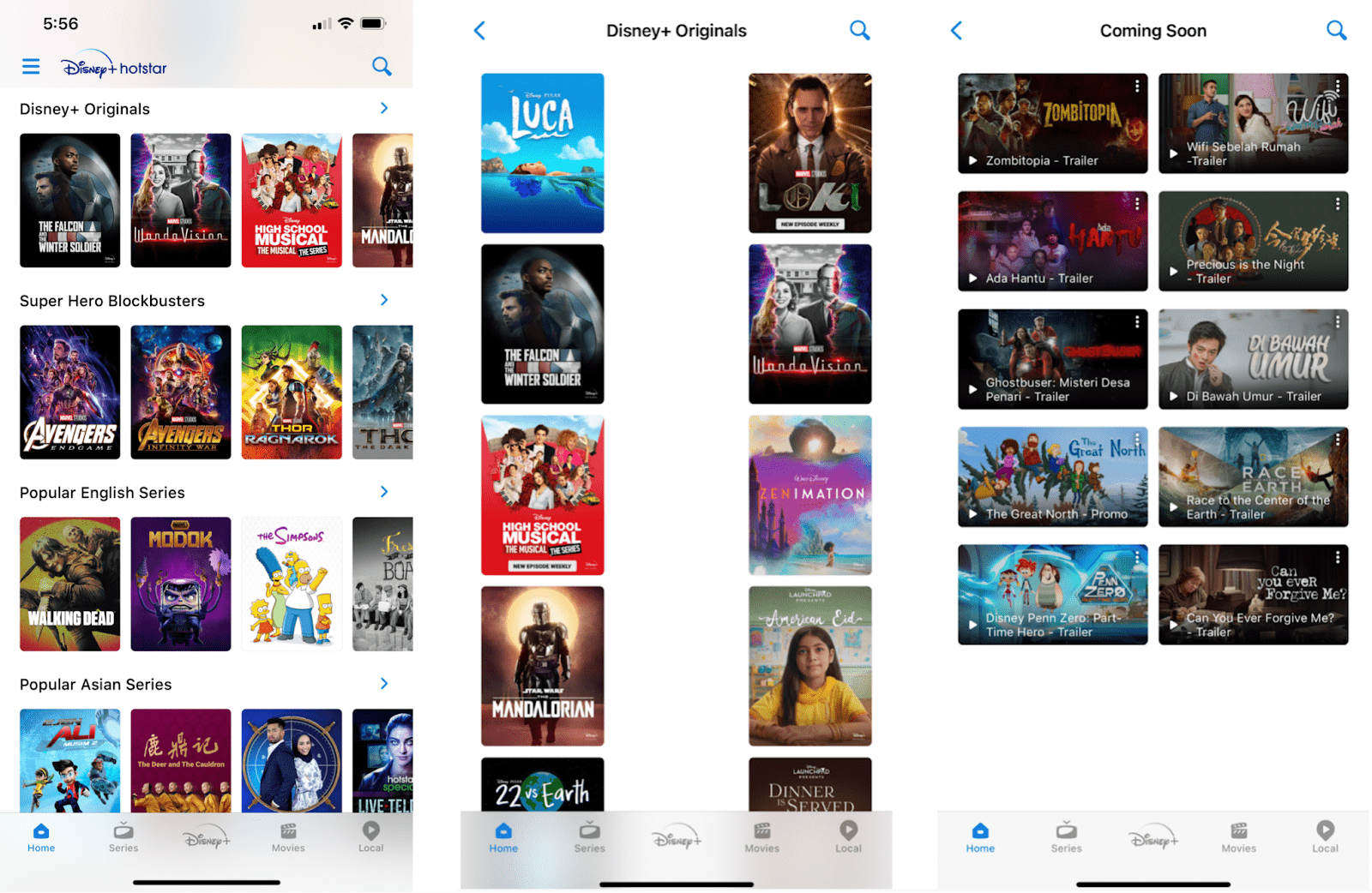
There’s a glaring lack of consistency in the way content is laid out in their categories. Though one might argue that Disney+ might have intended to draw a clear distinction between content and trailers by using portrait and landscape thumbnails respectively, something still feels off about it.
Firstly, not only trailers were given portrait thumbnails on the homepage, so it’s clearly not for distinction purposes. Secondly, when they do decide to use portrait thumbnails in a category, they leave an awkward amount of white space where they could easily fit another column of thumbnails.
If you pay enough attention, it’s only a matter of time before the inconsistency in Disney+ Hotstar’s design makes you scratch your head and wonder — Is this design direction intentionally unconventional, or is it just not very well thought out?
All that aside, their homepage for Categories makes up for a bit of it with good scannability. With the well spaced out categories and smaller thumbnails, they fit a good number of thumbnails into a single screen, which is great for quick browsing.
HBO Go Categories
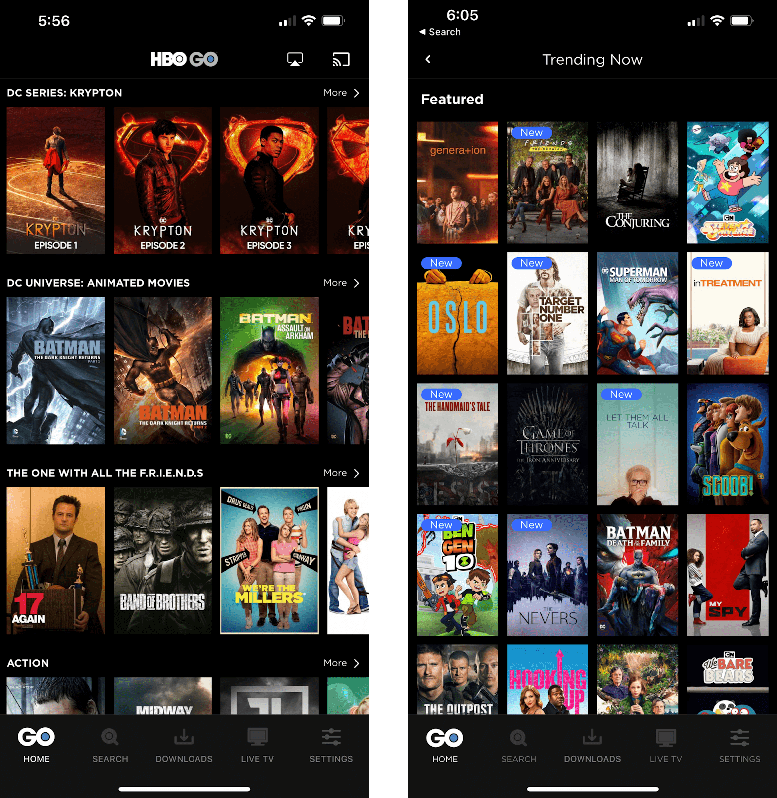
At first glance, HBO Go’s category page looks identical to Disney+ Hotstar’s, except with tighter spacings between the thumbnails and categories, which allows for larger thumbnails. Like on Netflix, despite fewer thumbnails fitting in a single screen, users get a more immersive experience here because of how “full” the screen feels.
Overall, HBO sticks to a pretty safe and familiar UI all throughout. This is good, but nothing particularly helps them stand out from the others.
Phase 3: Search
Searching on Netflix
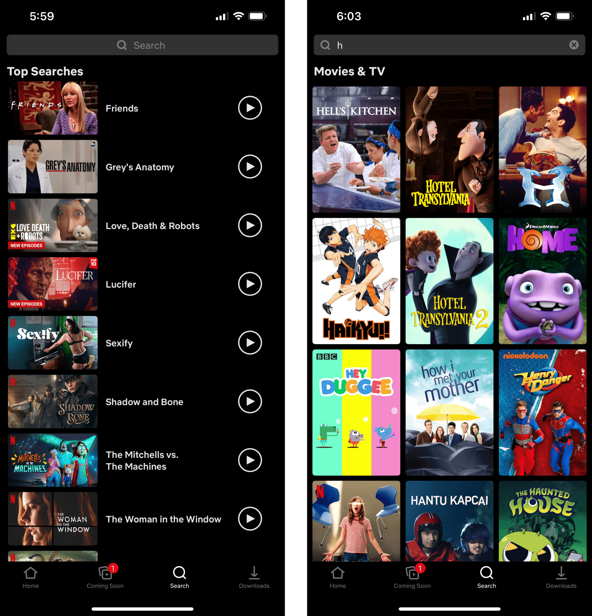
Before any input in Netflix’s search bar, a list of most-searched content displays before any input in the search bar. Titles are present in and beside the thumbnails, and a play icon on the right of each row indicates clearly that the cards are clickable. After searchbar input, it transitions into a pretty standard 3×3.5 layout with portrait thumbnails.
Overall, as usual, Netflix spared no expense in utilizing every pixel on the screen. This shows their commitment to optimizing the experience for their audiences, even those watching on tiny mobile phones.
Searching on Disney+
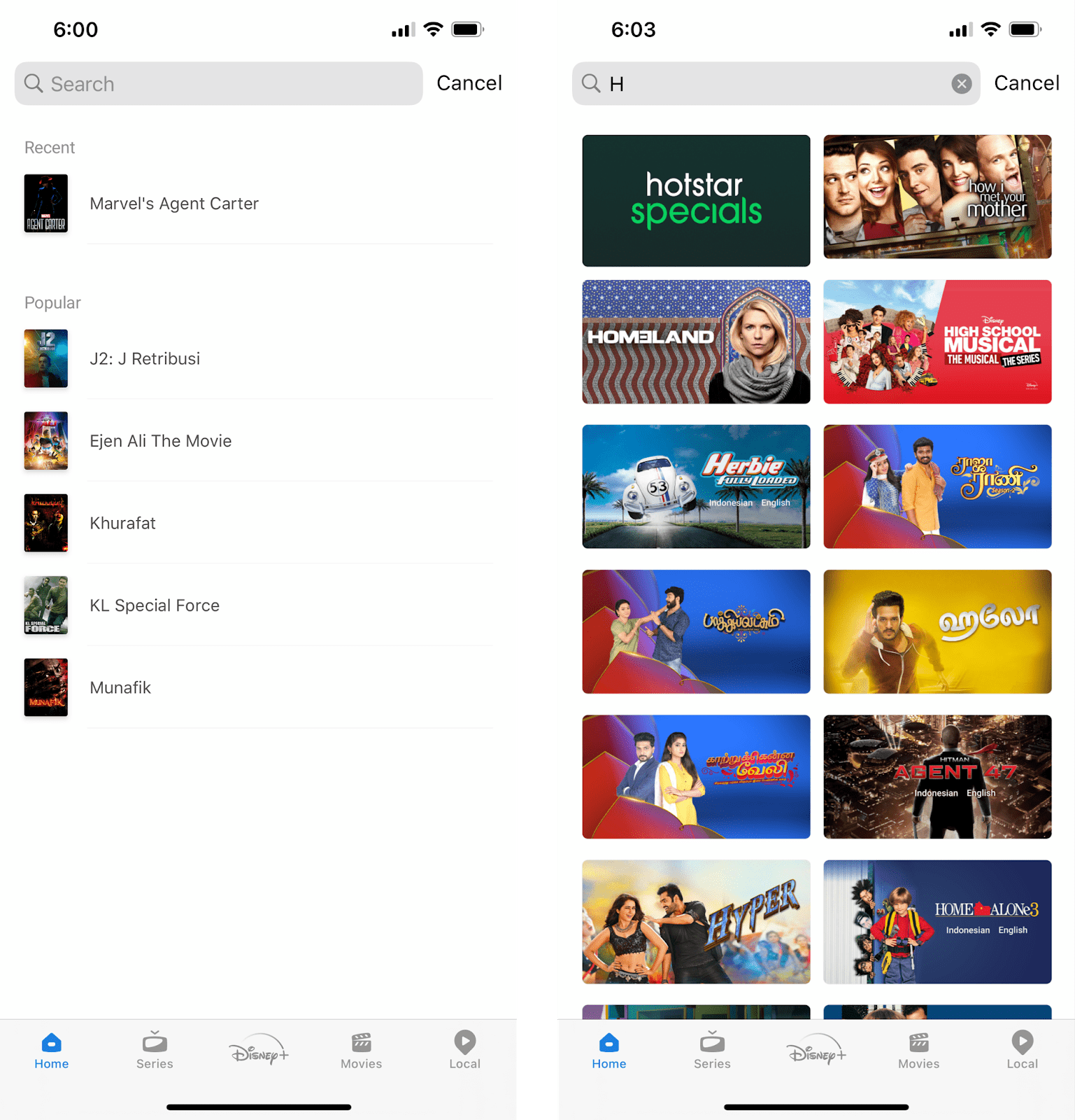
Disney+ Hotstar also recommends popular content on their pre-searchbar input page, except with almost tiny thumbnails and without CTA buttons. After a good look at it, the default search page feels uninspired for a couple of reasons:
- The content ratio is unbalanced. White space takes up more screen real estate than the content itself.
- Their popular category looks empty and unenticing, which defeats the purpose of a recommendation list.
The good thing, however, is that they make up for it when the user starts typing in the search bar. Despite the strange choice of landscape thumbnails (once again), the screen is filled with content pretty well.
Searching on HBO Go
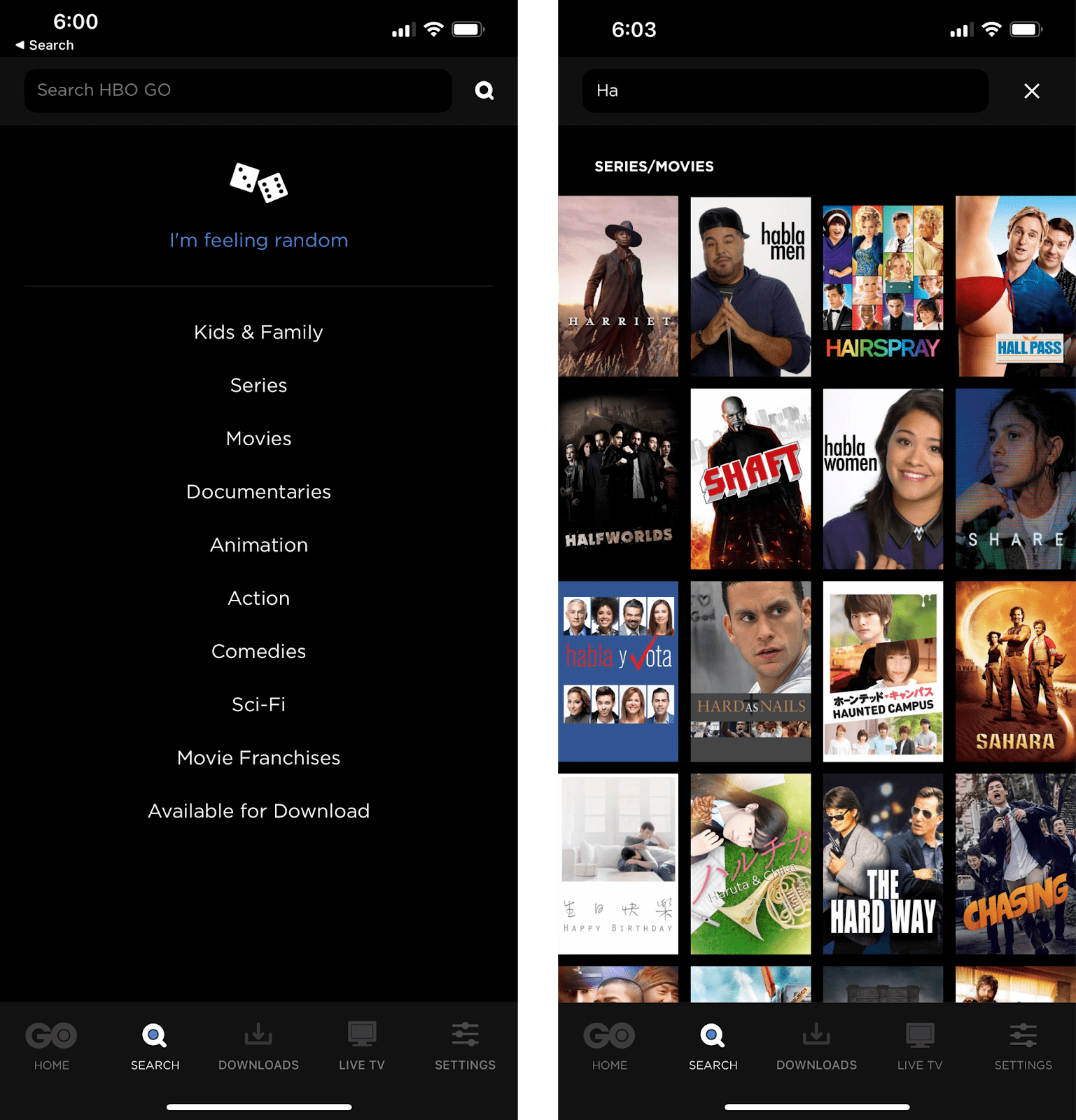
Unlike the others, HBO Go doesn’t provide any suggestions pre-input. Instead we see a list of clickable categories in text, which is a much more simplistic approach, but in terms of how well that entices users, it might be a questionable design choice. After all, a list of text versus thumbnails that are so delicious that you could lick them?! We’ll leave you to ponder on that.
A definite plus, though, is their I’m feeling random button — a unique addition that caters to people who aren’t searching up a specific title and are just here for the fun.
Moving on, their post-input layout dons a standard 4×4 tile with portrait suggestion thumbnails. Despite smaller thumbnails against Netflix’s, they get to squeeze more content into the screen.
Phase 4: Content
Netflix Content
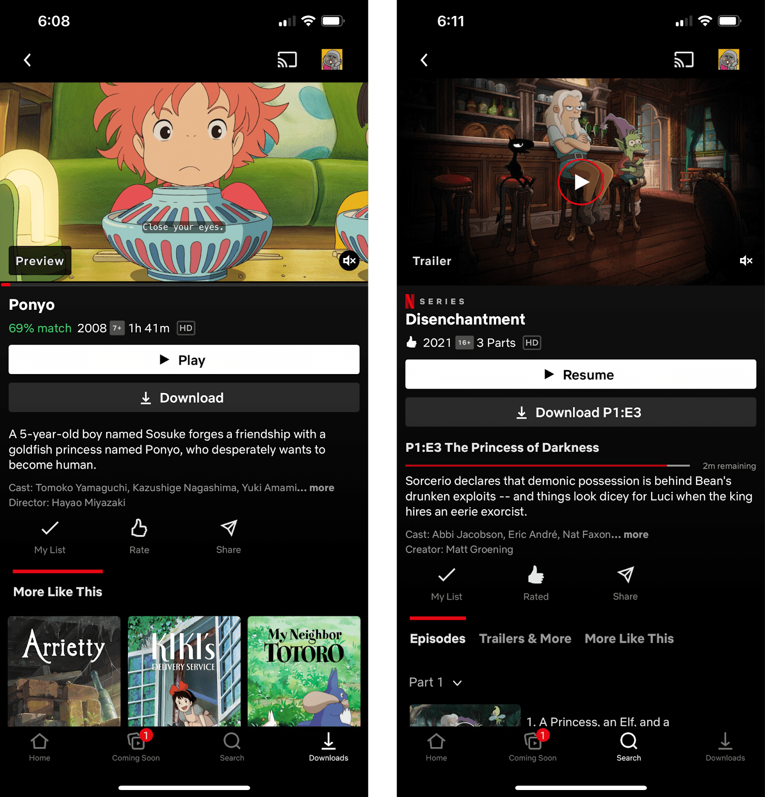
Right off the bat on Netflix’s content page, it’s apparent that there’s a lot of emphasis on the Play/Resume button. As the object with the highest contrast and a width spanning across the screen, it just pops. A little down the hierarchy of importance would be the Download button right beneath it, with the same scale but lower contrast.
For resumable content, it’s effective that the circle around the Play icon on the feature image is red, matching the progress bar. Not only does this automatically group the two elements together to urge the user to resume watching, it makes a clear distinction that they have played the content before.
Disney+ Hotstar Content
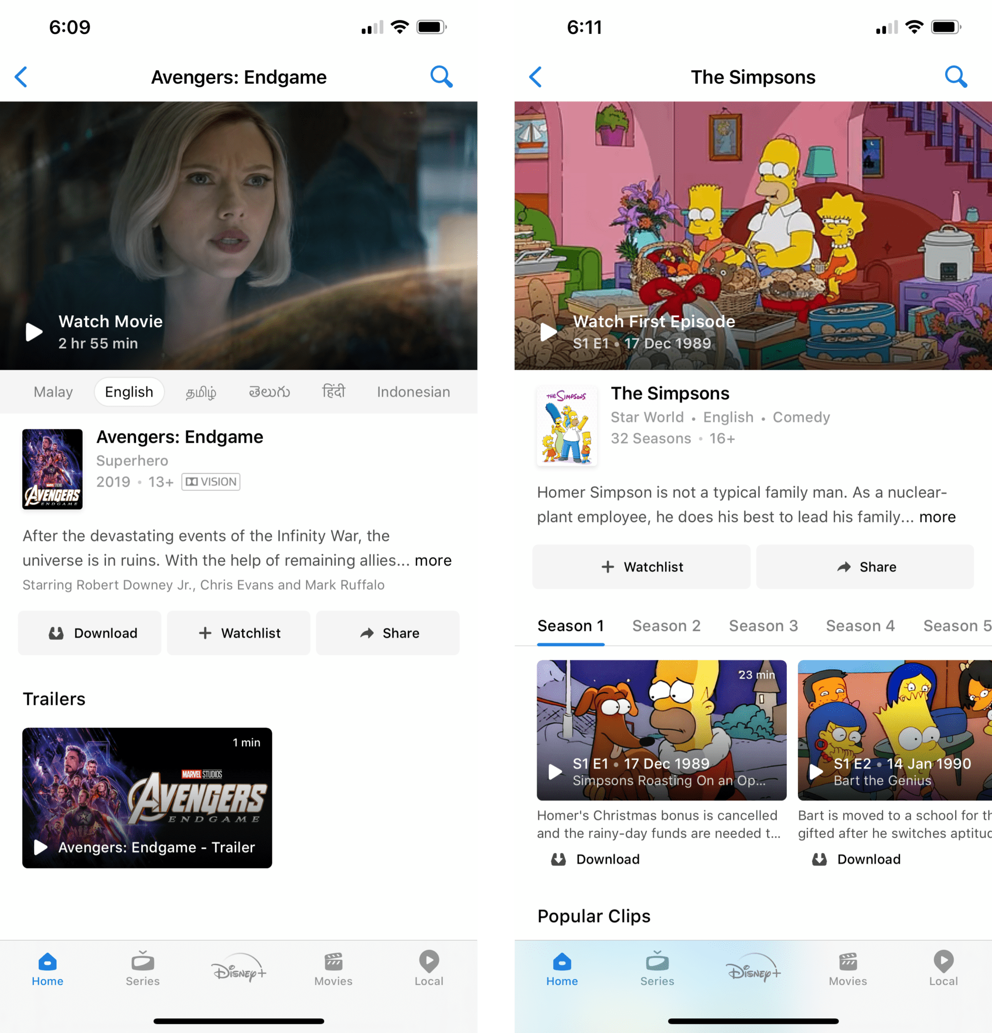
On Disney+ Hotstar’s content pages, CTA buttons are all given the same hierarchy. The Download, Watchlist, and Share buttons all share the same scale and colors, which may not do much for calling-to-action.
What seems like a missed opportunity is their Play button, which looks somewhat muted and monotonous. Instead of chucking it in the bottom left of the featured image with a color that blends in with the base color of the app, they could do a lot more to give it some pizzazz.
One unique feature the app has, however, is the language switching tab that displays all available dubs and allows for instant language selection before playing the content. This caters to multilingual users and may do well at encouraging click throughs for a diverse user base.
HBO Go Content
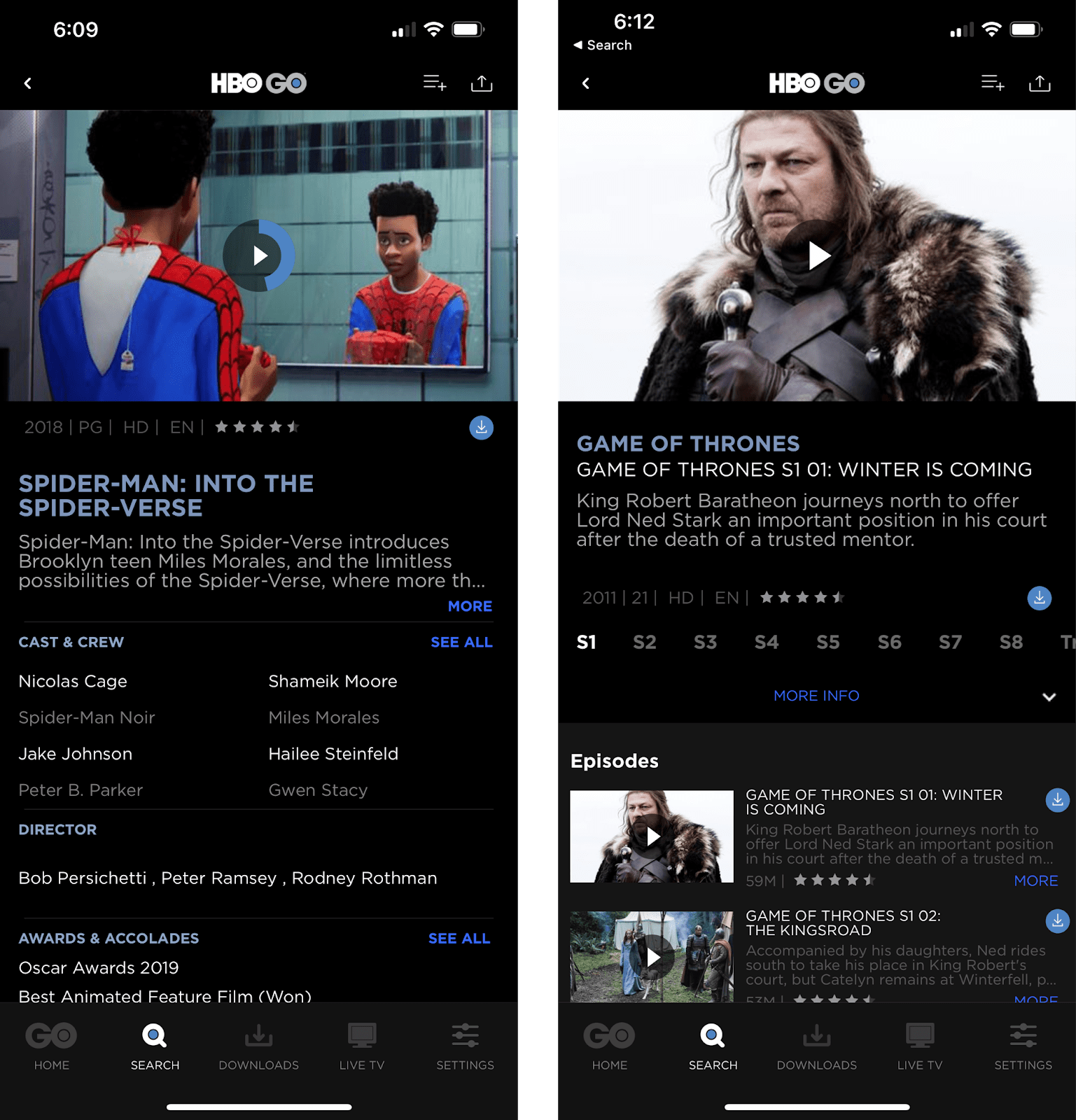
On HBO Go, we see a way, way more detailed approach with content pages. Displaying additional information like ratings for each episode, detailed cast & crew, as well as awards and accolades, their content pages look extremely full. For some, this may come off as cluttered.
Since text already fills the page, CTA and navigation buttons can’t afford to take up much space. HBO combined their circular progress indicator with their Play icon on the content’s featured image; squeezed the tiny Download buttons under the featured images and content summaries; and compressed the season selection buttons to take up minimal space.
Despite the packed layout, however, HBO Go does a good job grouping similar buttons together with color — sky blue for main CTA buttons like Play and Download, and royal blue for expansion buttons like More and See All. This subtle detail retains the order in their layout.
Phase 5: Playback
Disclaimer: Due to restrictions from the Digital Rights Management, screenshots in this section are from web clients.
Netflix Playback
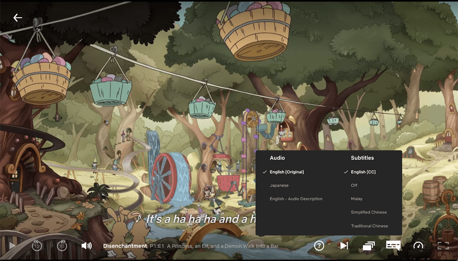
On Netflix, the playback speed control where users can choose to stream at 0.5x, 0.75x, 1x, 1.25x, or 1.5x, is an especially useful function for users with blindness and deafness. Those who are hard of hearing and rely heavily on reading subtitles may take a longer time on dialogues, while according to a study on human listening rates, those who are visually impaired are likely to process speech at higher speeds and thus may prefer faster playback. This simple feature is a big win for accessibility.
As for time-saving controls, Netflix has the standard Skip Intro and Play Next Episode buttons as well as an episode picker where users can browse episode catalogues and directly switch to a different episode without leaving the player. There are also 10s back and forward skip controls that can be gestured using double taps on either side of the screen, as well as a native slider for adjusting brightness without going through the pull-down menu on one’s device.
Next, by allowing users to lock their screen and hide playback controls with the Screen Lock function, Netflix further optimizes the experience for mobile and touch interfaces. Fingers accidentally touching the edges of your screen when you’re watching on your phone? You’ll soon forget that was even a problem.
Disney+ Hotstar Playback
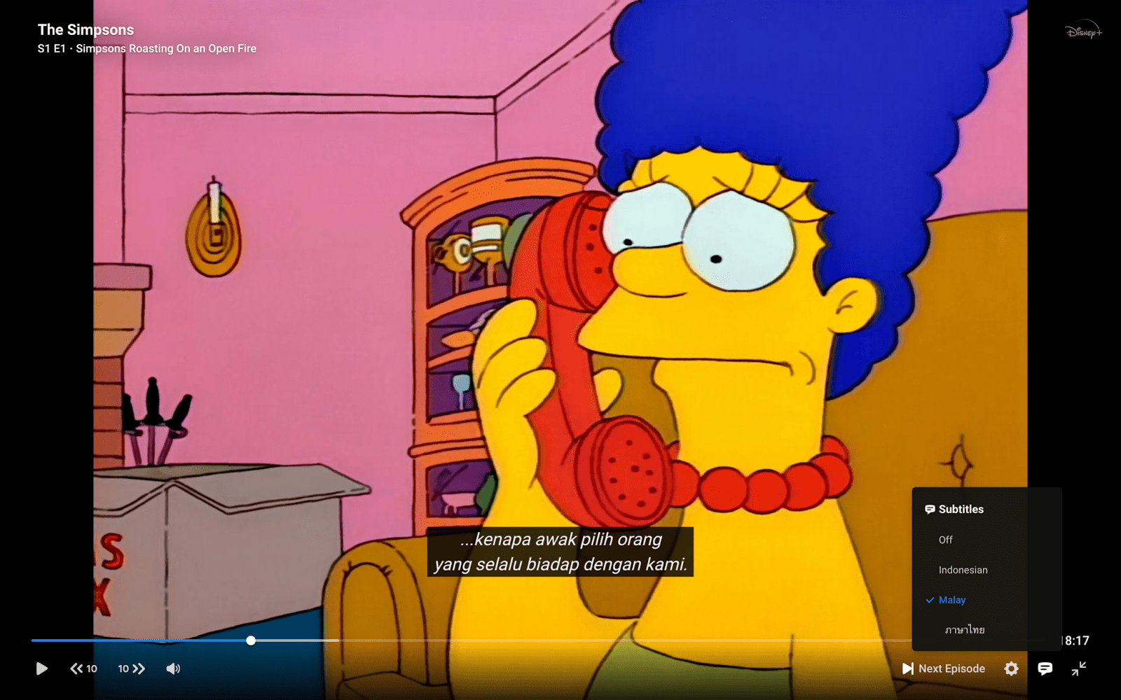
Not a surprise at this point, Disney+ does things a little differently.
On playback, the app allows users to choose their preferred streaming quality (Auto, High, Medium, Low) under playback settings. This bandwidth-saving control is great for some who might want the option to reduce data usage when they’re streaming on mobile data. However, based on discussions on YouTube’s quality selector in the past, most people prefer to stream on the highest quality by default, and would not enjoy manually changing their video quality every single time they watch something.
On platforms like YouTube where most videos are no longer than 10 minutes, users are more likely to watch videos on mobile data and hence find this feature useful occasionally. But on streaming platforms like Netflix and Disney+ where content extends beyond 30 minutes, most would be either watching on unlimited data or WiFi. So the question remains: Is a quality selector really necessary here?
Like the others Disney+ Hotstar has an episode picker in their player. However, instead of displaying catalogues in full, users are only able to view episode catalogues when they’re in portrait mode with the episode playing above it. This may be a little disorienting because, well, people don’t want to be rotating their screen just to get to a different episode.
HBO Go Playback
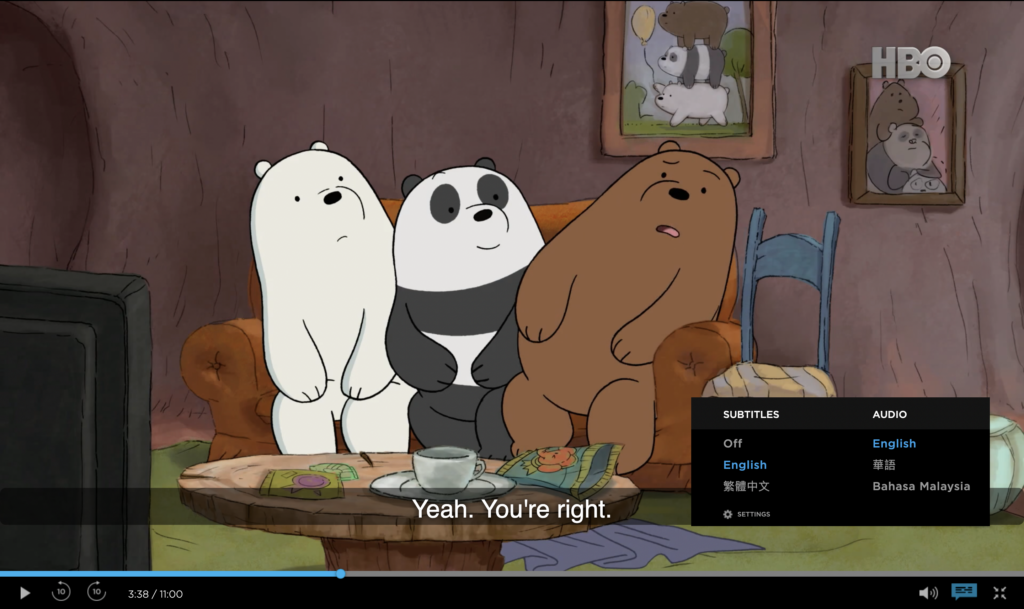
Things look pretty simple on HBO Go.
A functioning in-player Episode Picker, check. 10s back and forward skip controls, check. Audio and subtitles pop-up menu, check. Volume and full screen controls, check.
Nothing really worth shouting about here, but they’ve definitely covered the essentials.
What’s the Verdict?
Now that we’ve made it all the way here, let’s finally zoom out and observe the patterns.
Netflix is clearly the most assertive with highlighting singular and selected objects, which is apparent not only with their recommendations but also the pattern breakers inserted in their layouts, as well as their CTA buttons. There seems to be much more focus and intentionality in their design, which is undoubtedly a great thing. They utilize screen real estate well, and their experience in general proves to be user-friendly.
Disney+ Hotstar, on the other hand, appears to be weaker on design consistency. With a direction that sticks out the most among the three, it’s a shame that despite having a wealth of catalogs and franchises like Marvel and Star Wars, there’s a lot of catching up to do in their design choices. With a lot of advantage in terms of content, if given a little polishing design-wise, this app could definitely rise up to the top.
HBO Go, lastly, seems to apply safe and conventional design in most of their layouts. Their features are solid, but not bold enough to really make a difference. To put it on a scale, the app just kinda hovers in between good and great.
And so the best mobile experience goes to…
…Netflix! Surprise, surprise. The Netflix app demonstrates excellent usability and optimization for mobile and touch interfaces. The others are definitely not far behind, however. There’s a reason why they are strong contenders in the first place. With a little iteration here and there, they could easily catch up and take over the #1 spot.
Need A Hand?
Snappymob is a team of web and app experts who care about user experience down to the finest detail.
If you align with us (and are as picky as we are about design), feel free to get in touch with us!

