Editor’s Note
This article has been updated in 2024 for better comprehension, user experience, and relevancy.
When we put two of the biggest sportswear brands’ websites side by side, who trumps the other at user experience? With the help of our design team, we carried out a UI/UX audit to find out.
What this is about: User experience is all about usability, which the ISO 9241-11 standard defines as “the extent to which a product can be used by specified users to achieve specified goals with effectiveness, efficiency and satisfaction in a specified context of use”. This definition is the center of focus in this audit. What this means is that in every aspect of inspection, we seek to answer the question — How usable, effective, efficient and satisfying is this?
How we’re doing it: For each of the 13 selected web design categories, if not tied, one winner is allocated — Nike or Adidas. At the end of the analysis, the brand with the most points wins.
Let’s see how they do.
Top Menu
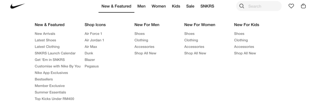
Due to a tighter layout, Nike has a more scannable top menu. Increasing the color contrast between categories and sub-categories presents information in a clearer hierarchy.

Adidas’s top menu may not be as scannable, but the larger spaces between columns help distinguish the categories from one another. Adidas appears to do better in this area.
The vertical line and added space between the New & Trending menu and the product categories give the said menu a more prominent distinction compared to Nike’s. Aside from that, the bolded typefaces used for the main categories also work great at setting apart the main categories (Men, Women, Kids, and Outlet) from the other minor ones (Sports, Brands, Release Dates).
Winner — Adidas
Hero Section
Both Nike and Adidas display large and impactful visuals of a specific and selected product, using both models and product-only shots.
Adidas’s homepage hero section features a 3-layout looping image that takes up the full width of the screen, while Nike includes a video showcase of their products with ample white space around.
There isn’t a right and wrong here, because both creative choices create different effects — visuals that flood the screen tend to be more impactful, while white space soothes and gives users space to breathe.
For Adidas, the hero section is placed with buttons that take you to the product shown in the hero image, whereas Nike’s are placed below, which can be a bit of a hassle as it requires a little scrolling. However, this isn’t much of an issue as the hero section itself also acts as the button.
Despite this slight difference, both are still great ways to target a specific audience and get people to convert.
Winner — Tie
Content Width
When it comes to content width, we observe consistency with Nike and a lot of variation with Adidas.
Having sections with different widths can help you tell them apart, but too much of it can be distracting. With multiple moving images on each page, Adidas’s layout could be confusing, especially for people with neurodivergent traits.
Winner — Nike
Additional CTAs
In comparison to Nike’s website, Adidas’s has more pop-ups, such as promotional banners and a feedback button on the right side of the page.
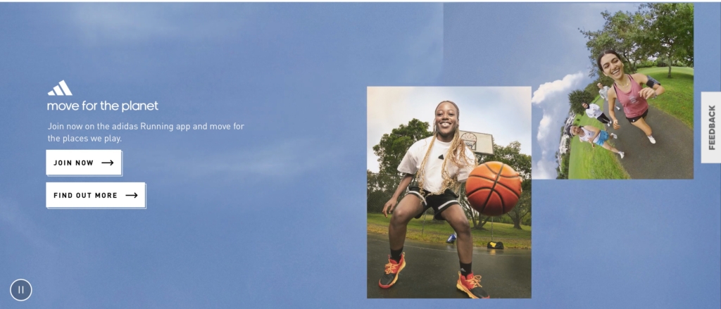
Pop-ups may bring customer service to the forefront by making it easier for users to reach, but they can also get in the way of content while users are browsing.
Winner — Nike
Search Bar
When you click on the search bar, Nike shows you a list of popular search terms that show the brand’s best-selling items right now. This makes shopping on the site better overall by focusing on people who are just looking around without a specific product in mind.

Another great thing about Nike’s search function is that as the user types in the search bar, the site shows five relevant products along with images of the products. This can be very helpful for users who need to use pictures to find the product they want.
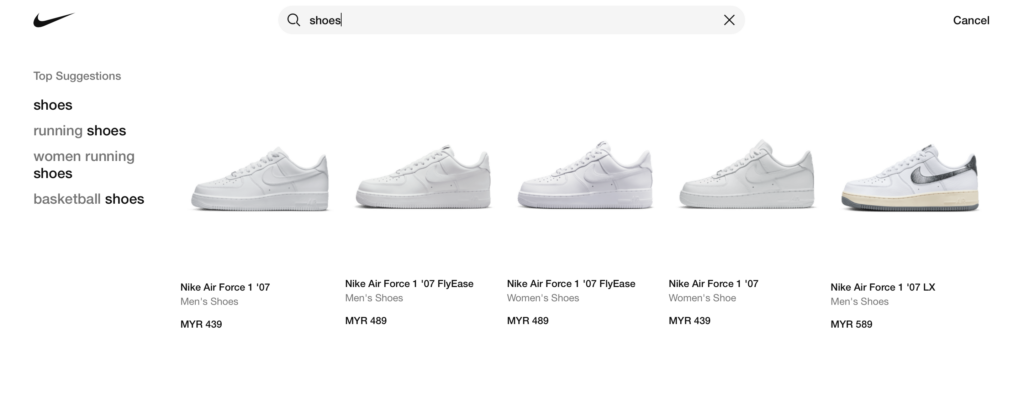
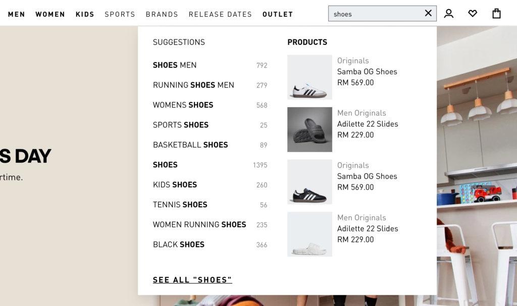
Nike sets a pretty high standard in this area, but Adidas’s search function isn’t too far behind. Adidas shows how many products are available under each suggestion, even though suggestions don’t show up until the user starts typing in the search bar.
Winner — Nike
Card Carousels
Nike’s card carousel displays 3 images and a hint for overflow, with a single-line indicator beneath it. Users can either click on the Next arrow button or hold and drag to view more products.
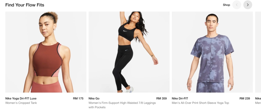
Adidas, on the other hand, puts 4 and a half cards in a row, so they can show more products. This gives users a more varied preview, but it also makes images and text smaller and harder to read. Similarly to Nike, the hold-and-drag function is also available with Adidas’s carousels.

However, the Next and Previous arrow buttons for Nike and Adidas differ slightly. While both are relatively large and have contrasting hover states making them distinguishable from the product images, Adidas’ buttons aren’t immediately visible.
Users have to actually hover over an image in the carousel for it to appear. This may prompt a discoverability issue for Nike’s website visitors with issues like missed content and delayed interactions. But, considering the button appears instantly at the slightest hover, this design choice isn’t a concern.
Winner — Tie
Product Listing Filters
Nike’s filters are economical with space and action. A sidebar lists out all product filters vertically, and users can choose to hide or show the filters, which is the best part.
The great thing about all filters being lined up in a single sidebar is that it doesn’t require many clicks to get to them. All it takes is a couple scrolls to view all the filters.
In contrast, Adidas has its product filters arranged horizontally at the top of the page. Though they don’t take up a lot of space either, users need to click on each one of the filters to view their variables. This is much more time-consuming than scrolling and may lead to quicker browsing fatigue.
Winner — Nike
Product Listing Visuals
Both Nike and Adidas use hover effects on the pages that list their products, but they do it in different ways. Under the main image of a product on Nike, there are thumbnails of the different versions of the product. When you hover over a product on Adidas, the images change quickly.
Nike’s hover effect keeps their design simple and minimal by hiding unnecessary details to make way for the thumbnails of the product’s variations. To prevent clutter, the product series and titles are hidden when hovered over.
Adidas does the opposite with space. Hovering over a product image immediately displays a different image of the product and expands a card showing product details and variations.
On the plus side for Adidas, the little heart-shaped button in the top right corner of each product image makes it much easier to mark items as favorites. Users have to click through to a product on Nike’s site before they can add it to their list of favorites.
Winner — Tie
Scrolling and Pagination
For their product listing pages, Nike allows infinite scrolling. This feature is great for keeping people browsing for a long time, but it can make it harder to go back, especially if there are hundreds of products in a certain category.
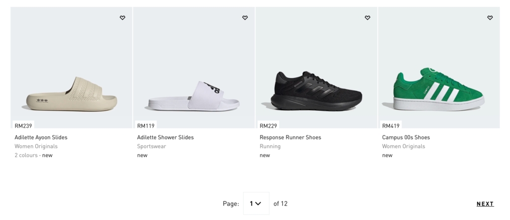
With pagination, Adidas divides their lists of products into sections that make it easier for users to go back if they need to. Even though endless scrolling makes browsing much easier, users have more control over how to move around when they use pagination buttons.
Winner — Adidas
Individual Product Pages
Nike uses tiled galleries to display each product. Their layout is great for quickly taking a look or scanning, but there are a few things that could be done better.

Nike’s product details, reviews, as well as the Favorite and Add to Bag buttons aren’t sticky, and this makes it more of a hassle to scroll all the way back to the top when a user is done viewing product images. With this layout, a Back to Top button would help improve the experience.
The stock availability indicator lacks specificity with the message “Just a few left. Order soon.” being much too vague for users to make an informed decision. Aside from that, their size guide link opens in a new tab, which may be disruptive to the browsing session.
Despite all that, Nike’s collapsible accordions for Size & Fit, Free Delivery and Returns, and Reviews work great for their minimal, spacious, and clean design.
Adidas gets the sticky part right — their product info and section bars stick to the screen to make navigating easy for users no matter where they are on the page.
The product image viewing experience on Adidas is also great with a click-to-zoom function and a button for full-screen viewing. Their stock availability indicator is also more effective with a specific stock count and a contrasting text color (Not to mention: red is a great color for creating a sense of urgency).
Another win for Adidas is their pop-up size guide, restock subscription, as well as delivery and return information. Without being forced to open new tabs, staying on the site and in the session is made easier.
Winner — Adidas
‘Added to Bag’ Pop-up
Nike’s subtle Added to Bag pop-up on the top right corner is much less disruptive compared to Adidas’s centered pop-up box that needs to be manually closed.
Aside from it being small in size, what’s great about Nike’s pop-up is that it auto-closes after a few seconds, creating minimal movement and minimal distraction.
Winner — Nike
Shopping Bag
Both Nike and Adidas’s shopping bag layouts have very well-accentuated CTAs, which is one of the most crucial features in a good shopping cart experience.
At a single glance, it’s clear what the next course of action is — Checkout. Other low-importance buttons like Move to Favorites and Remove are muted and smaller in size.
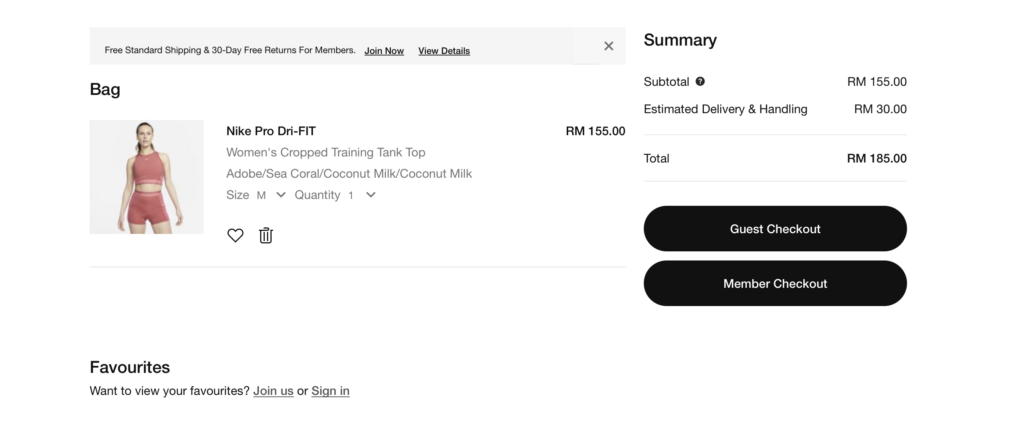
In Adidas’s shopping bag, additional elements like Promo Code and Accepted Payment Methods are highlighted differently, making it easy to distinguish high-importance from low-importance information.

Winner — Tie
Payment and Checkout
Adidas and Nike both use inline labels on their shipping information form for easy reference during form-filling. These labels transition into floating labels once the field is clicked and produce green indicators once filled, providing a great and unobtrusive way of guiding users through the form-filling process.
Another smart little thing that Adidas does is pre-select the consent checkboxes to make the checkout process quicker. This may be helpful in terms of usability but questionable in terms of ethics. It may not be good UX practice for Privacy Policy checkboxes to be pre-checked simply because the purpose of it is to have the user make the choice for themselves.
The only downside of Nike’s checkout process is the login section. Compared to Adidas’ same-page login, Nike customers have to leave the checkout page to login; making the whole payment process slightly troublesome.
Winner — Adidas
Who Takes the Crown?
Based on the points we’ve tallied in our analysis, Nike wins with 5 points, and Adidas comes close with a 4.
However, it’s worth noting that although there are best practices in user experience design, UX design is still to some extent, subjective. How design is perceived largely comes down to personal preferences, and with that being said, some may prefer Nike’s web design while others may prefer Adidas’s.
After all, their approaches are different. Nike’s design has a generally cleaner and more minimal feel with little movement and distraction, while Adidas maximizes on pop-up advertising, moving elements and dynamic design.
Which is better? Share your thoughts with us.


