
In the world of music streaming, two giants stand tall – Spotify and Apple Music. Both platforms offer a vast library of songs, podcasts, and other audio content, but when it comes to the user interface and user experience, there are distinct differences.
It has been a while since our last UI/UX audit on the three most popular video streaming platforms. This time around, we’ll take a deep dive into the UI and UX of the two most widely used music streaming platforms and see which one comes out on top. So sit back, relax, and hear us out!
Phase 1: Homepage and First Impressions
First, let’s talk about the component we’ll quite literally see first in every app: its homepage. Despite having a similar position to their all-mighty main menu at the bottom of the screen, they have very different approaches to their UX.
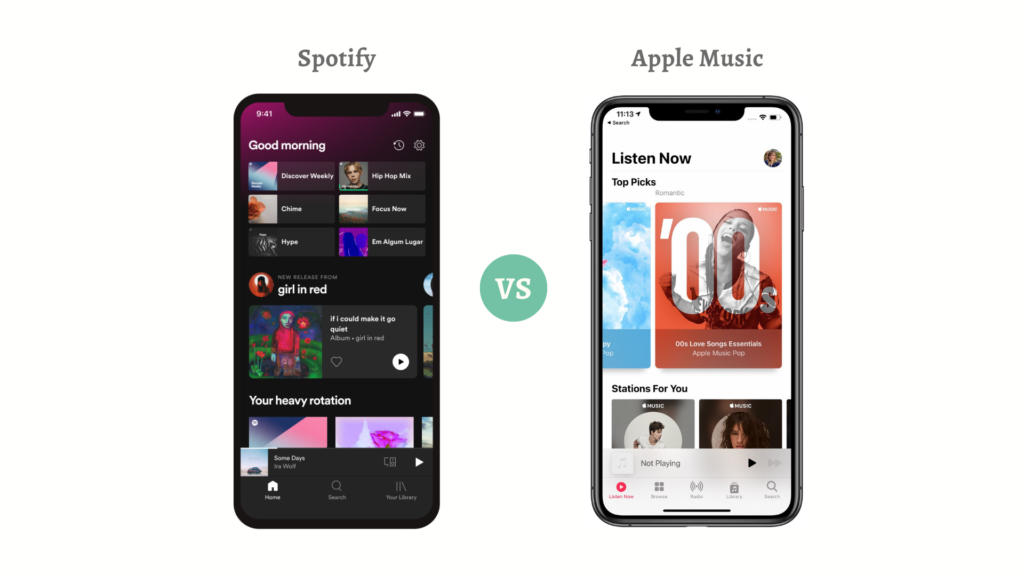
The Spotify Homepage
Each time the app is launched, you’ll be greeted with a vibrant and colorful design that quickly grabs your attention. The green and black color scheme is eye-catching, and the layout is intuitive and easy to navigate.
As your eyes wander around the screen, you’ll find suggestions tailored to your tastes based on your listening history. As well as a steady stream of fresh playlists, albums, and podcasts. So even if you have no existing playlists, the homepage points you to every possible direction to explore and create one seamlessly.
Speaking of personalisation, its sub-sections also come with tailored titles such as “Your top mixes”, “Shows you might like”, “Made for <your name>” etc., to further the sense of individualization.
The Apple Music Homepage
Apple Music goes for a minimalist design, with a white and black color scheme. Just like Spotify, the main menu is also located at the bottom of the screen for easy navigation.
Their UX concept puts emphasis on personalisation – to the max. They include playlists, artists, albums, songs and more, making it easier to access your library.
Keep in mind that this personalisation aims to offer accessibility to their existing library, not curated playlists or the top music of the month etc. In other words, its home screen screams ‘user’s library’, while devoting the rest of the screen for ‘recently added’ music.
Although the layout is super simple, it lacks the friendliness and guidance to navigate the best picks or recommendations for a first-timer who hasn’t made any playlists. This causes the app to have a lesser sense of engagement and individualization.
Our Verdict: If you’re looking for the type of personalisation that offers exploration features for curated playlists, then Apple Music’s flexibility is nowhere near Spotify’s. And if you’re obsessed with basking in your personal library, then Spotify will not be your cuppa’ tea. It’s all about how you take the tunes!
Phase 2: The Player
Now that we’ve got the first impressions down, time to get to the meat of a music app: the player. Undoubtedly the most important part of any music app, the music player is a make or break for many users.
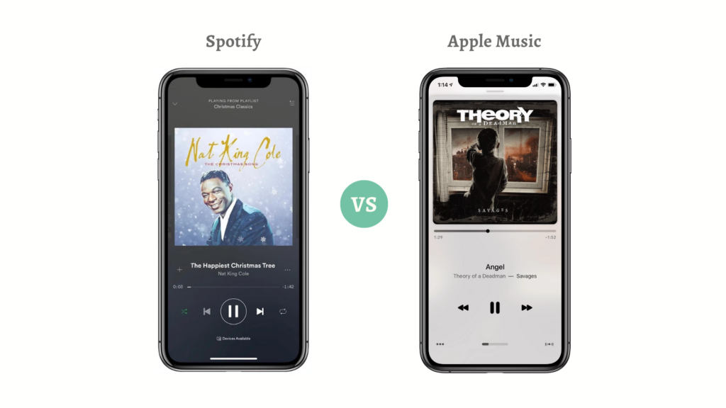
Spotify’s Player
The stark difference between the two apps is highlighted by just placing the two players side by side.
As obvious as it seems, both interfaces try to draw attention to their cover art. The way Spotify’s interface does this is by choosing a more subdued black and gray pattern, signifying its comfortable viewing in a ‘night mode’ sentiment, in contrast with Apple’s light interface.
When it comes to versatility, Spotify has the upper hand. Apart from the essential ‘play’ and ‘skip’ button, Spotify offers more features and controls including ‘shuffle’ and ‘repeat’ toggle buttons.
For the ‘shuffle’ button, you can:
- Turn it on; to randomize the playback order of the tracks in your playlist
- Turn it off; to revert to the original playback order
Meanwhile, for the ‘repeat’ button, there are two states:
- Toggle once; to repeat the current track once
- Toggle twice; to repeat the entire playlist
- Turn it off; playback will continue normally
Their foresight in knowing that most users would instead use the physical controls on the device’s frame to modify the volume was sensible. As a result, they’ve omitted a volume control from their UI, which allowed them to provide more capabilities without sacrificing usability.
Apple Music’s Player
As we’ve mentioned earlier, Spotify chose to prioritize comfortable readability with low-light locales. Why then does its main rival, Apple Music, choose a different approach? At first look, it could be merely for aesthetic reasons (Apple is known for its preference of white interfaces), but it is also related to the user experience.
Apple’s UX designers want the album art to leap off the screen when you browse Apple Music. Apple puts the user’s music in the spotlight by using a white background instead of a darker one, highlighting the album art’s vibrant hues.
Conversely, Apple’s volume slider feels like an unnecessary addition to the UI. The slider can only be adjusted by powering the device back on, should the user so desire. Why go through all that trouble? You can simply use the device’s physical volume controls to get the same result. It is what most people do anyway.
Our Verdict: Spotify has easily triumphed over Apple Music.
Phase 3: The Discovery
Both platforms offer features meant to help users find what they like among the millions of tracks accessible, but their music discovery algorithms favor music in different ways. Both interfaces are machine learning-powered, meaning they get better the more you use them.
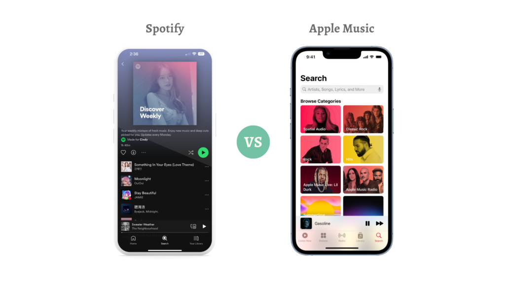
Spotify’s Discovery
Spotify’s Discovery tab, and particularly its Discovery Weekly feature, has received much praise for its superior user experience. The feature, which uses the user’s preferences to create a playlist every Monday, has proven so popular that even Google’s music streaming service took the similar design cue.
Apple Music’s Discovery
Apple has a large catalogue that tailors its recommendations to each individual user depending on their taste in music. Also crucial to Apple Music’s role in music discovery is Apple Music 1, which provides live radio 24 hours a day. Good on Apple for taking a more human approach to music discovery, rather than relying solely on complex algorithms.
Our Verdict: Despite both platforms offering an extensive collection of music, top-notch discovery tools and libraries, Spotify’s user interface outperforms Apple’s iPod-style interface by a significant margin, delivering a superior user experience.
Phase 4: Ecosystem
Who doesn’t love a great ecosystem that does everything for you? Having the ability to manage every musical activity in a central location definitely alleviates your listening experiences.
Spotify’s Ecosystem
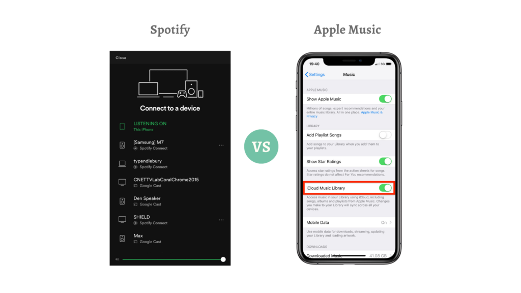
To put it simply, Spotify Connect is the kind of technological wizardry you’d normally associate with Apple. The queue, output device, play/pause status, and more can be managed from a central location.
While working from a local cafe, you can listen to your queue of streaming audio on your Mac, and then transfer it to your Samsung Galaxy phone to listen to on the way home. Fast and seamless; your listening experience will not be disrupted in any way.
Every year at WWDC, we’d get our hopes up that Apple would reveal a similar feature, only to be let down again and again.
Apple Music’s Ecosystem
Siri, play ‘Numb’ by Linkin Park.
Forget manual search because thanks to Apple Music’s unbeatable deep integration with its Apple ecosystem, Siri can do the job for you.
Furthermore, perhaps the most notable feature of Apple Music lies within its Apple iCloud Music Library, which can be accessed through iTunes. This allow users to listen to their personal music collection from any device as long as they are signed in with the same Apple ID.
Although the service’s initial release was plagued by collection-distorting problems, this capability is now a valuable addition that sets the service apart from the competition.
Our Verdict: Let’s be honest here, every “vendor-locked” Apple user is staying loyal mainly because it is difficult to disassociate themselves from Apple’s seamless integration. And if it weren’t for such a feature, chances are that Apple would be shaking in their boots. However, because the integration is simply so strong, Apple Music has the upper hand this round.
Phase 5: Spreading the Music
Sharing is caring, right? Whether it’s by making a playlist, learning about new artists, or just connecting over a common interest. And just like any social media out there, you can also follow your friends or any creators across both these platforms.
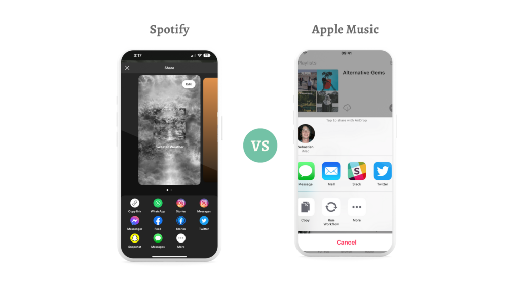
Spotify’s Sharing Feature
For the ultimate memorable mix, you and your loved ones are able to come together to create collaborative playlists. To further ease this process, you can also trade tunes with one another using QR codes.
As an additional bonus, users are able to broadcast their favorite tunes to the world through Instagram stories and direct connections on other social media platforms. Spotify is able to go above and beyond thanks to some nifty extra features.
Fun tip: users can take advantage of its ‘Group Session’ feature to host a virtual Spotify listening party with your friends. So say goodbye to the old school sharing-a-wired-headphone listening method and gather your folks online to listen to the same song at the same time!
Apple Music’s Sharing Feature
With Apple Music, you can share your playlists with your friends simply by sending a link, or through one of Apple’s most valuable features – Airdrop.
However, its social sharing tools are rudimentary and lackluster in comparison with Spotify’s. Unless you’re really into bragging about the music you listen to and sharing it with the world, this is not a huge concern at all.
Our Verdict: 100% Spotify. Not only is it easier to share music with others, but Spotify’s social sharing tool, especially its Spotify Wrapped has made its name throughout many different social media platforms, which only solidifies its community friendliness.
The Final Tally

Based on our verdict and the analysis of both music platforms, Spotify wore the cape and carried the crown.
Spotify focuses on its popping colors, easy-to-navigate curated playlists, and discovery features for the latest and relevant music. This is best for users who not only want to discover new trends, but also to share their playlists with friends and family.
Conversely, Apple Music’s clean and sleek interface pours their heart out for its users. Users who are all about personalisation, Apple devotees and music nerds who want to hear every nuance will definitely be head over heels for the platform.
Notably, whether the UI/UX of both platforms are brilliant or foolish, it all boils down to personal preferences. Individuals’ tastes in music streaming services—Spotify for some, Apple Music for others—illustrate this point, in the end, they have contrasting approaches.
We’re Here to Lend a Hand!
If you are someone who shares our obsession for UI and UX design, and have a desire to experience flawless user experience, feel free to get in touch with us!
Snappymob has a team of ever ready design experts who bothers with even the tiniest detail, so rest assured that your next design with us shall be immaculate!