

Unlike responsive apps where one design shared across all screen sizes, adaptable design requires customisation to mobile and web experiences. With all the advantages we reap from adaptive design — where we’re able to customize our products and leverage each experience’s unique features — comes the additional task of figuring out the best ways to tailor our design approach to both desktop and mobile experiences.
Where do we even begin? This is where research and data-driven design comes in.
Data-driven design isn’t just about cold, hard numbers — it’s about empathizing with millions of people at a time, and applying that empathy to our designs.
As Rochelle King puts it, “Data is numbers, but remember that behind every single one of those numbers is a real human being.”. Data-driven design isn’t just about cold, hard numbers. It’s about empathizing with millions of people at a time, and applying that empathy to our designs. By allowing behavioral data to drive the design decisions we make, we are advocating for the people we design for.
To dive deeper into UX research and design for mobile and web experiences, I talked to Product Design Lead at Facebook, Richard Yang and Senior Product Designer at Setel, Stan Tan about their perspectives on tailoring their design approaches to the different screens and experiences they design for.
Web Vs Mobile: Goals and Purposes
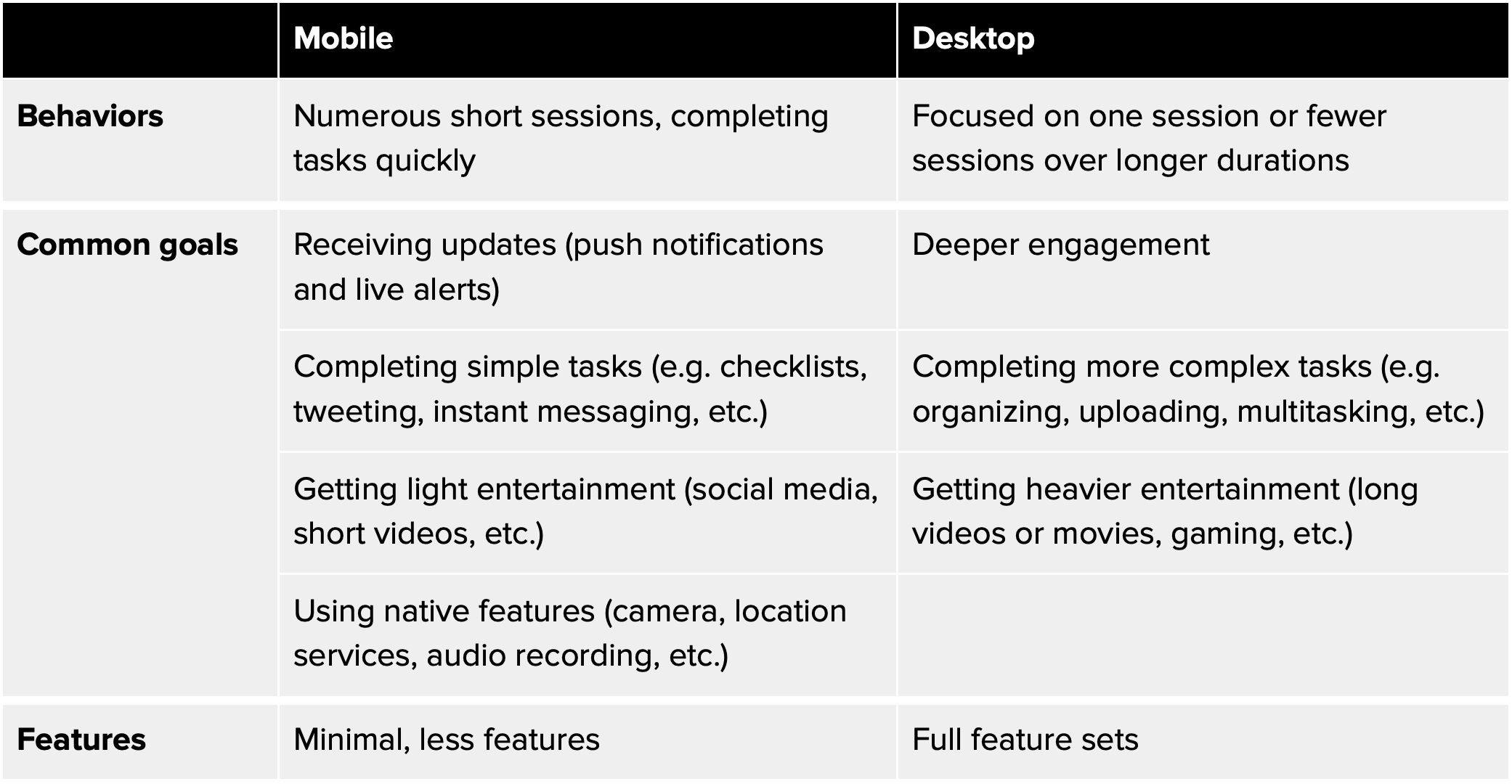
Users behave on mobile and desktop experiences differently because they have different strengths and weaknesses, and hence, serve different purposes. Generally, desktop or web apps are great for completing heavier tasks and multitasking. While mobile apps are great for completing simpler tasks and utilizing native features.
When mobile phones became widely available in the early 2000s, users grew familiar with mobile and web issues. For instance, after using social media on desktop and mobile, users may find mobile is better. This is because they can (1) access it anywhere at any time and (2) get notified on new activity from anywhere.
On the flip side…
Some users might find that multitasking is much easier on desktop. Stan brought up the popular horror story of handling SMS verification codes on mobile devices that don’t support keyboard autofill. On mobile, switching from your messaging app, memorising verification codes, then returning to the app to enter it is frustrating. It’s problems like these that help us realize when a web or mobile experience would be the better solution.
Generally, desktop or web apps are great for completing heavier tasks and multitasking, while mobile apps are great for completing simpler tasks and utilizing native features.
When it comes to completing heavier, more complex tasks like typing, uploading, and sketching, we’d naturally gravitate towards desktop apps. “Take Jira for example,” Stan said. “I’d appreciate getting notified on mobile on a task that’s been created or a comment I’ve received, but I’d still resort to using my desktop to compose a reply or edit a task description.”.
To wrap it all up, Richard laid out a user-centric summary that may help designers approach mobile and desktop experiences. Covering behaviors, common goals, and features associated with each experience.
Web Vs Mobile: Content Hierarchy
With different screen real estates, goals, and user behaviors, mobile and web interfaces cannot share the same content hierarchy. At least not exactly. How do designers build content and information architectures that are tailored and well-suited for each experience?
Desktop Content Hierarchy
On desktop experiences, Richard shared that creates tree diagram site maps with multiple hierarchical relationships that connect pages and sub pages. Content hierarchy maps tend to be broader on desktop than on mobile. This is because they cover more elaborate content with full feature sets.
Stan highlighted the importance of making use of horizontal space and minimizing downward scrolling on desktop experiences. It’s much less natural to scroll on a mouse or trackpad than on mobile.
As a side note, he mentioned that taking eye movements into consideration can also be helpful for designing web content. Due to the bigger screen size, desktop information scanning has more variable eye movement patterns than mobile. To validate this, it’s important to study eye movements on similar products to observe common patterns in fixations and saccades.
Mobile Content Hierarchy
On mobile, the two common patterns for content are horizontal and vertical. Horizontal patterns (bottom tabs), on the one hand, are typically great for apps with split features of equal importance. Conversely, vertical patterns (sidebar menus) are better for apps with a single core feature that users will focus on.
Most apps today, like Twitter for example, have both.
Conducting Research for Content Hierarchy
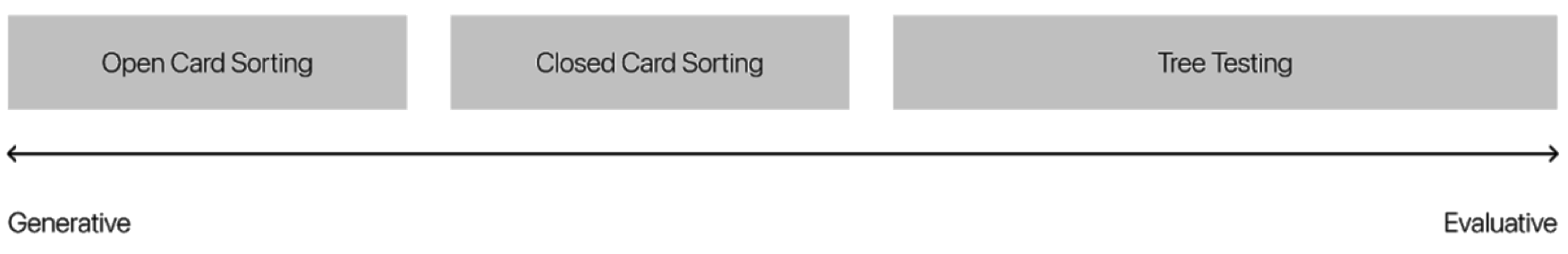
On conducting UX research for content hierarchy, Richard recommended card sorting and tree testing as helpful ways to validate and work out an effective information architecture on both mobile and web. Depending on your objectives, any of these methods can be applied to gather insights on user behavior:
- Open card sorting: Participants sort a set of cards by groups, and then name the groups themselves. This method helps generate new ideas for grouping and labeling content.
- Closed card sorting: Participants sort a set of cards into categories predefined by designers. This method tests existing groups and category labels.
- Tree testing: Participants are tasked to find a page or location in a tree using a top-down approach. This method is great for assessing the clarity in a navigation structure, identifying any issues with findability early on.
These methods span the spectrum between generative and evaluative research and are great ways to not only (1) generate insights on how users group and categorize information on your interface, but also (2) evaluate how well your existing information hierarchy works for them.
Richard also suggested using Red Route Analysis (RRA) to identify primary use cases to get the most important, most used content in the forefront of products. Facebook’s red route analysis, for example, shows that checking notifications is a critical use case, while blocking a user is secondary. This gives designers at Facebook a better idea of what to emphasize on the product for better engagement.
Web Vs Mobile: Limitations
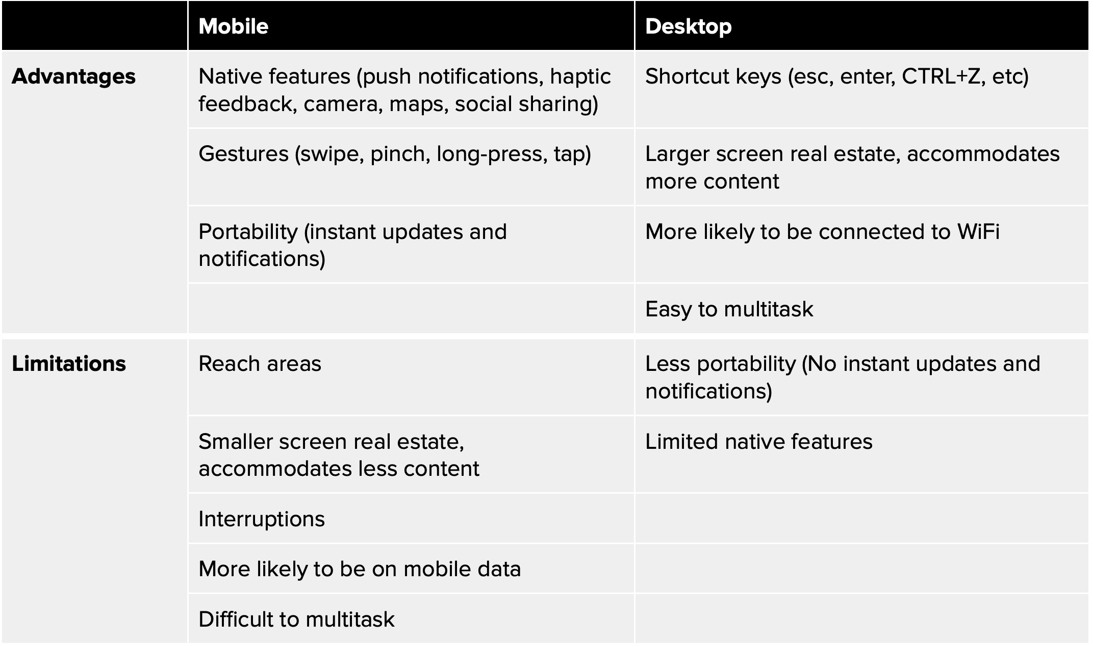
Both desktop and mobile experiences have their own unique set of advantages and limitations. Knowing what they are can help us avoid user-unfriendly elements and optimise each experience’s strengths.
Overcoming Desktop Limitations
a. Limited Native Features
Unlike mobile apps, desktop products cannot leverage as many native functionalities like haptic feedback, front and back cameras, social sharing, etc. This requires designers to be creative with their solutions by leveraging desktop advantages.
For example, they can leverage shortcut keys to simplify a process, or make use of the extra screen real estate with engaging microcopy or visual microinteractions that make up for the lack of haptic feedback.
b. Lack of Portability
Desktop products can’t follow users around like mobile products can (it’s the reason why they’re called mobile devices). Unlike mobile experiences, desktop experiences cannot offer the same kind of omnipresence where users have constant access to instant updates and notifications.
For this reason, especially for products that rely heavily on updates on new activity, it’s important to design a solution that enables alerts on the user’s mobile device in some way, be it via email or a native app that sends out push notifications.
Overcoming Mobile Limitations
a. Reach Areas
Steven Hoober’s research on how users hold mobile devices showed that 49% of people hold their smartphones with one hand, while Josh Clark’s research found that 75% of mobile users rely on their thumbs to complete tasks. These findings show how important the “thumb zone” is to note when it comes to mobile interface design.
This thumb-zone map illustrates the difficulty levels of reaching for different areas on a mobile screen, helping designers take note of where to place important interactive elements, and why they should accommodate both right and left-handed users in their designs.
b. Smaller Screen Real Estate
Smaller screen sizes call for economical use of space and extra attention to scaling text and graphic elements. Your product should have a design system with minimum text sizes and safe areas to accommodate the smallest screens. Tasks that require a lot of tapping, typing, and multitasking should also be simplified as much as possible.
c. Interruptions
Interruptions happen a lot more on mobile, whether intentional or unintentional. On mobile, switching between apps in the midst of a task (to answer a call, reply to a text, etc.) is something to be expected. Your product must be ready for interruptions, whether it’s in the form of pausing states or screens, or automatic progress saving.
d. Mobile Data
When someone is using your product on mobile, chances of them being on mobile data is much higher than it’d be if they were on desktop. It’s important to keep in mind that people rely on mobile data when WiFi networks are out of range. This calls for deeper optimization of speed and data consumption.
e. Multitasking
When content is loading on one tab, a desktop user can simply switch to other tabs to complete other tasks as they wait. Mobile users (especially of devices with lower RAM), however, are often forced to stay on one app and wait because switching away from an app will defer and even stop its content from loading. This can be a real obstacle if your product isn’t well optimized.
Stan mentioned that when multitasking is a limitation, and waiting is pretty much obligatory on mobile, it’s important to make use of interactive loading screens and loading time optimization to make waiting more comfortable for the user.
Web Vs Mobile: Which to Design First?
Ultimately, whether it makes more sense to go web or mobile first depends on your project and the nature of your product. Richard suggests that, for most consumer-facing products, mobile-first is better.
Stan had started to adopt the mobile-first approach in recent years, where he would design for mobile first, and then scale the designs to web interfaces, keeping the main content hierarchy.
Benefits of Going Mobile-First
Apart from adapting to rapidly growing mobile usage and smartphone sales, there are other great reasons to go mobile-first. The two development approaches — progressive advancement and graceful degradation — highlight the beauty of mobile-first design. These approaches encapsulate the two opposite starting points from which product design and development can begin:
Progressive Advancement
means to first build for the relatively simpler browsers (e.g. mobile phones) that will include the most basic functions and features, and then expand it into a more complex version for more advanced browsers (e.g. desktop). This means adding features, interactions, effects, etc. on top of the basic version.
Graceful Degradation
On the other hand, begins with the complex version for advanced browsers (e.g. desktop) and then “degrades” to a version for the simpler browsers (e.g. mobile phones) by cutting down on features or content.
Between the two, progressive advancement (or, the mobile-first approach) is the more preferred method among product designers and developers. Apart from being a great way to keep products accessible for users of older devices, progressive advancement improves content strategy and the overall creative and innovative process for product designers.
With graceful degradation, designers will often find it difficult to water a desktop product down for mobile after creating a complex product with many complex features. The mobile version will end up seeming like a stripped-down, not-as-great version of the desktop version.
But with progressive advancement, taking mobile products as the starting point where limitations (like screen real estate, bandwidth, etc.) are present from the get-go, it becomes a more conscious process for designers to prioritize and focus on only the most critical features of a product. Then, when the platform is expanded to a desktop version, it’ll be a much more open and explorative experience for them to finally leverage the advantages and features beyond mobile.
Learning Resources for Web and Mobile UX Design
Like any other profession, product design is a craft that requires practice and education. Before signing off, here are a few great resources recommended by Richard to growing product designers who want to learn and improve at both mobile and desktop user experience design:
Mobile UX
- Look into material design and Apple Human Interface Guidelines in more detail:
Desktop UX
- Look up UI kits and deconstruct them:
- Look at well established landing pages and deconstruct them:
Let Us Help You
As one of Malaysia’s top software development agencies, Snappymob is a team of UI/UX experts who care about user experience. Since 2012, we’ve been helping businesses of all sizes and verticals build and launch web and mobile products that delight.
Take a look at some of our work, read about what we do, or drop us a message on how we can help you with your next product.