What exactly is a design system?
It’s a collection of elements, patterns, and reusable components like buttons, input fields, headers, and more that help keep a digital product’s design consistent.”
Well, to put simply, it’s a house of digital elements that can be used to hold your design together. It is not a single product, but rather a set of elements used to make the design experience as smooth and predictable as possible.
Let’s look through some of the important factors of design systems.
Elements (the main pillar) of design systems :
Visual language
- Iconography. Icons are symbols that represent commands, functionality, features, or common actions. Icons should be easy to understand and recognised to reduce cognitive load.
- Typography. Typography is one of the most common types of content, yet it is often overlooked. It is part of the design you use to communicate with your users and show your product/service the way you want.
- Colour. It creates ideas, expresses emotions, stirs interest, and generates certain feelings.
UI elements
- Buttons. An element that communicates the action you’re going to take.
- Imagery. Images are used to help users relate to the product/service you are offering. A great image can create emotions, and help users to understand more than just from a wall of text.
- Patterns & templates. When several elements work together over and over again to convey the overall visual of the platform.
Rule & documentation
- Documentation. This process helps your product team properly assemble patterns, styles, and components. It gives designers the details of your processes too.
- Design guidelines. The main goal here is not just consistency, it’s for all elements to harmonize and create a beautiful and functional design. Here are 5 guidelines you can follow:
- Balance. A design’s elements such as images should be evenly spread. An unbalanced design may cause the users to lose interest.
- Pattern and Repetition. When patterns are used over and over, the design can reinforce consistency and create strong brand awareness in the user’s minds.
- Emphasis. Principles such as movement, proportion, and balance can be used to create emphasis. The idea is to pick out these elements, communicate and reveal the important parts of the design.
- Movement. This refers to the way the elements are arranged so that the users can easily move their attention from one angle to the next. This can be achieved through pieces or patterns that repeat or alternate.
- Contrast. A design with both light and dark colors can draw our attention because these colors offer more contrast and dynamics.
Why do you need a design system?
When a design system is applied correctly, it offers a design team many perks, which include:
Design work can be quickly produced and duplicated at scale.
– Speedy remake of designs through pre-built UI components and elements are the key benefit of design systems. Teams can use the same elements over and over again. This removes the need to reinvent the UI wheel and the risk of clashes.
Saves time on design resources
– Pre-built elements on UI that can be used again and again allow teams to save time and focus more on solving bigger problems. Especially in the case where you have tons of projects and teams to manage.
Establishes a common language among cross-functional teams.
– A common language reduces miscommunication and development time. This is important for teams that are not working in the same space.
Establishes visual coherence between products, channels, and (potentially isolated) departments.
– In cases where teams work in silo, a lack of an organization-wide design system can lead to messy presentations and muddled experiences. Design systems can manage the standards and create unity in the same space. It can also manage massive redesigns or rebrands.
It’s simple for new teammates to follow.
– With the help of style guides, any team member can comfortably create content and UI designs. Furthermore, they can seamlessly connect through all UX UI decisions.
How to create Design systems
There are three types of design systems to opt for:
- adopting an existing design system
- modifying an existing design system
- create custom design system
Each approach has its pros and cons, but as you may already know, creating a custom design system from scratch costs more time and money. On the other hand, opting for existing design systems can save more time and money.
In custom design systems, you’ll have the flexibility to customise. In the long run, the benefits of opting for an existing design system will diminish. Above all, it’s important to understand your company’s needs and then analyze the pros and cons of each approach before embarking on a design system journey.
Creating your own design system from scratch
Pro tip! You’re going to need more than just designers. Let’s go through the process step-by-step:
1. Conduct a visual audit
Before you design anything, you should first do a visual audit of your current design. You need planned thinking to consider the CSS you’re using, and a sharp eye for the elements you need to include to gauge the time and money required for this process.
2. Establish a visual design language
The basis of a design system lies within its visual design language. The four main areas that make up your visual design language includes :
Color
It is always ideal to choose 1-3 primary colors to represent your brand. You should also use a range of shades and hues to make sure the design does not look too plain or cluttered, and to give your designers more colour options.
Images
What’s a design without images? Images are an important part as they are used to link your product. You can collect and create a set of fitting images to speak for your company and system.
Typography
Most design systems use only 2 fonts: 1 for the heading and 1 for the body content, and some only one font for the entire process. The key is to keep the layout simple and avoid messy typography, which will benefit both designers and users.
Sizing and Spacing
Sizing and spacing are like areas for all your elements to dance and move in rhythm. A 4-based scale is the most recent trend and it’s highly recommended, as it is compatible to iOS and Android standards, ICO size formats, and even the default browser font size.
3) Create a UI/pattern library
Software tools for designers such as Sketch, Figma, or Framer will come into play in this step. After setting the visual qualities of your design elements, it’s time to move on to the actual components of your UI.
Gather all of the components of your UI, including each button, form, modal, and picture. Combine what you need, create a pattern library and delete the rest.
4) Documentation and guidelines
Keep records of each step. A proper design system differs from a pattern library in its documentation and standards. Guidelines should be created to keep things neat.
Similar to any other guides, it is crucial to explain the part of the system’s purpose, conclusion, special usage restrictions, and interconnections.
5) Update the system regularly
Revise, document, and update your system. This may look easy on paper, but the hard part starts when you have to keep working to keep the system up to date. You don’t want the paperwork to just sit there and be forgotten.
Pre-built vs Custom Design Systems
Up to this point, we’ve only been sharing the benefits of having a design system as a whole. Let’s now look at the pros and cons of both ready-made and custom design systems.
As you may know, anything ‘custom’ would cost you quite a lot of time and money. That said, a custom design system will surely help in the long run and you’ll soon feel as if the struggles you had from the start are nothing huge. It’ll benefit you through:
- UI UX differentiation of your products
- All your teams will have full control and freedom in customization over all the UI element libraries
- Your brand will be able to leave strong and memorable impacts
Although many designers just want to jump right in and create their own system from scratch, it is not a need. In most cases, projects that need to comply with specific design standards uses pre-built open-source design systems. They,
- are less costly
- Saves time
- Modern pre-built UI kits allow some freedom to customise
The main drawback to using pre-built systems is the lack of freedom to make your company’s design special. They may be easy to use but your designs will look plain and boring, somewhat like the standard Google or Apple style you see everywhere. Furthermore, if you chose the wrong system, it can ruin your UX.
Design system examples
1)
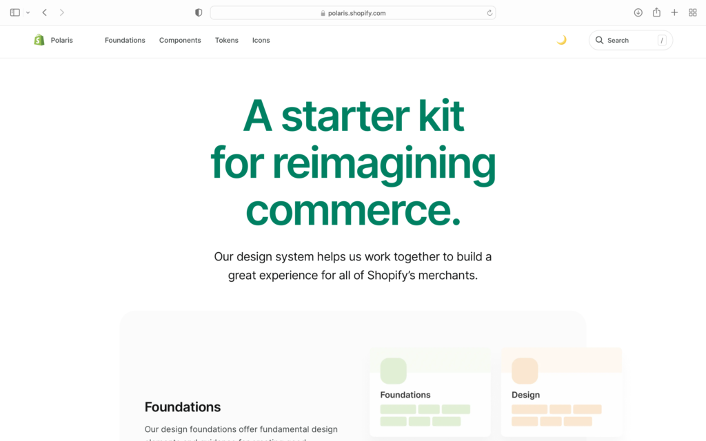
Shopify is one of the biggest ecommerce platforms that offers all the tools a company would need to manage and expand its business in one location (localisation).
The platform also has a public design system called Polaris, along with the company’s design philosophy:
- Be considerate and kind to all its users
- Empowerment. They want users to feel like they can accomplish anything with their tools.
- Craftsmanship. They want users to experience their amazing tools.
- Efficiency. Your Shopify experience shall be smooth with the platform’s quick solutions.
- Trust the brand and rely on it.
- Be comfortable. The platform wants its users to feel comfortable and welcomed.
Their design system features include:
- Colors
- Accessibility
- Resources
- Typography
- Illustrations
- Sounds
- Icons
- Interaction states
- Spacing
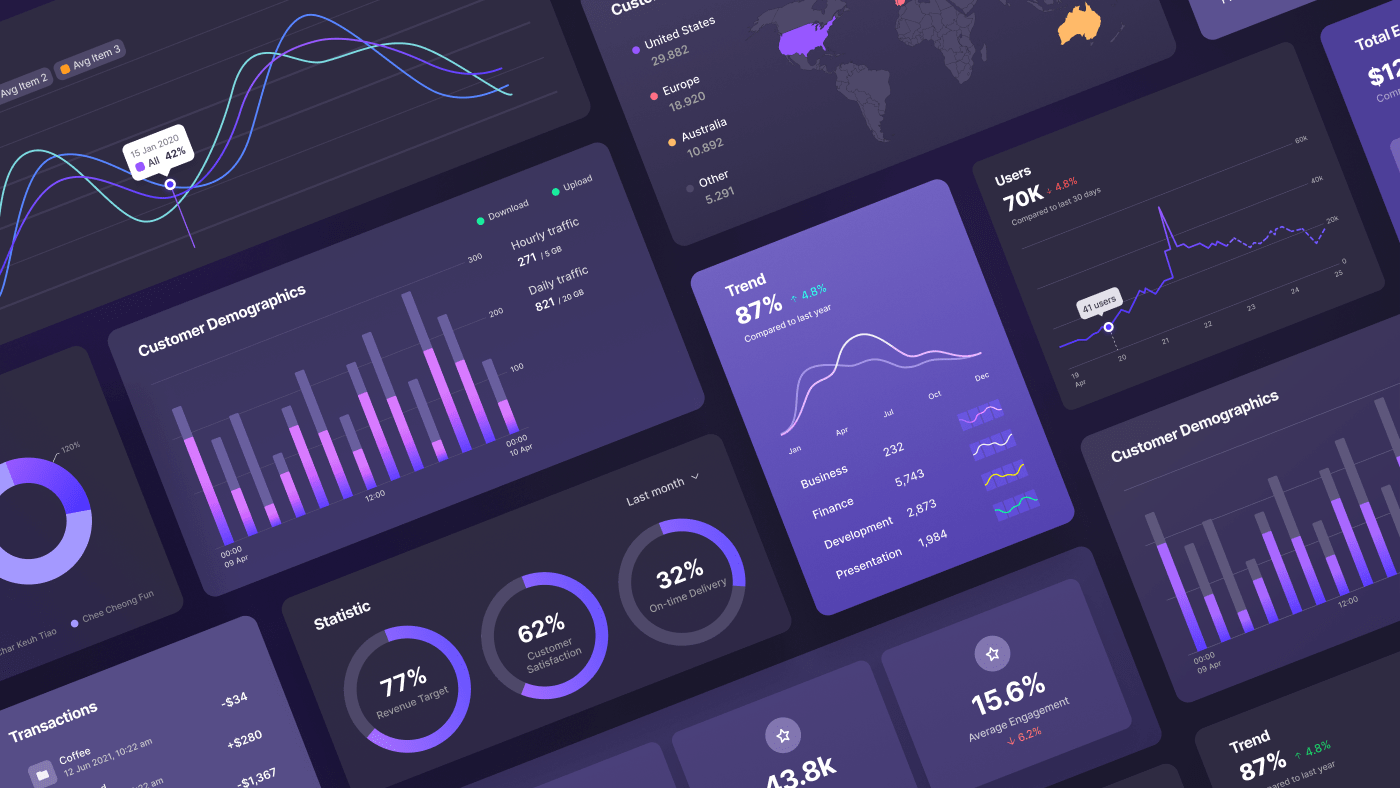
- Data visualizations
2)
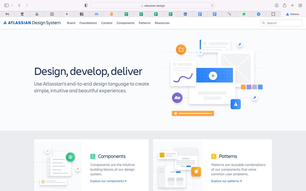
Atlassian’s focus is on providing smooth and simple collaboration tools like Jira and Trello for teams from around the world to connect and collaborate seamlessly.
Atlassian’s design philosophy looks at digital experiences and how it triggers improvement in the teams’ potential. They seek to:
- Have trust in each action
- Improving collaboration
- Empathize purpose and make users feel comfortable
- Maintain momentum throughout
- Drive value through guidance mastery
Atlassian’s Design System features include:
- Design Principles
- Brand Guidelines
- Product
- Illustration
- Prototyping
- Marketing
- Personality
3)
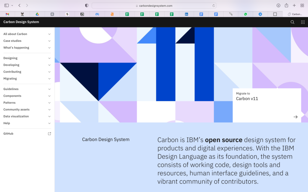
IBM’s services go from business consulting and financing, software development & IT hosting and management, to software-to-hardware products (servers, mainframes, storage).
IBM’s core design philosophy is about applying science, reason, and intelligence into creating and improving the constant progress of business, human condition, and society. They believe that a good design is more than just a requirement, but a responsibility too.
IBM’s Carbon Design System offers many tools including Adobe, Axure and Sketch, as well as resources for developers:
- Data Visualization
- Patterns
- Components
- Guidelines
- Tutorials
Next Step for You
As experts in the field software development, our team works diligently on our project-based designs through the use of style guides (a component of a design system) to cater to each needs.
It is important to choose your designers wisely as the UI kits they use can have a big impact the results of your project. Snappymob‘s designers are aware of this risk and have been carefully trained to find the right solutions for you. So do not hesitate to contact us today!