
Light vs dark UI is one of the hottest debates in UI/UX design. They are like two sides of a coin: you can use them together or against each other, but they’ll always be there. In the scientific world, light is synonymous with good and dark with evil connotations. This assumption could lead you to believe that a dark user interface will negatively affect user experience because people tend to give up easily when they expect something to be perfect.
Because of their repulsive association with the night, dark sites are immediately perceived by users as being harmful. But what about the psychology behind light color palettes? Let’s dive right in and unearth this topic together.
How Does it Affect User Experience
Designers, developers, and marketers alike should think carefully about the effects of light vs dark UI on user experience. It’s not enough to choose a color scheme because it looks or feels nice; you also need to think about how you might improve the user experience with it.
Interfaces that consume less light provide the user more leeway in their interactions because they can see what they’re doing at all times. In contrast, users have to make more of an effort while interacting with dark interfaces since they provide less visual cues to aid in job completion (like highlighting buttons).
Truth be told, the user experience may be improved or hindered by either light or dark UIs, depending on the user’s personal preference. So continue reading to find out how they can have adverse effects on the users!
The Pros and Cons of Light vs Dark UI Design
Have you ever wondered why some apps and websites have a light interface, while others have a dark one? Well, the answer lies in the pros and cons of each UI design.
Light UI has a clean and minimalist design that is perfect for high-visibility apps. Tools for learning and work that require extensive reading, writing, or viewing of comprehensive visual content are one example. However, light UI might cause screen glare, which can generate annoyance and reduced visibility. Additionally, users may have difficulty reading text or navigating an app when there is poor color contrast, which is detrimental to their experience.
Pros of Light UI:
- Often associated with a clean, simple, and easy-on-the-eyes style.
- Fits educational and productivity apps and websites that need great visibility.
- Good for apps that demand reading and writing or seeing detailed visual content.
- Often associated with traditional web design, and can convey a sense of familiarity and comfort to users.
Cons of Light UI:
- Can cause screen glare, especially in places where there is a lot of light.
- Staring at a bright screen for extended periods can cause eye strain and fatigue.
- Lack of contrast, creating impaired readability.
In contrast, dark UI can appeal to younger audiences due to its modern and edgy appearance. The feature is also suitable for apps and websites designed for low-light environments, like movie or music streaming apps. Another benefit of dark UI is that it is preferred by many people who spend long periods of time in low-light conditions, since it helps to alleviate eye fatigue and stress.
Yet, visibility might be reduced and the user experience significantly impacted in extremely well-lit areas. For the same reason, older users may struggle with apps that have a dark UI design.
Pros of Dark UI:
- Its modern and edgy look can be appealing to younger audiences.
- Specifically useful for media streaming apps and other websites that function best in dim conditions.
- Benefits those who spend long periods of time with their eyes open, such as those who operate in low-light conditions.
- Can provide a level of contrast that makes it simple for consumers to read content and move around a user interface.
Cons of Dark UI:
- Problematic readability in bright light, which might negatively affect user experience.
- Some users, especially those with visual impairments, may have a harder time reading.
- Displaying it on a screen uses extra energy, which might shorten the life of a battery in a mobile device.
- Perhaps inappropriate for older audiences.
Finding the Right Color Scheme for Your App
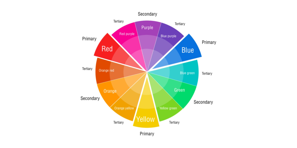
The first step in choosing a color scheme for your application is to create a color wheel – A circular diagram that shows how different hues and tints of light can be created by mixing together primary colors.
Once you have an idea of the colors you want to use, you can proceed with the following steps:
Define Brand Identity: It’s important to have a cohesive brand visual with consistency. In other words, your brand identity and UI should not undergo frequent changes, and align with your business goals. Logos and marketing items that are already in use should serve as inspiration for your color palette.
Consider your audience: Assess the demographic and psychographic features of your intended audience. For instance, if your app’s intended users tend to be young and hip, you might want to consider using vibrant, eye-catching hues. If, on the other hand, you’re targeting a more traditional demographic, you might want to opt for softer, subtler hues.
Look for inspiration: Websites like Dribbble and Behance are just two examples of the countless accessible tools that provide a wealth of color palettes from which to draw inspiration. You can also research successful applications in your field to learn more about the color schemes they employ.
Use a color palette tool: There are also numerous online tools available that can help you develop a color scheme for your application, such as Adobe Color or Coolors. With these resources, you can select complementary hues for a more unified overall design.
Test your color scheme: It’s crucial to acquire feedback from your intended consumers on your color scheme before committing to it. Feedback on your color scheme can be gathered through user testing or surveys, allowing you to make any necessary revisions.
Important Factors to Consider
There are a number of things to think about when deciding whether to give your app a light or dark user interface. Thinking about your app’s identity as a brand should be your first step. Is it lighthearted or solemn; casual or conventional? This information may help you determine the right color palette and design aesthetic for your project.
Next, think about what the end-users hope to accomplish with your application, in short – customer’s expectations. Is a visually striking design with vivid colors and sharp contrast something they’re hoping for, or do they gravitate towards a simpler layout with less visual elements? In order to craft a UI that is both functional and pleasant to use, you must first have a firm grasp of the user’s expectations.
Likewise, it is important to think about the user’s pre-existing assumptions about the world and how those could interact with your design. It’s especially vital to have an easy-to-navigate interface if your app deals with something people aren’t familiar with, like cryptocurrency trading or machine learning algorithms. That way, users can learn your app’s ins and outs and start making the most of it in no time.
Last but not least, think about where your application will be used. If it’s a website, will people be using it at home on their desktop computers, or in public places like cafes and airports, where overhead lighting could cast unwelcome shadows on their screens? Is it something they plan to carry with them when they stroll across the city at night? Since all of these can affect how easily people can interpret your design, it’s crucial that you put your interface through its paces in a wide range of real-world tests to make sure it lives up to users’ expectations.
Get Started with Low-Cost Development Tools
It is possible to make a professional-grade UI without spending a fortune by starting with inexpensive development tools. It’s no surprise that designers would gravitate for either Figma or Sketch given that they’re both high-quality, cost-free alternatives that have been around for some time.
Figma is a web-based graphical user interface design tool that facilitates real-time collaboration amongst team members and the creation of responsive graphical user interfaces. On the other hand, Sketch is an application for desktop computers that excels at producing vector-based designs.
Besides the two juggernauts, InVision is a great low-cost prototype tool that doesn’t require users to know how to code in order to produce interactive mockups of their designs. If you want to try something out fast before committing time and energy to constructing it in code, this can be a wonderful option. One prototype can be made with InVision’s free plan, making it a good choice for solo designers or small studios.
Balsamiq is another alternative for affordable development software. Designers can use this wireframing tool to first create interactive wireframes or sketches. This can be a wonderful method to rapidly iterate on design concepts and obtain input from stakeholders.
There are a plethora of low-cost development tools accessible that can assist designers in making high-quality UI designs without breaking the bank. Designers may improve the user experience all around by taking advantage of these technologies to make appealing and practical interfaces.
You Don’t Have to Choose Light or Dark Someday
These days, designers can make programmes with either a light or dark user interface. As a result, they can combine the two for a really one-of-a-kind and effortless adventure.
Finding the sweet spot between the two requires knowledge of both the app’s intended function and the users’ individual preferences. For a hybrid of light and dark UI, try setting the main screen’s background to black and the rest of the screens to white. With this method, people are better able to ignore secondary screens and concentrate on the primary one.
Another method takes into account both the time of day and the user’s preferences by employing a brighter UI during the day and a darker one at night. There are those in the design community who employ the usage of contrasting bright and dark elements on the same screen to draw attention to certain features.
Designers may create a more interesting, visually appealing, and practical experience by combining bright and dark UI elements. The objective is to make well-considered decisions and maintain a unified aesthetic throughout the app.
We’re Here to Help
We can see that there are benefits and drawbacks to both light vs dark UIs. A large percentage of users, though, clearly want a darker UI thanks to its aesthetics. However, we cannot deny the fact that lighter UIs are clean, sleek, and are in high demand as well.
If you’re struggling with the design of your interface, Snappymob‘s team of skilled designers with years of experience in UI/UX design are here to help. Get in touch with us right away if you’re interested in finding out more about how we can assist you in developing an excellent interface for your software.